What is the best watercolour paper?
It’s the hardy perennial that’s asked whenever a group of amateur artist’s get together and there just isn't a 'best' watercolour paper. When you ask around artists will just express their personal preferences.
I've only ever encountered one really difficult watercolour paper and that was a smooth Fabriano 5 - they probably market it under a different name now – and not all Fabriano papers are bad. It soaked up the colour like blotting paper and you couldn't lift off or sponge out. If these little tricks are a regular part of your repertoire then best abandon the paper and try something else. Maybe the sheets I bought came from a faulty batch which had not been properly sized. It wasn’t wasted though it took gouache and acrylic quite nicely so it was used up.
When pressed almost any surface can be used for drawing or painting. I was once in a café at The Hermitage on South Island, New Zealand which has a perfect view of Mount Cook . I just had to draw it and used a serviette and a fibre tipped pen. I later mounted the drawing in a sketchbook using acrylic medium so the memory is preserved.
Nowadays I buy Arches, Langton, or Waterford simply on the basis of who's offering the best deal. Miserly old scrooge you're all probably thinking!

Saturday, May 27, 2006
Why worry about boxes, brushes and paper?
Whenever a group of amateur painters get together it is certain that before long they will be discussing the merits of different papers or brushes, the Japanese Hake popularised by Ron Ranson or the French polishers mop a favourite tool of Edward Wesson. Then there are others willing to spend a small fortune on a hand crafted brass watercolour box or custom built wooden pastel box.
I’ve been guilty of the same preoccupation; in my impecunious student days I bought a Winsor & Newton College Box which held 16 half pans. I used it for years until someone on a course persuaded me that the rusty old thing was no longer fit for purpose and I should buy a Japanese Holbein Box. I ordered it by telephone from Frank Herring who warned me I might need a bank loan and the plastic Liz Deakin palette was much cheaper. I tried to sound like a man of means and insisted on buying the Holbein Box.
It was a bad mistake. It has a right hand thumb hole and as I’m left handed it wasn’t any use. Holding the palette by one corner John Yardley style didn’t work either – the wells are too shallow and I was forever ruining clean shirts. I’ve gone back to my old College Box and cut down a plastic ice cube tray to replace the rusty clips that held the pans. This holds colours squeezed from the tube and the thumb ring on the bottom works whether you are right or left handed. A little serendipity can often solve most problems.
All of these matters are a peripheral distraction. Painting is mostly about discovering a lost childhood vision that finds expression by simple direct means. Give a child a crayon and a sheet of paper and they quickly become totally focussed. Children are able to produce stunning images with the most basic equipment.
John Blockley in his later years used to mix his colours on a large plastic surfaced table with his work laid flat alongside, and I read recently that Fred Cuming uses a piece of hardboard as a palette for his oil paints – when it becomes encrusted he simply gets a new sheet. What sensible men.
Wednesday, May 24, 2006
painting can be agony with very little ecstasy
l'Ancresse Bay, Guernsey
This link goes to a painting I've been agonising over for a fortnight. It's an acrylic painting on canvas slightly under 20" x 16". I'd regarded it as finished and I put it on my website but I've delayed varnishing it because of a nagging disatisfaction with it. I've tried all the usual procedures,looked at its mirror image, hidden it for a few days, got on with something else hoping to come back to it with fresh eyes but all to no avail.
Much of it has been reworked which the forgiving nature of acrylic allows you to do, added a flock of gulls but none of this has brought satisfaction. Coming to it afresh again today I think perhaps it's too busy and needs some quiet passages. I'll allow that idea to distill for a few days and see if a prime vintage matures. Watch this space!
Sunday, May 21, 2006
Accidents are rarely happy
Yesterday there occurred one of those frustrating moments when I thought I had brought a painting to a satisfying conclusion only to notice a small splatter of white paint in the centre of a delicately toned part of the sky. It was only 2mm in diameter but once aware of its existence it attracted the eye like a magnet. Scraping away had no effect – acrylic paint is a tough stubborn substance.
David Cox the 19th Century watercolourist took comparable annoyances in his stride. He sometimes painted on sugar paper which had dark flecks in it. Asked by a lady admirer how he coped with these he replied; “Why madam I give them wings and they fly away.” In my painting the option of converting the splatter into a seagull would have caught the eye even more emphatically – that was not the best solution.
The offending splatter intruded in a light toned passage that had been painted by blending colours wet in wet directly on the canvas and there was no way that the effect of the blends could be easily matched. I mixed a slightly lighter near match and applied it as a thin line with a palette knife. The edges were softened with a sponge and the splatter disappeared behind a wisp of cloud.
Accidents when they occur in the early stages of a painting may have happy consequences; if they arise when the painting is almost finished they are potential disasters. Fortunately acrylic is a most forgiving medium.
Thursday, May 18, 2006
A way of seeing
‘The Impressionists’ – BBC2’s drama documentary made informative viewing. There was a telling moment in the first episode where Julian Glover, as Monet, brandished a bunch of flowers before his guest’s eyes and asked, “What do you see?” It took the startled man three tries to give the answer Monet wanted – “Patches of purple, yellow, green…...” His natural reaction at first was to give names to the objects rather than respond to the emotive sensation of colour.
This little incident summed up nicely what the Impressionist painters were setting out to do – essentially to see the world as small patches of pure colour. Monet’s late water lily paintings are not concerned with portraying particular named varieties – instead he offers a purely personal assemblage of colour harmonies. Look more closely and even more subtleties of colour are revealed by the brush marks
It doesn’t do to be stuck in an Impressionist time capsule, painting moves on, but colour sensation and the mark – whether made with brush or chalk – are two basic elements in painting that allow us to communicate our personal view. The colour patch and the mark themselves are pure abstractions but Monet and his friends showed how they could be used to reveal a new way of seeing.
Saturday, May 13, 2006
Guernsey didn’t disappoint

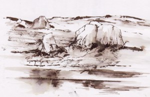
Taking a walk along the cliff paths opened up views of sea and rock which for me have always been exciting subjects. In spring these cliff tops are a riot of colour sea campion, thrift, bluebells, sloe and gorse all in flower. Then there are the colours and textures of the lichen covered rocks themselves that excite. I’m looking for a change of direction more concerned with the small and intimate rather than the grand vista so I wasn’t disappointed.
My sketches on this visit were mostly of rock formations recorded with a brush pen and sepia wash. The brush is ideal for creating the expressive linear forms found in weathered granite. More information relating to colour and texture can be recorded with a digital camera.
Now begins the task of recreating the painterly visual equivalent of tbese experiences in the studio.
Subscribe to:
Posts (Atom)