Painter IX again
At last things are coming together. I’ve found a simple way of working with Painter IX that I can get on with. This involves working with layers and devising a plan for what each will contain. The first layer is always the canvas and for the moment for me that is always ‘sandy pastel paper.’
The next layer contains the drawing. Until today this has been a scanned drawing from my sketchbook. The drawback with this is that the sketch has to be cropped and resized in Photopaint first to fit the canvas. Today though I made the drawing by working directly with the stylus on an Intuos 3 tablet. This is how I would normally work on a real canvas, corrections can be made just as easily but the big advantage is that the sketch layer is preserved in the saved file and can always be referred to. In a real painting it is lost.
A new layer is opened for the lay-in where the main features are blocked in. This is followed by a defining layer where the drawing is firmed up and tonal adjustments are made. Finally come a detail layer for the final touches.
For the moment I’m following this simple strategy with a range of Pastels Brush tools. These tools respond to stylus pressure which comes easily with the way I draw. There is some stunning digital art produced by artists with Painter IX who manipulate photographs and graphic art work using cloning techniques. The range and scope of digital art is amazing.

Tuesday, January 09, 2007
Going Digital
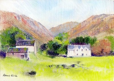
 I'm resolved to gain some competence with Painter IX this year. I’ve tinkered about with it and found it a difficult piece of software because of its complexity. I suppose the danger is that you read abouits different features and try out everything at once.
So it’s back to basics. The pastel, conte and grainy pencil brushes seem to suit my style best and they’re the tools I’m most at ease with. So I’ve decided to confine myself to using those.
Then there’s the problem of getting started. I’ve not been too successful with using cloned photographs so at the moment I’m using scans of sketches as a starting point. ‘Keep things simple’ is my motto as far as digital painting goes. Here’s a sample:-
Saturday, January 06, 2007
Thank You Prof. Gombrich
‘There really is no such thing as Art. There are only artists.’ These are a surprising couple of opening sentences for a book about the ‘The Story of Art.’ Back in December I read reviews of Ernst Gombrich’s best seller which Phaidon have reprinted as a pocket edition. The reviews prompted me to take a fresh look at my own copy – a weighty paperback which is a reprint of the 16th edition of 1995. Like many other students my first acquaintance with the book was via a college library copy and I immediately took to the direct plain language of his writing.
I’ve always discovered new insights from Gombrich. Even after having ‘The Story of Art’ on my bookshelf for around ten years I was taken by his comments on Raphael’s sketch books in the introduction. The sketchbook drawings were Raphael’s studies for his ‘Virgin in the Meadows’ of 1505 now in Vienna. It’s regarded as the most charming of Raphael’s ‘Madonna’ paintings and the pages of pen and ink sketches reveal the trouble he took to get the group of three figures into a harmonious relationship.
Few of us take similar pains or are inclined to give much thought to composition today. Painting manuals gloss over the problems in demonstrations – giving descriptions of each stage but little about the thought processes needed to compose the painting in the first place. When sketching ‘en plein air’ all too frequently I take the subject as presented and often have to make major changes in the studio. The Professor's words and Raphael's sketches prompt me change my ways!
Thursday, November 30, 2006
The Way I Was: doing a Wesson
When starting out in watercolour it’s a good idea to focus on a painter whose work appeals. Once, for me and others in my painting circle, it was Edward Wesson. His loose understated style in the tradition of Sargent, Whistler, and Edward Seago evolved as a means of quick direct observation done en plein air. It seemed the right way to paint watercolour.
I’ve never regretted the time when I hauled an easel, a rucksack full of painting gear, and a drawing board out of the car boot and set up in the corner of some field – but it is a bind. Often when walking our local footpaths a compelling subject would present itself – no time to set up all the paraphernalia even if I’d had it with me. I soon decided that travelling light with just a sketchbook was better.
Most of the interest in painting landscape comes from recording effects of light and these are often fleeting. Mood and the sense of place can be captured quickly and directly in a bold medium like charcoal or graphite pencil. Colour is not critical, it is an element that can be worked on imaginatively in the studio, but tonal values are much more difficult to recreate convincingly from memory.
Looking through some old sketchbooks at my charcoal drawings they seemed to lead naturally to the ‘Wesson treatment.’ He’s a hard act to follow and so many have trodden the road where he led. There’s a fascination and charm about his way of working though – so maybe I’ll do one more ‘Wesson’ for old time’s sake.
Thursday, November 23, 2006
A Ruskin Masterclass on colour
I’ve just picked up my copy of Ruskin’s ‘Elements of Drawing’ again, it’s a timeless work because the advice he gives is equally relevant and applicable today. He reduces drawing to its basic elements of making marks and developing an eye for shape and form before going on to deal with more complex concepts like colour and composition.
Re-reading the ‘Elements’ has set me thinking about ways of colour mixing in watercolour and the merits of each. Ruskin omits the obvious method of premixing in the palette which often produces a sullied colour less pure than the constituents. He first discusses mixing wet in wet on the paper, a familiar technique which is good fun but is always unpredictable. Next comes laying one pure colour over an earlier wash when dry – it’s interesting to note what Ruskin has to say about this:-
‘If you lay a solid touch of vermilion and after it is quite dry, strike a little very wet carmine quickly over it, you will obtain a much more brilliant red than by mixing the carmine and vermilion. Similarly if you lay a dark colour first and strike a little blue or white body-colour over it you will get a more beautiful grey than by mixing the colour with blue or white.’
His reference to the use of white might surprise those who regard watercolour as a pure transparent medium. For Ruskin this attitude is too restrictive and he recommends mixing Chinese white with colours as a preferable way to tint them rather than dilute them with water.
‘The mixing of white with the pigments, so as to render them opaque, constitutes body-colour drawing, and you will, perhaps, have it often said to you that this body-colour is ‘illegitimate.’ It is just as legitimate as oil-painting, being so far as handling is concerned, the same process, only without its uncleanliness,……for oil will not dry quickly, nor carry safely, nor give the same effects of atmosphere without tenfold labour.’
The last method he describes is ‘Breaking one colour in small points through or over another.’ This is not a method that seems to be endorsed very much but Ruskin rates it highly.
‘This is the most important of all processes In good modern oil and watercolour painting,…….. To do it well is very laborious, and requires such skill and delicacy of hand as can be only acquired by unceasing practice.’
The method involves the interlacing of one pure colour over or alongside another, or applying small touches separately sometimes leaving space between them allowing the untouched paper to show. What he seems to be advocating is a technique that relies on an optical mix of pure colours that anticipates Impressionism.
Note that Ruskin is inclusive in his comment of both oil and watercolour. The basic problem of rendering colour has to be faced in all media.
After Turner, Ruskin rated Rossetti and Holman Hunt the best of the 19th Century watercolourists. It’s worth studying the work of each of them particularly in respect of the way they employed ‘broken’ colour.
Tuesday, October 24, 2006
Fanciful Gothic Beasts
This pastel was composed around 1992 from sketches of the misericords in the choir stalls of St. Laurence, Ludlow. They are quaint carvings of biblical stories as interpreted by the medieval woodcarvers. Sketching them involved sitting on the floor to get a better view which meant I was out of sight to anyone standing at the chancel screen. While totally engrossed I was interrupted by the verger leaning over the bookrest to see what was going on. Apparently thefts of choir stall seats were not unknown.
Dark fantasy is never far away in the art of Northern Europe – you find it in the paintings of Breughel and Heironymous Bosch. But I found these fishes and beasts rather quaint, all that was lacking was bright cheerful colour. Use the thumbnail to see a larger image.
Fanciful Gothic Beasts
Saturday, October 21, 2006
‘A brief encounter after more than 15 years.’
Yesterday I went into our local print gallery just to browse. They have boxes of cheap mounted prints that are on offer for a few pounds. On the walls they display paintings of varying age and quality and I was stunned to find that they had a framed pastel of mine. I told the assistant that I was the artist and asked how they had acquired it – she had no idea.
I remember that it was a painting of a hill farm – Alltforgan – at the head of Lake Vyrnwy. It was painted at least 15 years ago and I must have sold it at one of the Ludlow Art Society exhibitions. In those days I was not very businesslike and did not keep careful records or take photographs of my work so I have no idea who the original purchaser was.
By co-incidence another painting by a former Vice-President turned up recently in the same shop. It was bought by his son who showed it to me. Fortunately I was able to tell him who had bought it and the gallery must have acquired it at a sale of the purchaser’s effects when she died. I guess the gallery acquired mine in a similar way. It was good to see it again and I was tempted to buy it back because they’d valued it at far less than the price I ask now. I resisted but I’ll probably go back again to see if they’ve sold it – I hope it finds a good home
Friday, October 13, 2006
“It’s Like Meeting Old Friends.”
I’m married to a woman who is passionate about tidiness so when faced with the threat of having my normally chaotic studio tidied up I knew I had to act immediately! The trouble with being ‘tidy’ is that you can never find things; but never mind the enforced reorganisation of my studio storage did me a good turn – I had to sort through my old painting and drawings.
This was a task that took me two days because renewing acquaintance with the paintings was like meeting old friends, you can’t just give them a cursory glance and pass on. Memories come back and the realisation dawns that things don’t look as they once did so many of the subjects I would now treat differently. There are several paintings though that could be improved by the application of a stronger wash or by cropping to a smaller format. That’s a task that will have to be fitted in between developing new work during the coming months.
Sunday, October 01, 2006
Scilly tips for Sketchers
Sketching outdoors in front of the subject beats having to work solely from photographs. When working out of doors these days I do tonal studies and leave colour work for the studio. It is difficult to assess tone values when you are also considering colour. The advantage of making tonal studies is that the means of doing them is so simple. The 'Tonal Studies' link navigates to a web page that discusses the topic further - do have a look!
Tonal Studies
Saturday, September 23, 2006
More Candidates for reworking

Although these two pastels started as ‘plein air’ sketches one ended up as a finished pastel. It was a mistake though to work over the original sketch – the first fresh vision has gone. At the time I was rushing to find work for an exhibition – as it turned out I need not have got in a froth because I’m still enjoying 'Pennine Summer at home!
At the end of day crit. Moira didn’t seem very taken with ‘Pennine Summer’ and preferred ‘Jack Beck 2’. I think perhaps she thought it caught the brooding mood of the Pennine moors better and the drawing was more direct.
With Moira’s comments in mind I decided to use ‘Jack Beck 2’ as the foundation for a new painting in water media – leaving the options open for a pure watercolour treatment, or acrylic, or a combination of the two. There were features in ‘Pennine Summer’ that I was reluctant to lose. I decided to retain the barn and some of the trees in any future reworking.
Monday, September 18, 2006
Second Thoughts - reworking in a different medium.
I’m currently taking a look at some paintings I did a few years ago with the idea of reworking them. It’s not that that I’m dissatisfied with my past work or that they are particularly bad paintings. I want to explore the idea that something new could be said by reworking a subject in a different medium. A few years ago I did relatively few watercolours and worked mostly in pastel so the choice was virtually a faite accompli – what could be discovered about a place by transforming a pastel study into a watercolour.
The first work I chose for reworking was a little pastel of a hill farm above the Mawddach estuary in Wales. It’s a small work done in 2002 measuring 15cm x 21cm. on a buff Ingres paper. I found pastel a difficult medium to use on such a small scale – though Diana Armfield has produced some little gems which are no bigger! She has the talent to focus on the most significant forms and colours leaving areas of the paper untouched. On a small intimate scale this approach works better than the full painterly treatment that I used.
Saturday, September 09, 2006
“This guy can draw anything.”
In Ludlow we were entertained by John Palmer who gave a presentation to Art Society members at our September social meeting. John sprouts up almost like a hardy annual in Ludlow, it was his third visit and judging by the large attendance he came by popular request.
John is based in Bristol and has worked all his life as a graphic designer producing advertising art work and magazine illustrations. He always brings a huge portfolio of his graphic work in watercolour, gouache and acrylic and is happy to have this passed around. The range of style and subject matter is staggering. “This guy can draw anything.” said one of our young members as she looked at the next piece of art work that came to hand.
For his demonstrations John brings three or four large watercolours at various stages of finish and works on each in turn – sometimes adding more drawing as well as new washes. It’s an interesting way to work; it emphasises that sound draughtsmanship lies at the heart of good watercolour and forms an integral part of the finished work.
I first got to know John’s work from a book he wrote back in 1993. The title was ‘Drawing and Sketching’ and was published as a title in the Ron Ranson’s Painting School series. The series has long since been out of print and I picked up my copy at a bargain price in a publishers remaindered bookshop. I always intend to get him to autograph my copy perhaps on a future visit I will remember
to ask him.
Incidentally I was surprised to find copies of the book are still available via Amazon.
Saturday, September 02, 2006
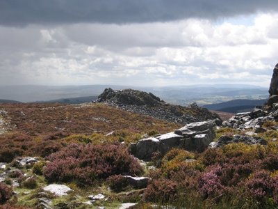
Drenched but Ecstatic
Last week I paid a visit to ‘The Stiperstones’ – these are striking outcrops of rocks on a hilltop in Shropshire. The outcrops consist of Precambrian quartzite – old, metamorphosed and hard they have been eroded into fantastic shapes which have given rise to legend hence the largest and most northerly outcrop has been named ‘The Devil’s Chair.’
I wasn’t fearful of the devil on this occasion I was more apprehensive about the shower clouds blowing in from the west. I had my sketching gear in the rucksack and wondered if I would get a chance to make use of it. Apart from the threat of rain it was a wonderful day of changing light which threw shadows across the rocks, the heather was in bloom reflecting bright purple when in sunlight. All these transient effects had to be captured on camera in the uncertain weather conditions.
The first shower arrived as I approached the summit outcrop which provided some shelter but not sufficient to make a drawing. At the next bright interval I moved out to look around for a sketching viewpoint and was made ecstatic by the effect of sunlight on wet rocks – just got to grab that – another job for the digital camera.
There was just time to settle on a viewpoint and get the sketchbook out when the next shower arrived. Caught on an open hillside and drenched in the first minute of driving rain the only option was to retreat back to the car. Not a wasted day though my trusty Canon digital camera had captured several images that could be used as reference material for paintings. Here’s my favourite:-
Thursday, August 24, 2006
I’ve Been Out Sketching Today
I happened to be in Worcester with an hour to spare, it was a warm sunny afternoon so I found a quiet spot in the cathedral close and had an absorbing 45 minutes drawing a bit of medieval ruin near the west doorway. Drawing en plein air is an activity I’ve neglected of late. Nowadays I work mostly from old sketchbooks or I rework paintings by transforming them into a different medium – so a pastel subject is revived and taken in a different direction through the medium of watercolour.
That’s a convenient way of working and when looking through old work there are always discoveries to be made. I could have happily kept working in this way reworking things in Pastel, Acrylic or watercolour except events have a way of taking over. The Ince exhibition nudged me towards taking pure watercolour seriously again and his sketchbooks displayed a degree of finish which I’d never attempted.
Then I bought ‘Light and Mood in Watercolour’ - David Curtis most recent book which prompted me to take another hard look at his work. His early training as a draughtsman shows in all his watercolours – very noticeably so in his larger ones. This was reason enough to go back to basics and work on my own draughtsmanship.
Wednesday, August 23, 2006
In Watercolour Small is Beautiful
J. M. Ince’s watercolours in Hereford have set me off on a series of small watercolours. Ince’s paintings in the bicentenary exhibition were around 10in x 14in or 7in x 10in. To me watercolour accommodates these small dimensions far better than oil – the medium is ideal when working on a small intimate scale. I can understand why artists frequently submit large half imperial watercolours to open exhibitions anything smaller gets lost in a massive show.
So I’m following the Cox/Ince route and adopting the small scale watercolour mode – not to imitate their technique or method but at least to try and capture the charm of their small works.
Tuesday, August 15, 2006
Celebrating 60 Years
Celebrating 60 Years Of Achievement
Ludlow Art Society’s Summer Exhibition which opens on the 19th August marks the Society’s 60th Anniversary. As a small celebration of the occasion we are showing work by former members - sadly most of them have died. When details of the former members paintings were received, pleasant memories were revived of people who were active in the Society when I first joined 20 years ago now.
Although I only managed to assemble a small and rather arbitrary selection of former members work it confirms the impression – held by those of us who’ve been associated with the Society for many years – that the standard has remained consistently high. The Society’s exhibitions have always been an interesting, varied mixture of amateur and professional work. Long may it continue – for another 60 years and more.
There is more information on the Society’s website : www.ludlowartsociety.org.uk
Sunday, August 06, 2006
The Painter of Presteigne
The Hereford Art Gallery and Museum is curently showing an exhibition of Watercolours by Joseph Murray Ince 1806-1851 to celebrate his bicentenary. Although born in London he was brought up in Presteign. He was a fine watercolourist who studied for three years with David Cox in Hereford before finally establishing himself as a painter in London. The link goes to the Powys On-line History Project that gives more information about him and contains an illustration of his work.
Follow the link - Joseph Murray Ince
Seeing an exhibition of largely topographical watercolours by a single 19th Century artist is a striking reminder of how the best work of that period was underpinned by really sound draughtsmanship. This is a quality that often missing in modern watercolour due to the prevalent fashion for 'loooseness.' The quality of Ince's mastery of drawing can be seen in his sketchbook studies in the exhibition. These are fine examples of firmly controlled linework done mostly in pencil – simple means but wonderful artistry.
In Ince's day painters had to be content with a few simple colours – the modern synthetic colours and those made from coal tar derivatives like Alizarin and French Ultramarine did not arrive until some time later. Ince's palette was made up of Cobalt blue, a few earth colours and white. Greens were made from black, yellow ochre, with a touch of cobalt. Cobalt and yellow ochre were used for skies and occasionally light red.
With these simple colours they often fell back on well-tried strategies. Blues were kept for distances and foregrounds were laid in over a warm background wash of yellow ochre or light red. Foreground incidentals frequently contained a touch of vermilion used for a farm labourer's waistcoat or a skirt.
As a student with David Cox Ince probably learned by copying his tutor's sketches and paintings. It was the standard method of teaching and has much to commend it.
Thursday, August 03, 2006

A struggle with ‘The Friars’
The gothic west front of I Frari in Venice dominates a little campo so that you have to tilt the head backwards to view its full height. Constantly moving the head when drawing creates all sorts of problems – the task is far easier when both the subject and the drawing are held within the field of vision. Nevertheless with the colourful pair of gondolas as a foreground motif I thought it would be a good subject. Working from a rather inadequate pen drawing dashed off in a hurry and photographs the painting became a struggle.
Buildings with dominant verticals always seem to present a problem so in the under drawing I used a t-square to lay in the lines of the shallow buttresses on the façade. Gradually these got lost as the painting progressed and had to be restated using the t-square – but the mechanically drawn lines laid on a loosely handled paint surface didn’t work.
After much agonising I looked afresh at the sketch and the photographs and realised there wasn’t a vertical line anywhere! Furthermore although In the sketch the buttresses were drawn with strong pen lines, in the photograph they only appeared as subtle tonal differences. The way forward then was to to think like a painter rather than an architectural draughtsman – concentrate on the colour and texture in the brickwork of the façade and offer merely a suggestion of the buttresses. This might convey the atmosphere of the place without needing precise accuracy.
This little campo is a favoured location for artists but usually they have the sense to turn their backs to I Frari and choose a subject looking down the canal from the far side. There is a shot of John Yardley in an APV Films video at his easel doing just that. Trevor Chamberlain also shows a nice little watercolour in one of his books of the view looking along the canal from the bridge in my picture. He made his picture from a few simple elements, a bridge and two or three boats moored on the canal. The buildings were cropped below first floor level – no head tilting needed for that approach. It was enough to capture the spirit of the place.
With hindsight I realised that the west doorway of I Frari held sufficient visual interest in itself to make an attractive picture. I could have saved myself a lot of trouble by keeping to simple things!
Tuesday, August 01, 2006
A Preview and a First Night
Last week I was at the Aberystwyth Arts Centre for the first night of Michael Bogdanov’s production of ‘Fiddler on the Roof’. My wife always gets a hug from Bogdanov - she got to know him when he directed the Shakespeare play at the Ludlow Festival for three years. This year – following a true Ukranian custom I got one too.
The Arts Centre also puts on some interesting exhibitions and while waiting of the performance I wandered towards the sound of people chatting and unexpectedly gate crashed a preview. The Exhibition was called ’40 Part Motet’ by Janet Cardiff. It was an installation of 40 hi fi loudspeakers mounted at shoulder level and arranged in a circle. Each speaker presumably playing one of the 40 parts. The curious thing was that nobody seemed to be listening to a single note.
In the theatre at least the audience were listening and enjoying the music.
Sunday, July 30, 2006
En Plein Air
Artists’ online forums are interesting places. For a start they are an ideal way for artists to share interests and concerns even though they are located miles apart and are unlikely ever to meet face to face. Just recently I came across a thread about painting ‘en plein air.’ Some contributors had never painted outdoors and were seeking advice about how to begin, others were enthusiasts. Video tutorials inevitably have a sequence of the painter with his easel set up at an outdoor location demonstrating an oil or watercolour suggesting to beginners that this is the way to work.
Certainly when I started to paint seriously in watercolour the loose style of Seago and Wesson was the flavour of the month. Tales circulated of how Ted Wesson would dash off his characteristic freely handled watercolours done sur le motif as demonstrations for students on his courses. This was the accepted way of working and it had to be done en plein air.
I was once infected by the same enthusiasm and used to set out with easel, portfolio containing drawing board and paper, haversack with watercolour materials – a massive weight of gear. Then I saw a TV broadcast about David Gentleman – he just set out with a camping stool and haversack over his shoulder. At his chosen location he just sat on the stool and worked in a sketchbook on his knee with water pot placed on the ground with easy reach. That’s how I work outdoors now.
Unless your sole aim is to be a Wesson disciple it’s rarely worth attempting to make a finished watercolour in front of the subject – I’ve wasted many sheets of watercolour paper by trying.
A myth has taken root about painting en plein air which arises from misconceptions about impressionism. It was generally thought that the Impressionists completed their canvases outdoors in front of the motif. John House in ‘Landscape into Art’ describes Monet’s methods in some detail. Although Monet took his canvases almost to completion en plein air he rarely produced a final work in front to the subject. Particularly from about 1880 on most of his outdoor studies were refined later after a period of reflection in the studio.. His salon submissions often have the characteristics of studio work which suggests that he regarded his outdoor paintings chiefly as studies.
Another misconception is that the Impressionists cared nothing about composition and simply accepted the random arrangements of the natural world. Monet in fact spent time exploring a new location for good viewpoints and made quick linear sketches of motifs in a sketchbook. So when he set off with his easel and canvasses he probably carried in his mind an idea for a composition..
Subscribe to:
Posts (Atom)