

Thursday, January 31, 2013
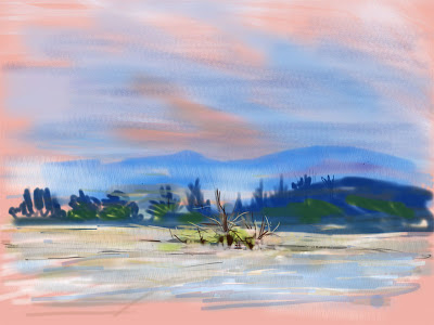
CONISTON WATER
John Ruskin was regarded by Kenneth Clark - former Director of the National Gallery - as one of the finest watercolour painters of the late 19th Century. A few days ago I came across a watercolour he painted of Brantwood his house on Coniston Water. This prompted me to try an iPad watercolour simulation.
I worked from a half-sheet watercolour which I painted some years ago. It's a view from the southern end of lake looking towards the ConistonFells which make a fine backdrop. I wanted to try for the soft colours which are produced by thin transparent washes. Even working as I did on four layers it proved difficult to capture the same effect.

Wednesday, January 30, 2013
HOBBY AT MINSMERE 2
One thing leads to another! I came across an article about David Hockney's iPad paintings in the Daily Telegraph app and discovered he works with the BRUSHES App. So I just had to give it a go.
I've used it to add some finishing touches to the Hobby painting in the last post. I downloaded BRUSHES 3. It's a simple bit of software – easy to use. The only drawback is that the basic version does not have a layers feature but you can purchase it as an add on.
Mr Hockney's iPad paintings made with BRUSHES are astonishing - an inspiration for anyone following the digital trail. For the moment though I think I'll stick with Sketchbook Pro which has more features and I'm getting used to it.


Saturday, January 26, 2013
Hobby in long grass, Minsmere
This is another iPad painting of the Hobby this time using Sketchbook Express. I'm trying out different iPad drawing apps to find one which suits me. Sketchbook Express has more painterly features than Sketchbook Ink so the bird's feathers and the long grass are treated in a more interesting way.


Thursday, January 24, 2013
iPad Sketch made with Autodesk Pro
I was disappointed with my first iPad sketch made with Sketchbook Ink. I was working from a line and wash sketch and I lost my way somewhat. I decided the next attempt would be more considered.
In this post I’m using Autodesk Pro – a more sophisticated app. It has a range of ‘brushes’ for producing different effects and it allows the use of layers which makes planning the work easier. I was working in front of the subject – a view across the Teme Valley – from the comfort of my living room.
I worked directly rather as an oil painter might when sketching en plein air. I flood filled the base layer then worked on three extra layers for different treatments of each stage. It was late afternoon with mist forming and with backlit clouds. Nice atmospheric qualities which were beyond my grasp working digitally.

Wednesday, January 23, 2013
Jackdaws on St, Catherine's Hill, Winchester.
This painting has taken a long time to reach completion. It was developed from preliminary studies that were the subject of previous blogs. I've used an acrylic primed board and and worked almost entirely in Golden Open Acrylics.


Tuesday, January 22, 2013
GOING DIGITAL

Monday, January 21, 2013
DABCHICKS ON THE RIVER ITCHEN
Christmas
New Year and birthday celebrations of of the way I'm looking forward
to completing paintings that have been put hold. Finishing is a slow
process with me I like to have paintings around in temporary frames
because – for me – that is the only sure way to pick up the
passages which are not working properly.
I've
used Golden Open Acrylics on primed MDF board for this painting of
Dabchicks Their slow drying properties are what appeals and the only
minor failing of the colours is that they are transparent are except
for the whites. But there are ways of working round this and glazing
by using a gell medium is easy.

Tuesday, December 18, 2012
CHRISTMAS GREETINGS

I went into the gallery and introduced myself as the artist who'd painted it. I briefly considered buying it back to resell it but the gallery assistant said she liked it because she knew the location. Her appreciation convinced me that the painting had found a good home so I said farewell to it for a second time!
I keep a digital photograph of all my work so here it is adapted as a Christmas Card.
HAPPY CHRISTMAS TO ALL VISITORS TO MY BLOG.
Saturday, November 17, 2012
GOING DIGITAL
I’ve dabbled with digital painting for a few years using
Painter. I began with Painter 9 and progressed through upgrades to the current
version Painter12. Professional illustrators
produce quite stunning images with Painter for a variety of applications.
Painter though has a quite complex interface and it takes some time to
appreciate and become familiar with many of its features.
My interest in it is as a means of exploring starting
points that could be developed further by using traditional painterly
techniques. An easy way to gain familiarity with the program is to explore the
‘auto painting’ feature. First copy a reference image into Painter and save it.
Next open a new layer and start the autopainting tool. This will start to build
up a clone of the reference image which in time would produce a clone of the
reference source. The auto feature can be paused at any stage as the clone
proceeds.I’ve used a scan of a late pastel by Degas as the source reference and paused the process as a starting point for further development with Painter’s ‘Pastel Brushes.’ I don’t intend to do more work on it. The objective was to become familiar with methods that can be used with Painter.


Friday, October 12, 2012
DUCKS HEADING FOR COVER ON THE RIVER ITCHEN.

For the past few weeks I’ve been preoccupied with drawing. Pencil studies of birds mostly and some sketches for future compositions. I find I have to draw up watercolour compositions – it is a medium which is not easy to change once you have started. Others though like to live dangerously by laying wet washes and extracting a ghost image from them – does Turner come to mind? Of course he had a good eye and could draw better than most of us.
Acrylic is a friendly medium which offers much more freedom. I began this on a hardboard panel prepared with an even base coat of dark brown/green. I composed ‘on the hoof’ putting down markers to place the ducks and making small adjustments to position as the work developed.
I’m using Liquitex Heavy Body Acrylics. They have a nice creamy consistency. I thin with a matt medium and a little water if I want to glaze over passages. When working quickly and freely the short drying time is an advantage. There is still much to do before I can say; “I’m happy with that” – my favourite quote from Alwyn Crawshaw.
Tuesday, August 07, 2012
LAS Members Summer Exhibition

Yellow-Eyed Penguins on Doubtful Sound, New Zealand.
Watercolour
Below
First Winter Blackback Gulls: Ostend. Watercolour
 These are two of five paintings I'm sending in to the Ludlow Art Society's Summer Exhibition.
Sat.18th to Sun. 26th August
at the Harley Centre,
Castle Square, Ludlow.
10.00am to 5.00pm daily.
Sunday, July 22, 2012
Church Stretton Festival 24th July - 3rd August
Three paintings I've sent to the Church Stretton Festival Art Exhibition
Opening times are 10.00am to 6.00pm Daily
 |
| Tortoishell Butterflies: Watercolour |
 |
| Nesting Kittiwakes: Acrylic |
 |
| Arnside Oystercatchers: Watercolour
|
Thursday, July 12, 2012
Exhibitions

The picture shows my submissions to the Ludlow Art Society Spring Exhibition which ran for one week opening on Easter Saturday. Now the local exhibition season has started in earnest.
After the recent event at Gt. Witley I'm sending to the Church Stretton Festival Exhibition which runs from 24th July to 3rd August. I'll be showing the Nesting Kittiwakes and the Avocets at This event which didn't sell at Easter.
I have five more new pictures ready for the LAS Summer Exhibition which will be held at The Harley Centre, Ludlow from August 18th to 26th.
I hope interested followers of my blog will drop by to either of the above exhibitions. If I happen to be around please introduce yourself I'd love to meet you.
Monday, July 09, 2012
LADIES IN WINTER DRESS: Bramblings.

This watercolour will be my 5th and final submission for the LAS Summer Exhibition which is held on the last two weeks in August.
Precise
minded ornithologists might give ‘Hen Bramblings in Winter Plumage’ as a
correct title of the picture. But I’m reminded that Charles Tunnicliffe painted
a colourful watercolour of fancy pigeons which he called ‘Angels and
Archangels.’ So I think ‘Ladies in Winter Dress’ catches the mood of the
painting and would be acceptable in an open exhibition.
I make increasing use of opaque bodycolour these days prefering mainly Titanium rather than the traditional Chinese (Zinc) White. I think it has to be used sensitively and not make the painting look as if it's been given a coat of distemper. There are several ways white has been applied to this painting - ranging from pure pigment for the white parts of the birds to general washes which can be worked on while still wet.
I make increasing use of opaque bodycolour these days prefering mainly Titanium rather than the traditional Chinese (Zinc) White. I think it has to be used sensitively and not make the painting look as if it's been given a coat of distemper. There are several ways white has been applied to this painting - ranging from pure pigment for the white parts of the birds to general washes which can be worked on while still wet.
Wednesday, June 27, 2012
YELLOW-EYED PENGUINS 0N DOUBTFUL SOUND

This is the final version of the ones shown in earlier posts. I'm making increasing use of acrylic in my watercolours - I like their strength and translucency. I've moved onto using Golden Open Acrylics almost exclusively they are never totally opaque. They do not flow freely like watercolours and I use them to soften and give 'body' to pale watercolour washes.
I suppose I prefer broadly stated paintings to precise detail - as Matisse said: 'exactitude is not truth.'
Monday, June 25, 2012
I’VE BEEN LOST WITHOUT MY COLOUR BRUSH
My favourite tool for sketching has been a Sepia Pentel
Colour Brush. It had water soluble pigment which could be softened and blended
with a Pentel wash brush. The range of Pentel Colour brushes seems to have been
discontinued so I was delighted to discover an improved replacement in an Art
Materials shop in Worcester last week.
This is the ZIG Art and Graphic Twin marketed by Kuratake.co.uk. Their full range can be found on their website. I've been trying one out on a sheet of A3 Canson.

This is the ZIG Art and Graphic Twin marketed by Kuratake.co.uk. Their full range can be found on their website. I've been trying one out on a sheet of A3 Canson.

The drawing shows a sketch of a jackdaw but the brush drawings were made with the brush end of the A&G Twin washed over with a colour brush loaded with plain water. I've doodled with the rubber marker tip which gives a fine even line. These can also be softened and washed over to good effect.
Sunday, June 24, 2012
GREAT WITLEY FESTIVAL OF ART 2012
On receiving
day – which was last Friday – your entries are checked and you are given labels
to attach to your paintings. Exhibitors are then free to place their paintings
on the chairs for display. One old hand brought his own radial easel to display
two large canvases but most of us are content with the upholstered dining
chairs with the paintings leaning against the backrest. All very informal and
seemingly chaotic – but it works. I
found myself a circle with 3 vacant chairs and placed my 4th entry
on the table above. The thought occurred that as more and more artists arrived
some rearrangement would be inevitable
My wife and
I went on to Worcester for some shopping – she was looking for a summer dress
and I was tempted by a showerproof jacket from the Rohan shop. Two hours later
on the way home I decided to drop by the exhibition to see how things were
going. Sure enough I found that my
pictures had been rearranged. One watercolour had been moved onto the table and
the space was on the chair was occupied by two small watercolours. I found that
the culprit was John Horton – a fellow TWASI member who paints beautifully
crafted watercolours of birds. So I was quite flattered to be showing alongside
a superior talent.
This year’s
exhibition I was delighted by a rare surprise. On Saturday evening I received a
telephone call from a man who told me he had purchased my watercolour of
Mevagissey at the exhibition. He told me how much he admired it and I thanked
him and said I hope the painting would give him lasting pleasure. Not often that situation occurs.
I will be setting off shortly to collect
unsold work at the close of the exhibition. I’m pleased at this year’s exhibition to have met some nice friendly people and made a sale
which will help pay for my Rohan Jacket.
Monday, June 11, 2012
ARCTIC TERNS OVER RAMSEY SOUND

This is another version of the painting I posted back in November
2011 – then it had a flight of oystercatchers over the Sound. I was never really happy with it so I have
reworked it again. I repainted the Sound to hide the Oystercatchers. I’ve reworked
the sky because the overcast evening sky didn’t work. Some tonal adjustments
were made to the cliffs on Ramsey Island.
To create a new wildlife interest to replace the
Oystercatchers I’ve attracted some Arctic Terns to fly in from the Farne Islands
to complete the picture. I’m reminded of how Alwyn Crawshaw always ended his TV
demonstrations with. “I’m happy with
that.” That sums up this post for me too.
Friday, June 08, 2012
PENGUIN FLOTILLA STAGE 1.

This is a half-sheet watercolour on Waterford NOT composed
from an arrangement of the Yellow Eyed Penguin sketches. After the initial
pencil drawing I dampened the paper and laid a light background wash.
As the work developed it became a study in the attitudes
adopted by the birds as indicators of their behaviour. One had a fish in it’s
beak another was preening and the others seemed to be alert. More detail work
needs to be done on the heads and I have to work out how to exploit changes in
tone on the water surface to unify the composition.
Thursday, May 10, 2012
YELLOW EYED PENGUINS

New Zealand’s Fiordland has some wonderful locations. I took
a boat excursion to Doubtful Sound. It was a day of heavy rain but that did not
seem to upset a small group of Yellow Eyed Penguins that I was able to
photograph with a 400mm lens from the boat.
I’m planning to make a series of studies from the photographs
to compose a painting. This is a page I did yesterday.
11th May
2012
 On this second page I thought for a moment I had a ready-made composition because of the way the sketches
were distributed quite accidentally.
On this second page I thought for a moment I had a ready-made composition because of the way the sketches
were distributed quite accidentally.
But then the attitudes of the birds were so
similar I began to think that they were taken from frames of the same bird.
Does that matter? I don’t think it does really the same bird preening strikes quite
a different attitude to when it is at rest. So I’ll look further at my reference
material to see what other poses I’ve collected.
Subscribe to:
Posts (Atom)