A recent visit to Tate St. Ives revealed yet another video installation – this time by Tacita Dean. There is a lovely view across the beach from the semi circular atrium all changing light and weather - then they steer you into a darkened room to look at flickering black and white film shot in Berlin accompanied by harsh distorted sound - hardly a thrill. So moved on quickly to look again at the St. Ives modernists. Except for dear old Alfred Wallis whose reputation owes all to the misconceptions of Christopher Wood and Ben Nicholson they grow with renewed acquaintance. For me the best of the non figurative bunch is Bryan Wynter. The paintings are simple linear compositions embellished with gestural and dragged brush marks – very subtle and he’s sensitive to what paint can do. The best of his work of the 1950’s was probably produced while in the trance-like state induced by using mescalin. The drug was used to suppress the conscious and let the subconscious mind take over.
After this disappointment it was good to see a big exhibition in Truro at the Cornwall Museum of work by Kurt Jackson. These days he supplements his watercolours with large works on canvas in water media. He works the paint by splashing and dribbling or pouring onto the canvas laid flat on the ground – and done on site. These are large works with their longest dimension at around 2 metres. Stretched up and displayed in a large gallery they look great there’s a subtle spaciousness to them suggesting glimpses into open sunlit woodland – lovely sensations.
I’ve seen two exhibitions where Kurt shows video of himself at work on these large paintings. Once on a Cornish cliff top with the canvas weighted down with rocks he was dancing around barefoot over the canvas making use of the occasional footprint or toe scratchmark. In the Cornish show he was more sensibly wearing wellington boots. There was no commentary just the natural sounds of the breeze but it was entertaining to see him at work and, unlike the St. Ives installations, the video had a point.

Wednesday, December 07, 2005
Making copies of other artists’ work is one of the best ways of gaining new insights into working methods. Whenever I come across a painting or drawing which grabs my attention I frequently try to make a copy of it. There is a reproduction of a Rossetti ink drawing in Bernard Dunstan’s annotated edition of Ruskin’s‘The Art of Drawing.’ that I once tried. There was some fine hatching that Rossetti had subtly drawn with diluted ink. Now how many of us would have thought of doing that – and yet it is an obvious way of introducing greater tonal subtlety into a line drawing.
Rembrandt made some lovely line and wash drawings of the farms, mills, and canals around Amsterdam which integrate lively line work with delicate washes. He used a quill pen and sepia ink and they prompted me to learn how to cut my own quills. I’ve also experimented with making my own ‘improvements’ – replacing the sepia washes with coloured ones, it adds to the fun!
Rembrandt made some lovely line and wash drawings of the farms, mills, and canals around Amsterdam which integrate lively line work with delicate washes. He used a quill pen and sepia ink and they prompted me to learn how to cut my own quills. I’ve also experimented with making my own ‘improvements’ – replacing the sepia washes with coloured ones, it adds to the fun!
Monday, December 05, 2005

This detail of Thomas Richardson's watercolour was set as a copy exercise to my workshop participants. I decided to make a copy myself. The buff paper ground of the original was simulated with a raw sienna wash laid on a 300gsm Bockingford sheet from a sketchbook. Next the underdrawing was made and the picture was built up with controlled washes and finally the touches of white bodycolour were added with White acrylic ink. I've floated a cropped image below to show the linework more clearly - some adjustment was needed to the roof of the left-hand building. No prizes for working out how it was done!
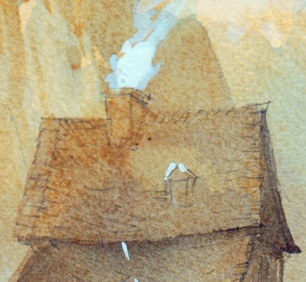
Richardson created this painting by the simplest and most direct means which left me full of admiration. The purplish blue wash laid on the distant hillside was carried down onto the buildings to bring them forward. Essentially the same wash strengthened was used for the shadows. All that was required then were the touches of white and a few added details. None of this would have been discovered by just looking at the painting.
Making copies leads to surprising insights. The aim is not to recreate a mark by mark imitation of the original. There is far more detail in Richardson's linework than in my copy. A careful study of his underdrawing would be worthwhile as a separate exercise. The hand guiding the brush writes its own calligraphy so why not improvise your own style on your copy once the general principles have been grasped.
Friday, December 02, 2005
I've recently completed a series of watercolour workshops for a group of complete beginners - it was something of a challenge. Routine exercises like laying washes, experimenting with wet in wet are not particularly exciting after you've made a few attempts. Sketching outside was a rather daunting prospect for most as it showed up inadequate drawing skills. Students managed a simple still life more convincingly but some had formed clear ideas of what they wanted to achieve. "I want to paint landscapes like Alwym Crawshaw." said one. Others were stimulated by the
'Watercolur Challenge' TV broadcasts.
Then it occurred that copying might be the best way forward - but from what sources? certainly not from photographs. Studying good reproductions of works of art is much better. Making copies has a long tradition as part of a painter's apprenticeship. Dr Monroe invited Joseph Turner and Tom Girtin as two promising RA students into his home to copy the engravings in his collection which he bought for 2s.6d and a bowl of oysters. Girtin often doing the linework and Turner adding watercolour washes - look where this training led!
So good examples were needed - what better artist to begin with than Rembrandt. His pen and wash drawings of the mills and farms in the countryside around Amsterdam display a mastery of line and tone which is an inspiration. Unless a reed or quill pen is used it is hopeless to try and achieve the variey of line which these tools can achieve in the hand of a master like Rembrandt - but for the beginner it is worth transposing the linework by using a modern waterproof ball or fibretip pen. Then the applied washes need not be monochrome - the sketches can be teated imaginatively by applying colour.
I chose two watercolours from the Royal Watercolour Society's Diploma Collection as models. These can be found in Stephen Spender's book 'The Glory of Watercolour.' The first choice was John Varley's delightful small watercolour 'Cader Idris.' It's merit lies in the beautifully controlled washes he has laid down to portray the receding planes of the mountains and lake. He uses a simple colour scheme mainly of blues and greens. The painting is an example of traditional transparent watercolour of the highest quality.
The second example shows a different approach to watercolour. It is 'Saÿn on the Pretsoh Bach, Rhine' by Thomas Miles Richardson. It was painted on a buff ground, the line drawing plays an integral part in the finished picture showing through the overlaid washes to record the details of the buildings. Final touches were added with white bodycolour to render the half timber buildings and a smoke rising from a chimney.
So two different ways of using watercolour which are instructive and worthy of careful study. I asked the students to make their own studies of the examples - I'm keen to see what they made of them.
Subscribe to:
Posts (Atom)