Friday, April 28, 2006

Guernsey revisited

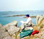
Tomorrow my wife and I are off on a visit to Guernsey. It is ten years since our last visit and I’m quite excited at the prospect. On previous visits I was a madly compulsive sketcher – here I’m sketching the tiny island of Jethou from a rocky headland on Herm. These little islands are lovely unspoilt places and painterly subjects abound.

I’ve been looking at the sketches I made on these early visits. Some are simple pencil line drawings in others I’ve used charcoal for a broader tonal treatment. Then I came across a series of line and wash drawings done with a quill and acrylic ink. I used to carry around some of those plastic cases that came with Fuji 35mm films – ideal for holding small samples of ink in different dilutions. For this visit my sketching kit will be pared down to a few Carb-Othello Pencils and a Pentel colour brush with a water reservoir. Oh and a digital camera of course.

Sadly these sketches of 10 years ago do not generate the excitement they did at the time. Partly my artistic objectives have changed and I tend to delve deeper into my memory than I once did indicating that perhaps I’m becoming more of a dreamer. I quite hope that this next visit will regenerate the visual excitement I once experienced on Guernsey – we shall see.

Thursday, April 27, 2006

Was his stilted eloquence the same before his hair turned grey?

Last week I watched the last programme of ‘Brian Sewell’s Grand Tour’ on Channel 5 and afterwards searched the web for his website – he has three. The tasteless content on two of them was a surprise and I wondered if it was included with his approval or if he was just being sent up. One Shockwave Flash clip shows a young dark-haired Sewell giving a commentary from the ornamental garden of a country house. Was it him or was it a look-alike - the poor quality of the video made it impossible to be sure.

Another page shows the central panel from the Sistine ceiling with him superimposed on the figure of God. The digital make over is a mirror image of the original so the ‘omnipotent Sewell’ becomes left handed in the web version. The left hand is infusing life into a Brian Sewell t-shirt design that serendipitously makes use of the BSI kite logo.

This association of one of the great images of Renaissance art with such tasteless treatment seems out of character. He is after all a writer who has been fiercely critical of similar tackiness produced in the name of art.

The broadcast ended with the old sage sitting in the Danielli enjoying a cup of hot chocolate - this was something he’d first done in his impecunious student years. He was visibly moved by the memory and by the thought that he may not enjoy many more visits to Venice. I’ll stay away from the dreadful web sites that display his name and carry a memory of him enjoying his hot chocolate in the civilised surroundings of the Danieli – that’s where he belongs.

Saturday, April 15, 2006

A Genius who was creative to the end.

Robert Hughes (remember ‘the Shock of the New’?) is the best art critic around and he’s recently written a perceptive review of an exhibition of Goya’s late works. The exhibition is devoted to work done when he was nearly 82 and living in exile in Bordeaux. There is a moving oil, ‘Self Portrait with Dr Arrieta.’ How did he paint that? He is shown ill and ailing and the doctor is encouraging him to drink a potion. A painting carefully composed from memory perhaps.

The most instructive though are the little miniatures he did in watercolour on ivory. Mostly of subjects he observed on the streets of Bordeaux of people odd and tormented. These are not the tight detailed miniatures we’ve grown accustomed to from The Hilliard Society but expressive ones made from blots, dabs and accidental runs of black dilute watercolour. As Hughes observes ‘… they contain some of the most beautiful feats of controlled chance that would be seen in art until the 20th Century.’

‘Man looking for fleas in his shirt.’ is a study of a short-sighted old man trying to remove tne tiny pests. Goya would have been sympathetic to the man’s predicament because he was complaining to friends about his own failing eyesight. The miniature shows that powerful and moving images are made by acute observation and empathy with the subject rather than refined and perfected technique.

You can read Robert Hughes’ review at: Goya's Last Works
There is also a link to the exhibition where you can see the pictures.

Friday, April 07, 2006

Perhaps ’Lonely Akaroa’ needs an emphatic complement

‘Lonely Akaroa’ is an acrylic painting of a quiet harbour on the Bank’s Peninsula in New Zealand.

I’ve never been entirely satisfied with it though it’s going in a show over Easter. Perhaps I’d missed the trick of using a complementary harmony to enliven the painting.

The painting's dominant colour scheme is green so a touch of red - green’s complement - might help. No need to add more elements to clutter the composition – red walls or red roofs on the sheds on the left might work.

Of course in painting things are never simple. A splash straight out of the Cadmium Red tube will not do. Green’s incline towards either yellow or blue. The complement of a yellow/green needs to be a red inclined to mauve and a blue/green towards orange.

Time to try a digital enhancement on the PC perhaps. Placing the original with the ‘enhanced’ image allows comparison but I’m still not sure which I prefer.