Watercolours Fast and Loose – but are they any good?
I regularly post to artists’ forums and become a bit dismayed by the almost universal preoccupation with ‘looseness’ of handling in watercolour. Look around though and you discover watercolour is a medium which can be handled in many different ways.
The argument about loose and free as against tight or controlled handling of the medium has raged for at least a hundred years. Ruskin taught students to avoid the easy freedom achieved with the uncontrolled sweep of the brush or pencil. He wrote: “masterliness is in never letting the hand be free, but keeping it under control at every part of the line.” The qualities he admired are found in the beautiful drawings and watercolours of artists like Rossetti.
With watercolours of any quality looseness is an illusion. In the apparently freely handled watercolours of Edward Wesson or John Yardley what we’re really observing are carefully considered confident brushstrokes precisely placed to create maximum effect. The kind of mastery they each achieved arises from close observation and through the discipline of drawing. There’s no quick half-hour fix as offered by some of the popular watercolour manuals.

Thursday, January 11, 2007
Painter IX again
At last things are coming together. I’ve found a simple way of working with Painter IX that I can get on with. This involves working with layers and devising a plan for what each will contain. The first layer is always the canvas and for the moment for me that is always ‘sandy pastel paper.’
The next layer contains the drawing. Until today this has been a scanned drawing from my sketchbook. The drawback with this is that the sketch has to be cropped and resized in Photopaint first to fit the canvas. Today though I made the drawing by working directly with the stylus on an Intuos 3 tablet. This is how I would normally work on a real canvas, corrections can be made just as easily but the big advantage is that the sketch layer is preserved in the saved file and can always be referred to. In a real painting it is lost.
A new layer is opened for the lay-in where the main features are blocked in. This is followed by a defining layer where the drawing is firmed up and tonal adjustments are made. Finally come a detail layer for the final touches.
For the moment I’m following this simple strategy with a range of Pastels Brush tools. These tools respond to stylus pressure which comes easily with the way I draw. There is some stunning digital art produced by artists with Painter IX who manipulate photographs and graphic art work using cloning techniques. The range and scope of digital art is amazing.
At last things are coming together. I’ve found a simple way of working with Painter IX that I can get on with. This involves working with layers and devising a plan for what each will contain. The first layer is always the canvas and for the moment for me that is always ‘sandy pastel paper.’
The next layer contains the drawing. Until today this has been a scanned drawing from my sketchbook. The drawback with this is that the sketch has to be cropped and resized in Photopaint first to fit the canvas. Today though I made the drawing by working directly with the stylus on an Intuos 3 tablet. This is how I would normally work on a real canvas, corrections can be made just as easily but the big advantage is that the sketch layer is preserved in the saved file and can always be referred to. In a real painting it is lost.
A new layer is opened for the lay-in where the main features are blocked in. This is followed by a defining layer where the drawing is firmed up and tonal adjustments are made. Finally come a detail layer for the final touches.
For the moment I’m following this simple strategy with a range of Pastels Brush tools. These tools respond to stylus pressure which comes easily with the way I draw. There is some stunning digital art produced by artists with Painter IX who manipulate photographs and graphic art work using cloning techniques. The range and scope of digital art is amazing.
Tuesday, January 09, 2007
Going Digital
 I'm resolved to gain some competence with Painter IX this year. I’ve tinkered about with it and found it a difficult piece of software because of its complexity. I suppose the danger is that you read abouits different features and try out everything at once.
So it’s back to basics. The pastel, conte and grainy pencil brushes seem to suit my style best and they’re the tools I’m most at ease with. So I’ve decided to confine myself to using those.
Then there’s the problem of getting started. I’ve not been too successful with using cloned photographs so at the moment I’m using scans of sketches as a starting point. ‘Keep things simple’ is my motto as far as digital painting goes. Here’s a sample:-
 I'm resolved to gain some competence with Painter IX this year. I’ve tinkered about with it and found it a difficult piece of software because of its complexity. I suppose the danger is that you read abouits different features and try out everything at once.
So it’s back to basics. The pastel, conte and grainy pencil brushes seem to suit my style best and they’re the tools I’m most at ease with. So I’ve decided to confine myself to using those.
Then there’s the problem of getting started. I’ve not been too successful with using cloned photographs so at the moment I’m using scans of sketches as a starting point. ‘Keep things simple’ is my motto as far as digital painting goes. Here’s a sample:-
Saturday, January 06, 2007
Thank You Prof. Gombrich
‘There really is no such thing as Art. There are only artists.’ These are a surprising couple of opening sentences for a book about the ‘The Story of Art.’ Back in December I read reviews of Ernst Gombrich’s best seller which Phaidon have reprinted as a pocket edition. The reviews prompted me to take a fresh look at my own copy – a weighty paperback which is a reprint of the 16th edition of 1995. Like many other students my first acquaintance with the book was via a college library copy and I immediately took to the direct plain language of his writing.
I’ve always discovered new insights from Gombrich. Even after having ‘The Story of Art’ on my bookshelf for around ten years I was taken by his comments on Raphael’s sketch books in the introduction. The sketchbook drawings were Raphael’s studies for his ‘Virgin in the Meadows’ of 1505 now in Vienna. It’s regarded as the most charming of Raphael’s ‘Madonna’ paintings and the pages of pen and ink sketches reveal the trouble he took to get the group of three figures into a harmonious relationship.
Few of us take similar pains or are inclined to give much thought to composition today. Painting manuals gloss over the problems in demonstrations – giving descriptions of each stage but little about the thought processes needed to compose the painting in the first place. When sketching ‘en plein air’ all too frequently I take the subject as presented and often have to make major changes in the studio. The Professor's words and Raphael's sketches prompt me change my ways!
‘There really is no such thing as Art. There are only artists.’ These are a surprising couple of opening sentences for a book about the ‘The Story of Art.’ Back in December I read reviews of Ernst Gombrich’s best seller which Phaidon have reprinted as a pocket edition. The reviews prompted me to take a fresh look at my own copy – a weighty paperback which is a reprint of the 16th edition of 1995. Like many other students my first acquaintance with the book was via a college library copy and I immediately took to the direct plain language of his writing.
I’ve always discovered new insights from Gombrich. Even after having ‘The Story of Art’ on my bookshelf for around ten years I was taken by his comments on Raphael’s sketch books in the introduction. The sketchbook drawings were Raphael’s studies for his ‘Virgin in the Meadows’ of 1505 now in Vienna. It’s regarded as the most charming of Raphael’s ‘Madonna’ paintings and the pages of pen and ink sketches reveal the trouble he took to get the group of three figures into a harmonious relationship.
Few of us take similar pains or are inclined to give much thought to composition today. Painting manuals gloss over the problems in demonstrations – giving descriptions of each stage but little about the thought processes needed to compose the painting in the first place. When sketching ‘en plein air’ all too frequently I take the subject as presented and often have to make major changes in the studio. The Professor's words and Raphael's sketches prompt me change my ways!
Thursday, November 30, 2006
The Way I Was: doing a Wesson
When starting out in watercolour it’s a good idea to focus on a painter whose work appeals. Once, for me and others in my painting circle, it was Edward Wesson. His loose understated style in the tradition of Sargent, Whistler, and Edward Seago evolved as a means of quick direct observation done en plein air. It seemed the right way to paint watercolour.
I’ve never regretted the time when I hauled an easel, a rucksack full of painting gear, and a drawing board out of the car boot and set up in the corner of some field – but it is a bind. Often when walking our local footpaths a compelling subject would present itself – no time to set up all the paraphernalia even if I’d had it with me. I soon decided that travelling light with just a sketchbook was better.
Most of the interest in painting landscape comes from recording effects of light and these are often fleeting. Mood and the sense of place can be captured quickly and directly in a bold medium like charcoal or graphite pencil. Colour is not critical, it is an element that can be worked on imaginatively in the studio, but tonal values are much more difficult to recreate convincingly from memory.
Looking through some old sketchbooks at my charcoal drawings they seemed to lead naturally to the ‘Wesson treatment.’ He’s a hard act to follow and so many have trodden the road where he led. There’s a fascination and charm about his way of working though – so maybe I’ll do one more ‘Wesson’ for old time’s sake.
When starting out in watercolour it’s a good idea to focus on a painter whose work appeals. Once, for me and others in my painting circle, it was Edward Wesson. His loose understated style in the tradition of Sargent, Whistler, and Edward Seago evolved as a means of quick direct observation done en plein air. It seemed the right way to paint watercolour.
I’ve never regretted the time when I hauled an easel, a rucksack full of painting gear, and a drawing board out of the car boot and set up in the corner of some field – but it is a bind. Often when walking our local footpaths a compelling subject would present itself – no time to set up all the paraphernalia even if I’d had it with me. I soon decided that travelling light with just a sketchbook was better.
Most of the interest in painting landscape comes from recording effects of light and these are often fleeting. Mood and the sense of place can be captured quickly and directly in a bold medium like charcoal or graphite pencil. Colour is not critical, it is an element that can be worked on imaginatively in the studio, but tonal values are much more difficult to recreate convincingly from memory.
Looking through some old sketchbooks at my charcoal drawings they seemed to lead naturally to the ‘Wesson treatment.’ He’s a hard act to follow and so many have trodden the road where he led. There’s a fascination and charm about his way of working though – so maybe I’ll do one more ‘Wesson’ for old time’s sake.
Thursday, November 23, 2006
A Ruskin Masterclass on colour
I’ve just picked up my copy of Ruskin’s ‘Elements of Drawing’ again, it’s a timeless work because the advice he gives is equally relevant and applicable today. He reduces drawing to its basic elements of making marks and developing an eye for shape and form before going on to deal with more complex concepts like colour and composition.
Re-reading the ‘Elements’ has set me thinking about ways of colour mixing in watercolour and the merits of each. Ruskin omits the obvious method of premixing in the palette which often produces a sullied colour less pure than the constituents. He first discusses mixing wet in wet on the paper, a familiar technique which is good fun but is always unpredictable. Next comes laying one pure colour over an earlier wash when dry – it’s interesting to note what Ruskin has to say about this:-
‘If you lay a solid touch of vermilion and after it is quite dry, strike a little very wet carmine quickly over it, you will obtain a much more brilliant red than by mixing the carmine and vermilion. Similarly if you lay a dark colour first and strike a little blue or white body-colour over it you will get a more beautiful grey than by mixing the colour with blue or white.’
His reference to the use of white might surprise those who regard watercolour as a pure transparent medium. For Ruskin this attitude is too restrictive and he recommends mixing Chinese white with colours as a preferable way to tint them rather than dilute them with water.
‘The mixing of white with the pigments, so as to render them opaque, constitutes body-colour drawing, and you will, perhaps, have it often said to you that this body-colour is ‘illegitimate.’ It is just as legitimate as oil-painting, being so far as handling is concerned, the same process, only without its uncleanliness,……for oil will not dry quickly, nor carry safely, nor give the same effects of atmosphere without tenfold labour.’
The last method he describes is ‘Breaking one colour in small points through or over another.’ This is not a method that seems to be endorsed very much but Ruskin rates it highly.
‘This is the most important of all processes In good modern oil and watercolour painting,…….. To do it well is very laborious, and requires such skill and delicacy of hand as can be only acquired by unceasing practice.’
The method involves the interlacing of one pure colour over or alongside another, or applying small touches separately sometimes leaving space between them allowing the untouched paper to show. What he seems to be advocating is a technique that relies on an optical mix of pure colours that anticipates Impressionism.
Note that Ruskin is inclusive in his comment of both oil and watercolour. The basic problem of rendering colour has to be faced in all media.
After Turner, Ruskin rated Rossetti and Holman Hunt the best of the 19th Century watercolourists. It’s worth studying the work of each of them particularly in respect of the way they employed ‘broken’ colour.
I’ve just picked up my copy of Ruskin’s ‘Elements of Drawing’ again, it’s a timeless work because the advice he gives is equally relevant and applicable today. He reduces drawing to its basic elements of making marks and developing an eye for shape and form before going on to deal with more complex concepts like colour and composition.
Re-reading the ‘Elements’ has set me thinking about ways of colour mixing in watercolour and the merits of each. Ruskin omits the obvious method of premixing in the palette which often produces a sullied colour less pure than the constituents. He first discusses mixing wet in wet on the paper, a familiar technique which is good fun but is always unpredictable. Next comes laying one pure colour over an earlier wash when dry – it’s interesting to note what Ruskin has to say about this:-
‘If you lay a solid touch of vermilion and after it is quite dry, strike a little very wet carmine quickly over it, you will obtain a much more brilliant red than by mixing the carmine and vermilion. Similarly if you lay a dark colour first and strike a little blue or white body-colour over it you will get a more beautiful grey than by mixing the colour with blue or white.’
His reference to the use of white might surprise those who regard watercolour as a pure transparent medium. For Ruskin this attitude is too restrictive and he recommends mixing Chinese white with colours as a preferable way to tint them rather than dilute them with water.
‘The mixing of white with the pigments, so as to render them opaque, constitutes body-colour drawing, and you will, perhaps, have it often said to you that this body-colour is ‘illegitimate.’ It is just as legitimate as oil-painting, being so far as handling is concerned, the same process, only without its uncleanliness,……for oil will not dry quickly, nor carry safely, nor give the same effects of atmosphere without tenfold labour.’
The last method he describes is ‘Breaking one colour in small points through or over another.’ This is not a method that seems to be endorsed very much but Ruskin rates it highly.
‘This is the most important of all processes In good modern oil and watercolour painting,…….. To do it well is very laborious, and requires such skill and delicacy of hand as can be only acquired by unceasing practice.’
The method involves the interlacing of one pure colour over or alongside another, or applying small touches separately sometimes leaving space between them allowing the untouched paper to show. What he seems to be advocating is a technique that relies on an optical mix of pure colours that anticipates Impressionism.
Note that Ruskin is inclusive in his comment of both oil and watercolour. The basic problem of rendering colour has to be faced in all media.
After Turner, Ruskin rated Rossetti and Holman Hunt the best of the 19th Century watercolourists. It’s worth studying the work of each of them particularly in respect of the way they employed ‘broken’ colour.
Tuesday, October 24, 2006
Fanciful Gothic Beasts
This pastel was composed around 1992 from sketches of the misericords in the choir stalls of St. Laurence, Ludlow. They are quaint carvings of biblical stories as interpreted by the medieval woodcarvers. Sketching them involved sitting on the floor to get a better view which meant I was out of sight to anyone standing at the chancel screen. While totally engrossed I was interrupted by the verger leaning over the bookrest to see what was going on. Apparently thefts of choir stall seats were not unknown.
Dark fantasy is never far away in the art of Northern Europe – you find it in the paintings of Breughel and Heironymous Bosch. But I found these fishes and beasts rather quaint, all that was lacking was bright cheerful colour. Use the thumbnail to see a larger image.
Fanciful Gothic Beasts
This pastel was composed around 1992 from sketches of the misericords in the choir stalls of St. Laurence, Ludlow. They are quaint carvings of biblical stories as interpreted by the medieval woodcarvers. Sketching them involved sitting on the floor to get a better view which meant I was out of sight to anyone standing at the chancel screen. While totally engrossed I was interrupted by the verger leaning over the bookrest to see what was going on. Apparently thefts of choir stall seats were not unknown.
Dark fantasy is never far away in the art of Northern Europe – you find it in the paintings of Breughel and Heironymous Bosch. But I found these fishes and beasts rather quaint, all that was lacking was bright cheerful colour. Use the thumbnail to see a larger image.
Fanciful Gothic Beasts

Saturday, October 21, 2006
‘A brief encounter after more than 15 years.’
Yesterday I went into our local print gallery just to browse. They have boxes of cheap mounted prints that are on offer for a few pounds. On the walls they display paintings of varying age and quality and I was stunned to find that they had a framed pastel of mine. I told the assistant that I was the artist and asked how they had acquired it – she had no idea.
I remember that it was a painting of a hill farm – Alltforgan – at the head of Lake Vyrnwy. It was painted at least 15 years ago and I must have sold it at one of the Ludlow Art Society exhibitions. In those days I was not very businesslike and did not keep careful records or take photographs of my work so I have no idea who the original purchaser was.
By co-incidence another painting by a former Vice-President turned up recently in the same shop. It was bought by his son who showed it to me. Fortunately I was able to tell him who had bought it and the gallery must have acquired it at a sale of the purchaser’s effects when she died. I guess the gallery acquired mine in a similar way. It was good to see it again and I was tempted to buy it back because they’d valued it at far less than the price I ask now. I resisted but I’ll probably go back again to see if they’ve sold it – I hope it finds a good home

Yesterday I went into our local print gallery just to browse. They have boxes of cheap mounted prints that are on offer for a few pounds. On the walls they display paintings of varying age and quality and I was stunned to find that they had a framed pastel of mine. I told the assistant that I was the artist and asked how they had acquired it – she had no idea.
I remember that it was a painting of a hill farm – Alltforgan – at the head of Lake Vyrnwy. It was painted at least 15 years ago and I must have sold it at one of the Ludlow Art Society exhibitions. In those days I was not very businesslike and did not keep careful records or take photographs of my work so I have no idea who the original purchaser was.
By co-incidence another painting by a former Vice-President turned up recently in the same shop. It was bought by his son who showed it to me. Fortunately I was able to tell him who had bought it and the gallery must have acquired it at a sale of the purchaser’s effects when she died. I guess the gallery acquired mine in a similar way. It was good to see it again and I was tempted to buy it back because they’d valued it at far less than the price I ask now. I resisted but I’ll probably go back again to see if they’ve sold it – I hope it finds a good home
Friday, October 13, 2006
“It’s Like Meeting Old Friends.”
I’m married to a woman who is passionate about tidiness so when faced with the threat of having my normally chaotic studio tidied up I knew I had to act immediately! The trouble with being ‘tidy’ is that you can never find things; but never mind the enforced reorganisation of my studio storage did me a good turn – I had to sort through my old painting and drawings.
This was a task that took me two days because renewing acquaintance with the paintings was like meeting old friends, you can’t just give them a cursory glance and pass on. Memories come back and the realisation dawns that things don’t look as they once did so many of the subjects I would now treat differently. There are several paintings though that could be improved by the application of a stronger wash or by cropping to a smaller format. That’s a task that will have to be fitted in between developing new work during the coming months.
I’m married to a woman who is passionate about tidiness so when faced with the threat of having my normally chaotic studio tidied up I knew I had to act immediately! The trouble with being ‘tidy’ is that you can never find things; but never mind the enforced reorganisation of my studio storage did me a good turn – I had to sort through my old painting and drawings.
This was a task that took me two days because renewing acquaintance with the paintings was like meeting old friends, you can’t just give them a cursory glance and pass on. Memories come back and the realisation dawns that things don’t look as they once did so many of the subjects I would now treat differently. There are several paintings though that could be improved by the application of a stronger wash or by cropping to a smaller format. That’s a task that will have to be fitted in between developing new work during the coming months.
Sunday, October 01, 2006
Scilly tips for Sketchers
Sketching outdoors in front of the subject beats having to work solely from photographs. When working out of doors these days I do tonal studies and leave colour work for the studio. It is difficult to assess tone values when you are also considering colour. The advantage of making tonal studies is that the means of doing them is so simple. The 'Tonal Studies' link navigates to a web page that discusses the topic further - do have a look!
Tonal Studies
Sketching outdoors in front of the subject beats having to work solely from photographs. When working out of doors these days I do tonal studies and leave colour work for the studio. It is difficult to assess tone values when you are also considering colour. The advantage of making tonal studies is that the means of doing them is so simple. The 'Tonal Studies' link navigates to a web page that discusses the topic further - do have a look!
Tonal Studies
Saturday, September 23, 2006
More Candidates for reworking

Although these two pastels started as ‘plein air’ sketches one ended up as a finished pastel. It was a mistake though to work over the original sketch – the first fresh vision has gone. At the time I was rushing to find work for an exhibition – as it turned out I need not have got in a froth because I’m still enjoying 'Pennine Summer at home!
At the end of day crit. Moira didn’t seem very taken with ‘Pennine Summer’ and preferred ‘Jack Beck 2’. I think perhaps she thought it caught the brooding mood of the Pennine moors better and the drawing was more direct.
With Moira’s comments in mind I decided to use ‘Jack Beck 2’ as the foundation for a new painting in water media – leaving the options open for a pure watercolour treatment, or acrylic, or a combination of the two. There were features in ‘Pennine Summer’ that I was reluctant to lose. I decided to retain the barn and some of the trees in any future reworking.

Although these two pastels started as ‘plein air’ sketches one ended up as a finished pastel. It was a mistake though to work over the original sketch – the first fresh vision has gone. At the time I was rushing to find work for an exhibition – as it turned out I need not have got in a froth because I’m still enjoying 'Pennine Summer at home!
At the end of day crit. Moira didn’t seem very taken with ‘Pennine Summer’ and preferred ‘Jack Beck 2’. I think perhaps she thought it caught the brooding mood of the Pennine moors better and the drawing was more direct.
With Moira’s comments in mind I decided to use ‘Jack Beck 2’ as the foundation for a new painting in water media – leaving the options open for a pure watercolour treatment, or acrylic, or a combination of the two. There were features in ‘Pennine Summer’ that I was reluctant to lose. I decided to retain the barn and some of the trees in any future reworking.
Monday, September 18, 2006
Second Thoughts - reworking in a different medium.
I’m currently taking a look at some paintings I did a few years ago with the idea of reworking them. It’s not that that I’m dissatisfied with my past work or that they are particularly bad paintings. I want to explore the idea that something new could be said by reworking a subject in a different medium. A few years ago I did relatively few watercolours and worked mostly in pastel so the choice was virtually a faite accompli – what could be discovered about a place by transforming a pastel study into a watercolour.
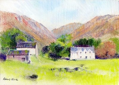
The first work I chose for reworking was a little pastel of a hill farm above the Mawddach estuary in Wales. It’s a small work done in 2002 measuring 15cm x 21cm. on a buff Ingres paper. I found pastel a difficult medium to use on such a small scale – though Diana Armfield has produced some little gems which are no bigger! She has the talent to focus on the most significant forms and colours leaving areas of the paper untouched. On a small intimate scale this approach works better than the full painterly treatment that I used.

I’m currently taking a look at some paintings I did a few years ago with the idea of reworking them. It’s not that that I’m dissatisfied with my past work or that they are particularly bad paintings. I want to explore the idea that something new could be said by reworking a subject in a different medium. A few years ago I did relatively few watercolours and worked mostly in pastel so the choice was virtually a faite accompli – what could be discovered about a place by transforming a pastel study into a watercolour.
The first work I chose for reworking was a little pastel of a hill farm above the Mawddach estuary in Wales. It’s a small work done in 2002 measuring 15cm x 21cm. on a buff Ingres paper. I found pastel a difficult medium to use on such a small scale – though Diana Armfield has produced some little gems which are no bigger! She has the talent to focus on the most significant forms and colours leaving areas of the paper untouched. On a small intimate scale this approach works better than the full painterly treatment that I used.
Saturday, September 09, 2006
“This guy can draw anything.”
In Ludlow we were entertained by John Palmer who gave a presentation to Art Society members at our September social meeting. John sprouts up almost like a hardy annual in Ludlow, it was his third visit and judging by the large attendance he came by popular request.
John is based in Bristol and has worked all his life as a graphic designer producing advertising art work and magazine illustrations. He always brings a huge portfolio of his graphic work in watercolour, gouache and acrylic and is happy to have this passed around. The range of style and subject matter is staggering. “This guy can draw anything.” said one of our young members as she looked at the next piece of art work that came to hand.
For his demonstrations John brings three or four large watercolours at various stages of finish and works on each in turn – sometimes adding more drawing as well as new washes. It’s an interesting way to work; it emphasises that sound draughtsmanship lies at the heart of good watercolour and forms an integral part of the finished work.
I first got to know John’s work from a book he wrote back in 1993. The title was ‘Drawing and Sketching’ and was published as a title in the Ron Ranson’s Painting School series. The series has long since been out of print and I picked up my copy at a bargain price in a publishers remaindered bookshop. I always intend to get him to autograph my copy perhaps on a future visit I will remember
to ask him.
Incidentally I was surprised to find copies of the book are still available via Amazon.
In Ludlow we were entertained by John Palmer who gave a presentation to Art Society members at our September social meeting. John sprouts up almost like a hardy annual in Ludlow, it was his third visit and judging by the large attendance he came by popular request.
John is based in Bristol and has worked all his life as a graphic designer producing advertising art work and magazine illustrations. He always brings a huge portfolio of his graphic work in watercolour, gouache and acrylic and is happy to have this passed around. The range of style and subject matter is staggering. “This guy can draw anything.” said one of our young members as she looked at the next piece of art work that came to hand.
For his demonstrations John brings three or four large watercolours at various stages of finish and works on each in turn – sometimes adding more drawing as well as new washes. It’s an interesting way to work; it emphasises that sound draughtsmanship lies at the heart of good watercolour and forms an integral part of the finished work.
I first got to know John’s work from a book he wrote back in 1993. The title was ‘Drawing and Sketching’ and was published as a title in the Ron Ranson’s Painting School series. The series has long since been out of print and I picked up my copy at a bargain price in a publishers remaindered bookshop. I always intend to get him to autograph my copy perhaps on a future visit I will remember
to ask him.
Incidentally I was surprised to find copies of the book are still available via Amazon.
Saturday, September 02, 2006
Drenched but Ecstatic
Last week I paid a visit to ‘The Stiperstones’ – these are striking outcrops of rocks on a hilltop in Shropshire. The outcrops consist of Precambrian quartzite – old, metamorphosed and hard they have been eroded into fantastic shapes which have given rise to legend hence the largest and most northerly outcrop has been named ‘The Devil’s Chair.’
I wasn’t fearful of the devil on this occasion I was more apprehensive about the shower clouds blowing in from the west. I had my sketching gear in the rucksack and wondered if I would get a chance to make use of it. Apart from the threat of rain it was a wonderful day of changing light which threw shadows across the rocks, the heather was in bloom reflecting bright purple when in sunlight. All these transient effects had to be captured on camera in the uncertain weather conditions.
The first shower arrived as I approached the summit outcrop which provided some shelter but not sufficient to make a drawing. At the next bright interval I moved out to look around for a sketching viewpoint and was made ecstatic by the effect of sunlight on wet rocks – just got to grab that – another job for the digital camera.
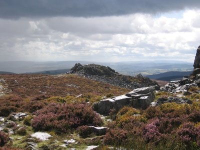
There was just time to settle on a viewpoint and get the sketchbook out when the next shower arrived. Caught on an open hillside and drenched in the first minute of driving rain the only option was to retreat back to the car. Not a wasted day though my trusty Canon digital camera had captured several images that could be used as reference material for paintings. Here’s my favourite:-

Last week I paid a visit to ‘The Stiperstones’ – these are striking outcrops of rocks on a hilltop in Shropshire. The outcrops consist of Precambrian quartzite – old, metamorphosed and hard they have been eroded into fantastic shapes which have given rise to legend hence the largest and most northerly outcrop has been named ‘The Devil’s Chair.’
I wasn’t fearful of the devil on this occasion I was more apprehensive about the shower clouds blowing in from the west. I had my sketching gear in the rucksack and wondered if I would get a chance to make use of it. Apart from the threat of rain it was a wonderful day of changing light which threw shadows across the rocks, the heather was in bloom reflecting bright purple when in sunlight. All these transient effects had to be captured on camera in the uncertain weather conditions.
The first shower arrived as I approached the summit outcrop which provided some shelter but not sufficient to make a drawing. At the next bright interval I moved out to look around for a sketching viewpoint and was made ecstatic by the effect of sunlight on wet rocks – just got to grab that – another job for the digital camera.
There was just time to settle on a viewpoint and get the sketchbook out when the next shower arrived. Caught on an open hillside and drenched in the first minute of driving rain the only option was to retreat back to the car. Not a wasted day though my trusty Canon digital camera had captured several images that could be used as reference material for paintings. Here’s my favourite:-
Thursday, August 24, 2006
I’ve Been Out Sketching Today
I happened to be in Worcester with an hour to spare, it was a warm sunny afternoon so I found a quiet spot in the cathedral close and had an absorbing 45 minutes drawing a bit of medieval ruin near the west doorway. Drawing en plein air is an activity I’ve neglected of late. Nowadays I work mostly from old sketchbooks or I rework paintings by transforming them into a different medium – so a pastel subject is revived and taken in a different direction through the medium of watercolour.
That’s a convenient way of working and when looking through old work there are always discoveries to be made. I could have happily kept working in this way reworking things in Pastel, Acrylic or watercolour except events have a way of taking over. The Ince exhibition nudged me towards taking pure watercolour seriously again and his sketchbooks displayed a degree of finish which I’d never attempted.
Then I bought ‘Light and Mood in Watercolour’ - David Curtis most recent book which prompted me to take another hard look at his work. His early training as a draughtsman shows in all his watercolours – very noticeably so in his larger ones. This was reason enough to go back to basics and work on my own draughtsmanship.
I happened to be in Worcester with an hour to spare, it was a warm sunny afternoon so I found a quiet spot in the cathedral close and had an absorbing 45 minutes drawing a bit of medieval ruin near the west doorway. Drawing en plein air is an activity I’ve neglected of late. Nowadays I work mostly from old sketchbooks or I rework paintings by transforming them into a different medium – so a pastel subject is revived and taken in a different direction through the medium of watercolour.
That’s a convenient way of working and when looking through old work there are always discoveries to be made. I could have happily kept working in this way reworking things in Pastel, Acrylic or watercolour except events have a way of taking over. The Ince exhibition nudged me towards taking pure watercolour seriously again and his sketchbooks displayed a degree of finish which I’d never attempted.
Then I bought ‘Light and Mood in Watercolour’ - David Curtis most recent book which prompted me to take another hard look at his work. His early training as a draughtsman shows in all his watercolours – very noticeably so in his larger ones. This was reason enough to go back to basics and work on my own draughtsmanship.
Wednesday, August 23, 2006
In Watercolour Small is Beautiful
J. M. Ince’s watercolours in Hereford have set me off on a series of small watercolours. Ince’s paintings in the bicentenary exhibition were around 10in x 14in or 7in x 10in. To me watercolour accommodates these small dimensions far better than oil – the medium is ideal when working on a small intimate scale. I can understand why artists frequently submit large half imperial watercolours to open exhibitions anything smaller gets lost in a massive show.
So I’m following the Cox/Ince route and adopting the small scale watercolour mode – not to imitate their technique or method but at least to try and capture the charm of their small works.
J. M. Ince’s watercolours in Hereford have set me off on a series of small watercolours. Ince’s paintings in the bicentenary exhibition were around 10in x 14in or 7in x 10in. To me watercolour accommodates these small dimensions far better than oil – the medium is ideal when working on a small intimate scale. I can understand why artists frequently submit large half imperial watercolours to open exhibitions anything smaller gets lost in a massive show.
So I’m following the Cox/Ince route and adopting the small scale watercolour mode – not to imitate their technique or method but at least to try and capture the charm of their small works.
Tuesday, August 15, 2006
Celebrating 60 Years
Celebrating 60 Years Of Achievement
Ludlow Art Society’s Summer Exhibition which opens on the 19th August marks the Society’s 60th Anniversary. As a small celebration of the occasion we are showing work by former members - sadly most of them have died. When details of the former members paintings were received, pleasant memories were revived of people who were active in the Society when I first joined 20 years ago now.
Although I only managed to assemble a small and rather arbitrary selection of former members work it confirms the impression – held by those of us who’ve been associated with the Society for many years – that the standard has remained consistently high. The Society’s exhibitions have always been an interesting, varied mixture of amateur and professional work. Long may it continue – for another 60 years and more.
There is more information on the Society’s website : www.ludlowartsociety.org.uk
Ludlow Art Society’s Summer Exhibition which opens on the 19th August marks the Society’s 60th Anniversary. As a small celebration of the occasion we are showing work by former members - sadly most of them have died. When details of the former members paintings were received, pleasant memories were revived of people who were active in the Society when I first joined 20 years ago now.
Although I only managed to assemble a small and rather arbitrary selection of former members work it confirms the impression – held by those of us who’ve been associated with the Society for many years – that the standard has remained consistently high. The Society’s exhibitions have always been an interesting, varied mixture of amateur and professional work. Long may it continue – for another 60 years and more.
There is more information on the Society’s website : www.ludlowartsociety.org.uk
Sunday, August 06, 2006
The Painter of Presteigne
The Hereford Art Gallery and Museum is curently showing an exhibition of Watercolours by Joseph Murray Ince 1806-1851 to celebrate his bicentenary. Although born in London he was brought up in Presteign. He was a fine watercolourist who studied for three years with David Cox in Hereford before finally establishing himself as a painter in London. The link goes to the Powys On-line History Project that gives more information about him and contains an illustration of his work.
Follow the link - Joseph Murray Ince
Seeing an exhibition of largely topographical watercolours by a single 19th Century artist is a striking reminder of how the best work of that period was underpinned by really sound draughtsmanship. This is a quality that often missing in modern watercolour due to the prevalent fashion for 'loooseness.' The quality of Ince's mastery of drawing can be seen in his sketchbook studies in the exhibition. These are fine examples of firmly controlled linework done mostly in pencil – simple means but wonderful artistry.
In Ince's day painters had to be content with a few simple colours – the modern synthetic colours and those made from coal tar derivatives like Alizarin and French Ultramarine did not arrive until some time later. Ince's palette was made up of Cobalt blue, a few earth colours and white. Greens were made from black, yellow ochre, with a touch of cobalt. Cobalt and yellow ochre were used for skies and occasionally light red.
With these simple colours they often fell back on well-tried strategies. Blues were kept for distances and foregrounds were laid in over a warm background wash of yellow ochre or light red. Foreground incidentals frequently contained a touch of vermilion used for a farm labourer's waistcoat or a skirt.
As a student with David Cox Ince probably learned by copying his tutor's sketches and paintings. It was the standard method of teaching and has much to commend it.
The Hereford Art Gallery and Museum is curently showing an exhibition of Watercolours by Joseph Murray Ince 1806-1851 to celebrate his bicentenary. Although born in London he was brought up in Presteign. He was a fine watercolourist who studied for three years with David Cox in Hereford before finally establishing himself as a painter in London. The link goes to the Powys On-line History Project that gives more information about him and contains an illustration of his work.
Follow the link - Joseph Murray Ince
Seeing an exhibition of largely topographical watercolours by a single 19th Century artist is a striking reminder of how the best work of that period was underpinned by really sound draughtsmanship. This is a quality that often missing in modern watercolour due to the prevalent fashion for 'loooseness.' The quality of Ince's mastery of drawing can be seen in his sketchbook studies in the exhibition. These are fine examples of firmly controlled linework done mostly in pencil – simple means but wonderful artistry.
In Ince's day painters had to be content with a few simple colours – the modern synthetic colours and those made from coal tar derivatives like Alizarin and French Ultramarine did not arrive until some time later. Ince's palette was made up of Cobalt blue, a few earth colours and white. Greens were made from black, yellow ochre, with a touch of cobalt. Cobalt and yellow ochre were used for skies and occasionally light red.
With these simple colours they often fell back on well-tried strategies. Blues were kept for distances and foregrounds were laid in over a warm background wash of yellow ochre or light red. Foreground incidentals frequently contained a touch of vermilion used for a farm labourer's waistcoat or a skirt.
As a student with David Cox Ince probably learned by copying his tutor's sketches and paintings. It was the standard method of teaching and has much to commend it.
Thursday, August 03, 2006

A struggle with ‘The Friars’
The gothic west front of I Frari in Venice dominates a little campo so that you have to tilt the head backwards to view its full height. Constantly moving the head when drawing creates all sorts of problems – the task is far easier when both the subject and the drawing are held within the field of vision. Nevertheless with the colourful pair of gondolas as a foreground motif I thought it would be a good subject. Working from a rather inadequate pen drawing dashed off in a hurry and photographs the painting became a struggle.
Buildings with dominant verticals always seem to present a problem so in the under drawing I used a t-square to lay in the lines of the shallow buttresses on the façade. Gradually these got lost as the painting progressed and had to be restated using the t-square – but the mechanically drawn lines laid on a loosely handled paint surface didn’t work.
After much agonising I looked afresh at the sketch and the photographs and realised there wasn’t a vertical line anywhere! Furthermore although In the sketch the buttresses were drawn with strong pen lines, in the photograph they only appeared as subtle tonal differences. The way forward then was to to think like a painter rather than an architectural draughtsman – concentrate on the colour and texture in the brickwork of the façade and offer merely a suggestion of the buttresses. This might convey the atmosphere of the place without needing precise accuracy.
This little campo is a favoured location for artists but usually they have the sense to turn their backs to I Frari and choose a subject looking down the canal from the far side. There is a shot of John Yardley in an APV Films video at his easel doing just that. Trevor Chamberlain also shows a nice little watercolour in one of his books of the view looking along the canal from the bridge in my picture. He made his picture from a few simple elements, a bridge and two or three boats moored on the canal. The buildings were cropped below first floor level – no head tilting needed for that approach. It was enough to capture the spirit of the place.
With hindsight I realised that the west doorway of I Frari held sufficient visual interest in itself to make an attractive picture. I could have saved myself a lot of trouble by keeping to simple things!
Tuesday, August 01, 2006
A Preview and a First Night
Last week I was at the Aberystwyth Arts Centre for the first night of Michael Bogdanov’s production of ‘Fiddler on the Roof’. My wife always gets a hug from Bogdanov - she got to know him when he directed the Shakespeare play at the Ludlow Festival for three years. This year – following a true Ukranian custom I got one too.
The Arts Centre also puts on some interesting exhibitions and while waiting of the performance I wandered towards the sound of people chatting and unexpectedly gate crashed a preview. The Exhibition was called ’40 Part Motet’ by Janet Cardiff. It was an installation of 40 hi fi loudspeakers mounted at shoulder level and arranged in a circle. Each speaker presumably playing one of the 40 parts. The curious thing was that nobody seemed to be listening to a single note.
In the theatre at least the audience were listening and enjoying the music.
Last week I was at the Aberystwyth Arts Centre for the first night of Michael Bogdanov’s production of ‘Fiddler on the Roof’. My wife always gets a hug from Bogdanov - she got to know him when he directed the Shakespeare play at the Ludlow Festival for three years. This year – following a true Ukranian custom I got one too.
The Arts Centre also puts on some interesting exhibitions and while waiting of the performance I wandered towards the sound of people chatting and unexpectedly gate crashed a preview. The Exhibition was called ’40 Part Motet’ by Janet Cardiff. It was an installation of 40 hi fi loudspeakers mounted at shoulder level and arranged in a circle. Each speaker presumably playing one of the 40 parts. The curious thing was that nobody seemed to be listening to a single note.
In the theatre at least the audience were listening and enjoying the music.
Sunday, July 30, 2006
En Plein Air
Artists’ online forums are interesting places. For a start they are an ideal way for artists to share interests and concerns even though they are located miles apart and are unlikely ever to meet face to face. Just recently I came across a thread about painting ‘en plein air.’ Some contributors had never painted outdoors and were seeking advice about how to begin, others were enthusiasts. Video tutorials inevitably have a sequence of the painter with his easel set up at an outdoor location demonstrating an oil or watercolour suggesting to beginners that this is the way to work.
Certainly when I started to paint seriously in watercolour the loose style of Seago and Wesson was the flavour of the month. Tales circulated of how Ted Wesson would dash off his characteristic freely handled watercolours done sur le motif as demonstrations for students on his courses. This was the accepted way of working and it had to be done en plein air.
I was once infected by the same enthusiasm and used to set out with easel, portfolio containing drawing board and paper, haversack with watercolour materials – a massive weight of gear. Then I saw a TV broadcast about David Gentleman – he just set out with a camping stool and haversack over his shoulder. At his chosen location he just sat on the stool and worked in a sketchbook on his knee with water pot placed on the ground with easy reach. That’s how I work outdoors now.
Unless your sole aim is to be a Wesson disciple it’s rarely worth attempting to make a finished watercolour in front of the subject – I’ve wasted many sheets of watercolour paper by trying.
A myth has taken root about painting en plein air which arises from misconceptions about impressionism. It was generally thought that the Impressionists completed their canvases outdoors in front of the motif. John House in ‘Landscape into Art’ describes Monet’s methods in some detail. Although Monet took his canvases almost to completion en plein air he rarely produced a final work in front to the subject. Particularly from about 1880 on most of his outdoor studies were refined later after a period of reflection in the studio.. His salon submissions often have the characteristics of studio work which suggests that he regarded his outdoor paintings chiefly as studies.
Another misconception is that the Impressionists cared nothing about composition and simply accepted the random arrangements of the natural world. Monet in fact spent time exploring a new location for good viewpoints and made quick linear sketches of motifs in a sketchbook. So when he set off with his easel and canvasses he probably carried in his mind an idea for a composition..
Artists’ online forums are interesting places. For a start they are an ideal way for artists to share interests and concerns even though they are located miles apart and are unlikely ever to meet face to face. Just recently I came across a thread about painting ‘en plein air.’ Some contributors had never painted outdoors and were seeking advice about how to begin, others were enthusiasts. Video tutorials inevitably have a sequence of the painter with his easel set up at an outdoor location demonstrating an oil or watercolour suggesting to beginners that this is the way to work.
Certainly when I started to paint seriously in watercolour the loose style of Seago and Wesson was the flavour of the month. Tales circulated of how Ted Wesson would dash off his characteristic freely handled watercolours done sur le motif as demonstrations for students on his courses. This was the accepted way of working and it had to be done en plein air.
I was once infected by the same enthusiasm and used to set out with easel, portfolio containing drawing board and paper, haversack with watercolour materials – a massive weight of gear. Then I saw a TV broadcast about David Gentleman – he just set out with a camping stool and haversack over his shoulder. At his chosen location he just sat on the stool and worked in a sketchbook on his knee with water pot placed on the ground with easy reach. That’s how I work outdoors now.
Unless your sole aim is to be a Wesson disciple it’s rarely worth attempting to make a finished watercolour in front of the subject – I’ve wasted many sheets of watercolour paper by trying.
A myth has taken root about painting en plein air which arises from misconceptions about impressionism. It was generally thought that the Impressionists completed their canvases outdoors in front of the motif. John House in ‘Landscape into Art’ describes Monet’s methods in some detail. Although Monet took his canvases almost to completion en plein air he rarely produced a final work in front to the subject. Particularly from about 1880 on most of his outdoor studies were refined later after a period of reflection in the studio.. His salon submissions often have the characteristics of studio work which suggests that he regarded his outdoor paintings chiefly as studies.
Another misconception is that the Impressionists cared nothing about composition and simply accepted the random arrangements of the natural world. Monet in fact spent time exploring a new location for good viewpoints and made quick linear sketches of motifs in a sketchbook. So when he set off with his easel and canvasses he probably carried in his mind an idea for a composition..
Wednesday, May 31, 2006
What is the best watercolour paper?
It’s the hardy perennial that’s asked whenever a group of amateur artist’s get together and there just isn't a 'best' watercolour paper. When you ask around artists will just express their personal preferences.
I've only ever encountered one really difficult watercolour paper and that was a smooth Fabriano 5 - they probably market it under a different name now – and not all Fabriano papers are bad. It soaked up the colour like blotting paper and you couldn't lift off or sponge out. If these little tricks are a regular part of your repertoire then best abandon the paper and try something else. Maybe the sheets I bought came from a faulty batch which had not been properly sized. It wasn’t wasted though it took gouache and acrylic quite nicely so it was used up.
When pressed almost any surface can be used for drawing or painting. I was once in a café at The Hermitage on South Island, New Zealand which has a perfect view of Mount Cook . I just had to draw it and used a serviette and a fibre tipped pen. I later mounted the drawing in a sketchbook using acrylic medium so the memory is preserved.
Nowadays I buy Arches, Langton, or Waterford simply on the basis of who's offering the best deal. Miserly old scrooge you're all probably thinking!
It’s the hardy perennial that’s asked whenever a group of amateur artist’s get together and there just isn't a 'best' watercolour paper. When you ask around artists will just express their personal preferences.
I've only ever encountered one really difficult watercolour paper and that was a smooth Fabriano 5 - they probably market it under a different name now – and not all Fabriano papers are bad. It soaked up the colour like blotting paper and you couldn't lift off or sponge out. If these little tricks are a regular part of your repertoire then best abandon the paper and try something else. Maybe the sheets I bought came from a faulty batch which had not been properly sized. It wasn’t wasted though it took gouache and acrylic quite nicely so it was used up.
When pressed almost any surface can be used for drawing or painting. I was once in a café at The Hermitage on South Island, New Zealand which has a perfect view of Mount Cook . I just had to draw it and used a serviette and a fibre tipped pen. I later mounted the drawing in a sketchbook using acrylic medium so the memory is preserved.
Nowadays I buy Arches, Langton, or Waterford simply on the basis of who's offering the best deal. Miserly old scrooge you're all probably thinking!
Saturday, May 27, 2006
Why worry about boxes, brushes and paper?
Whenever a group of amateur painters get together it is certain that before long they will be discussing the merits of different papers or brushes, the Japanese Hake popularised by Ron Ranson or the French polishers mop a favourite tool of Edward Wesson. Then there are others willing to spend a small fortune on a hand crafted brass watercolour box or custom built wooden pastel box.
I’ve been guilty of the same preoccupation; in my impecunious student days I bought a Winsor & Newton College Box which held 16 half pans. I used it for years until someone on a course persuaded me that the rusty old thing was no longer fit for purpose and I should buy a Japanese Holbein Box. I ordered it by telephone from Frank Herring who warned me I might need a bank loan and the plastic Liz Deakin palette was much cheaper. I tried to sound like a man of means and insisted on buying the Holbein Box.
It was a bad mistake. It has a right hand thumb hole and as I’m left handed it wasn’t any use. Holding the palette by one corner John Yardley style didn’t work either – the wells are too shallow and I was forever ruining clean shirts. I’ve gone back to my old College Box and cut down a plastic ice cube tray to replace the rusty clips that held the pans. This holds colours squeezed from the tube and the thumb ring on the bottom works whether you are right or left handed. A little serendipity can often solve most problems.
All of these matters are a peripheral distraction. Painting is mostly about discovering a lost childhood vision that finds expression by simple direct means. Give a child a crayon and a sheet of paper and they quickly become totally focussed. Children are able to produce stunning images with the most basic equipment.
John Blockley in his later years used to mix his colours on a large plastic surfaced table with his work laid flat alongside, and I read recently that Fred Cuming uses a piece of hardboard as a palette for his oil paints – when it becomes encrusted he simply gets a new sheet. What sensible men.
Whenever a group of amateur painters get together it is certain that before long they will be discussing the merits of different papers or brushes, the Japanese Hake popularised by Ron Ranson or the French polishers mop a favourite tool of Edward Wesson. Then there are others willing to spend a small fortune on a hand crafted brass watercolour box or custom built wooden pastel box.
I’ve been guilty of the same preoccupation; in my impecunious student days I bought a Winsor & Newton College Box which held 16 half pans. I used it for years until someone on a course persuaded me that the rusty old thing was no longer fit for purpose and I should buy a Japanese Holbein Box. I ordered it by telephone from Frank Herring who warned me I might need a bank loan and the plastic Liz Deakin palette was much cheaper. I tried to sound like a man of means and insisted on buying the Holbein Box.
It was a bad mistake. It has a right hand thumb hole and as I’m left handed it wasn’t any use. Holding the palette by one corner John Yardley style didn’t work either – the wells are too shallow and I was forever ruining clean shirts. I’ve gone back to my old College Box and cut down a plastic ice cube tray to replace the rusty clips that held the pans. This holds colours squeezed from the tube and the thumb ring on the bottom works whether you are right or left handed. A little serendipity can often solve most problems.
All of these matters are a peripheral distraction. Painting is mostly about discovering a lost childhood vision that finds expression by simple direct means. Give a child a crayon and a sheet of paper and they quickly become totally focussed. Children are able to produce stunning images with the most basic equipment.
John Blockley in his later years used to mix his colours on a large plastic surfaced table with his work laid flat alongside, and I read recently that Fred Cuming uses a piece of hardboard as a palette for his oil paints – when it becomes encrusted he simply gets a new sheet. What sensible men.
Wednesday, May 24, 2006
painting can be agony with very little ecstasy
l'Ancresse Bay, Guernsey
This link goes to a painting I've been agonising over for a fortnight. It's an acrylic painting on canvas slightly under 20" x 16". I'd regarded it as finished and I put it on my website but I've delayed varnishing it because of a nagging disatisfaction with it. I've tried all the usual procedures,looked at its mirror image, hidden it for a few days, got on with something else hoping to come back to it with fresh eyes but all to no avail.
Much of it has been reworked which the forgiving nature of acrylic allows you to do, added a flock of gulls but none of this has brought satisfaction. Coming to it afresh again today I think perhaps it's too busy and needs some quiet passages. I'll allow that idea to distill for a few days and see if a prime vintage matures. Watch this space!
l'Ancresse Bay, Guernsey
This link goes to a painting I've been agonising over for a fortnight. It's an acrylic painting on canvas slightly under 20" x 16". I'd regarded it as finished and I put it on my website but I've delayed varnishing it because of a nagging disatisfaction with it. I've tried all the usual procedures,looked at its mirror image, hidden it for a few days, got on with something else hoping to come back to it with fresh eyes but all to no avail.
Much of it has been reworked which the forgiving nature of acrylic allows you to do, added a flock of gulls but none of this has brought satisfaction. Coming to it afresh again today I think perhaps it's too busy and needs some quiet passages. I'll allow that idea to distill for a few days and see if a prime vintage matures. Watch this space!
Sunday, May 21, 2006
Accidents are rarely happy
Yesterday there occurred one of those frustrating moments when I thought I had brought a painting to a satisfying conclusion only to notice a small splatter of white paint in the centre of a delicately toned part of the sky. It was only 2mm in diameter but once aware of its existence it attracted the eye like a magnet. Scraping away had no effect – acrylic paint is a tough stubborn substance.
David Cox the 19th Century watercolourist took comparable annoyances in his stride. He sometimes painted on sugar paper which had dark flecks in it. Asked by a lady admirer how he coped with these he replied; “Why madam I give them wings and they fly away.” In my painting the option of converting the splatter into a seagull would have caught the eye even more emphatically – that was not the best solution.
The offending splatter intruded in a light toned passage that had been painted by blending colours wet in wet directly on the canvas and there was no way that the effect of the blends could be easily matched. I mixed a slightly lighter near match and applied it as a thin line with a palette knife. The edges were softened with a sponge and the splatter disappeared behind a wisp of cloud.
Accidents when they occur in the early stages of a painting may have happy consequences; if they arise when the painting is almost finished they are potential disasters. Fortunately acrylic is a most forgiving medium.
Yesterday there occurred one of those frustrating moments when I thought I had brought a painting to a satisfying conclusion only to notice a small splatter of white paint in the centre of a delicately toned part of the sky. It was only 2mm in diameter but once aware of its existence it attracted the eye like a magnet. Scraping away had no effect – acrylic paint is a tough stubborn substance.
David Cox the 19th Century watercolourist took comparable annoyances in his stride. He sometimes painted on sugar paper which had dark flecks in it. Asked by a lady admirer how he coped with these he replied; “Why madam I give them wings and they fly away.” In my painting the option of converting the splatter into a seagull would have caught the eye even more emphatically – that was not the best solution.
The offending splatter intruded in a light toned passage that had been painted by blending colours wet in wet directly on the canvas and there was no way that the effect of the blends could be easily matched. I mixed a slightly lighter near match and applied it as a thin line with a palette knife. The edges were softened with a sponge and the splatter disappeared behind a wisp of cloud.
Accidents when they occur in the early stages of a painting may have happy consequences; if they arise when the painting is almost finished they are potential disasters. Fortunately acrylic is a most forgiving medium.
Thursday, May 18, 2006
A way of seeing
‘The Impressionists’ – BBC2’s drama documentary made informative viewing. There was a telling moment in the first episode where Julian Glover, as Monet, brandished a bunch of flowers before his guest’s eyes and asked, “What do you see?” It took the startled man three tries to give the answer Monet wanted – “Patches of purple, yellow, green…...” His natural reaction at first was to give names to the objects rather than respond to the emotive sensation of colour.
This little incident summed up nicely what the Impressionist painters were setting out to do – essentially to see the world as small patches of pure colour. Monet’s late water lily paintings are not concerned with portraying particular named varieties – instead he offers a purely personal assemblage of colour harmonies. Look more closely and even more subtleties of colour are revealed by the brush marks
It doesn’t do to be stuck in an Impressionist time capsule, painting moves on, but colour sensation and the mark – whether made with brush or chalk – are two basic elements in painting that allow us to communicate our personal view. The colour patch and the mark themselves are pure abstractions but Monet and his friends showed how they could be used to reveal a new way of seeing.
‘The Impressionists’ – BBC2’s drama documentary made informative viewing. There was a telling moment in the first episode where Julian Glover, as Monet, brandished a bunch of flowers before his guest’s eyes and asked, “What do you see?” It took the startled man three tries to give the answer Monet wanted – “Patches of purple, yellow, green…...” His natural reaction at first was to give names to the objects rather than respond to the emotive sensation of colour.
This little incident summed up nicely what the Impressionist painters were setting out to do – essentially to see the world as small patches of pure colour. Monet’s late water lily paintings are not concerned with portraying particular named varieties – instead he offers a purely personal assemblage of colour harmonies. Look more closely and even more subtleties of colour are revealed by the brush marks
It doesn’t do to be stuck in an Impressionist time capsule, painting moves on, but colour sensation and the mark – whether made with brush or chalk – are two basic elements in painting that allow us to communicate our personal view. The colour patch and the mark themselves are pure abstractions but Monet and his friends showed how they could be used to reveal a new way of seeing.
Saturday, May 13, 2006
Guernsey didn’t disappoint

Taking a walk along the cliff paths opened up views of sea and rock which for me have always been exciting subjects. In spring these cliff tops are a riot of colour sea campion, thrift, bluebells, sloe and gorse all in flower. Then there are the colours and textures of the lichen covered rocks themselves that excite. I’m looking for a change of direction more concerned with the small and intimate rather than the grand vista so I wasn’t disappointed.
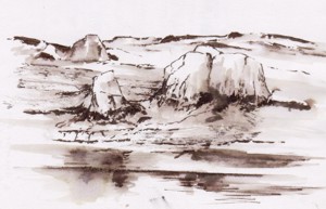
My sketches on this visit were mostly of rock formations recorded with a brush pen and sepia wash. The brush is ideal for creating the expressive linear forms found in weathered granite. More information relating to colour and texture can be recorded with a digital camera.
Now begins the task of recreating the painterly visual equivalent of tbese experiences in the studio.
Taking a walk along the cliff paths opened up views of sea and rock which for me have always been exciting subjects. In spring these cliff tops are a riot of colour sea campion, thrift, bluebells, sloe and gorse all in flower. Then there are the colours and textures of the lichen covered rocks themselves that excite. I’m looking for a change of direction more concerned with the small and intimate rather than the grand vista so I wasn’t disappointed.
My sketches on this visit were mostly of rock formations recorded with a brush pen and sepia wash. The brush is ideal for creating the expressive linear forms found in weathered granite. More information relating to colour and texture can be recorded with a digital camera.
Now begins the task of recreating the painterly visual equivalent of tbese experiences in the studio.
Friday, April 28, 2006
Guernsey revisited
Tomorrow my wife and I are off on a visit to Guernsey. It is ten years since our last visit and I’m quite excited at the prospect. On previous visits I was a madly compulsive sketcher – here I’m sketching the tiny island of Jethou from a rocky headland on Herm. These little islands are lovely unspoilt places and painterly subjects abound.
I’ve been looking at the sketches I made on these early visits. Some are simple pencil line drawings in others I’ve used charcoal for a broader tonal treatment. Then I came across a series of line and wash drawings done with a quill and acrylic ink. I used to carry around some of those plastic cases that came with Fuji 35mm films – ideal for holding small samples of ink in different dilutions. For this visit my sketching kit will be pared down to a few Carb-Othello Pencils and a Pentel colour brush with a water reservoir. Oh and a digital camera of course.
Sadly these sketches of 10 years ago do not generate the excitement they did at the time. Partly my artistic objectives have changed and I tend to delve deeper into my memory than I once did indicating that perhaps I’m becoming more of a dreamer. I quite hope that this next visit will regenerate the visual excitement I once experienced on Guernsey – we shall see.
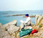
Tomorrow my wife and I are off on a visit to Guernsey. It is ten years since our last visit and I’m quite excited at the prospect. On previous visits I was a madly compulsive sketcher – here I’m sketching the tiny island of Jethou from a rocky headland on Herm. These little islands are lovely unspoilt places and painterly subjects abound.
I’ve been looking at the sketches I made on these early visits. Some are simple pencil line drawings in others I’ve used charcoal for a broader tonal treatment. Then I came across a series of line and wash drawings done with a quill and acrylic ink. I used to carry around some of those plastic cases that came with Fuji 35mm films – ideal for holding small samples of ink in different dilutions. For this visit my sketching kit will be pared down to a few Carb-Othello Pencils and a Pentel colour brush with a water reservoir. Oh and a digital camera of course.
Sadly these sketches of 10 years ago do not generate the excitement they did at the time. Partly my artistic objectives have changed and I tend to delve deeper into my memory than I once did indicating that perhaps I’m becoming more of a dreamer. I quite hope that this next visit will regenerate the visual excitement I once experienced on Guernsey – we shall see.
Thursday, April 27, 2006
Was his stilted eloquence the same before his hair turned grey?
Last week I watched the last programme of ‘Brian Sewell’s Grand Tour’ on Channel 5 and afterwards searched the web for his website – he has three. The tasteless content on two of them was a surprise and I wondered if it was included with his approval or if he was just being sent up. One Shockwave Flash clip shows a young dark-haired Sewell giving a commentary from the ornamental garden of a country house. Was it him or was it a look-alike - the poor quality of the video made it impossible to be sure.
Another page shows the central panel from the Sistine ceiling with him superimposed on the figure of God. The digital make over is a mirror image of the original so the ‘omnipotent Sewell’ becomes left handed in the web version. The left hand is infusing life into a Brian Sewell t-shirt design that serendipitously makes use of the BSI kite logo.
This association of one of the great images of Renaissance art with such tasteless treatment seems out of character. He is after all a writer who has been fiercely critical of similar tackiness produced in the name of art.
The broadcast ended with the old sage sitting in the Danielli enjoying a cup of hot chocolate - this was something he’d first done in his impecunious student years. He was visibly moved by the memory and by the thought that he may not enjoy many more visits to Venice. I’ll stay away from the dreadful web sites that display his name and carry a memory of him enjoying his hot chocolate in the civilised surroundings of the Danieli – that’s where he belongs.
Last week I watched the last programme of ‘Brian Sewell’s Grand Tour’ on Channel 5 and afterwards searched the web for his website – he has three. The tasteless content on two of them was a surprise and I wondered if it was included with his approval or if he was just being sent up. One Shockwave Flash clip shows a young dark-haired Sewell giving a commentary from the ornamental garden of a country house. Was it him or was it a look-alike - the poor quality of the video made it impossible to be sure.
Another page shows the central panel from the Sistine ceiling with him superimposed on the figure of God. The digital make over is a mirror image of the original so the ‘omnipotent Sewell’ becomes left handed in the web version. The left hand is infusing life into a Brian Sewell t-shirt design that serendipitously makes use of the BSI kite logo.
This association of one of the great images of Renaissance art with such tasteless treatment seems out of character. He is after all a writer who has been fiercely critical of similar tackiness produced in the name of art.
The broadcast ended with the old sage sitting in the Danielli enjoying a cup of hot chocolate - this was something he’d first done in his impecunious student years. He was visibly moved by the memory and by the thought that he may not enjoy many more visits to Venice. I’ll stay away from the dreadful web sites that display his name and carry a memory of him enjoying his hot chocolate in the civilised surroundings of the Danieli – that’s where he belongs.
Saturday, April 15, 2006
A Genius who was creative to the end.
Robert Hughes (remember ‘the Shock of the New’?) is the best art critic around and he’s recently written a perceptive review of an exhibition of Goya’s late works. The exhibition is devoted to work done when he was nearly 82 and living in exile in Bordeaux. There is a moving oil, ‘Self Portrait with Dr Arrieta.’ How did he paint that? He is shown ill and ailing and the doctor is encouraging him to drink a potion. A painting carefully composed from memory perhaps.
The most instructive though are the little miniatures he did in watercolour on ivory. Mostly of subjects he observed on the streets of Bordeaux of people odd and tormented. These are not the tight detailed miniatures we’ve grown accustomed to from The Hilliard Society but expressive ones made from blots, dabs and accidental runs of black dilute watercolour. As Hughes observes ‘… they contain some of the most beautiful feats of controlled chance that would be seen in art until the 20th Century.’
‘Man looking for fleas in his shirt.’ is a study of a short-sighted old man trying to remove tne tiny pests. Goya would have been sympathetic to the man’s predicament because he was complaining to friends about his own failing eyesight. The miniature shows that powerful and moving images are made by acute observation and empathy with the subject rather than refined and perfected technique.
You can read Robert Hughes’ review at: Goya's Last Works
There is also a link to the exhibition where you can see the pictures.
Robert Hughes (remember ‘the Shock of the New’?) is the best art critic around and he’s recently written a perceptive review of an exhibition of Goya’s late works. The exhibition is devoted to work done when he was nearly 82 and living in exile in Bordeaux. There is a moving oil, ‘Self Portrait with Dr Arrieta.’ How did he paint that? He is shown ill and ailing and the doctor is encouraging him to drink a potion. A painting carefully composed from memory perhaps.
The most instructive though are the little miniatures he did in watercolour on ivory. Mostly of subjects he observed on the streets of Bordeaux of people odd and tormented. These are not the tight detailed miniatures we’ve grown accustomed to from The Hilliard Society but expressive ones made from blots, dabs and accidental runs of black dilute watercolour. As Hughes observes ‘… they contain some of the most beautiful feats of controlled chance that would be seen in art until the 20th Century.’
‘Man looking for fleas in his shirt.’ is a study of a short-sighted old man trying to remove tne tiny pests. Goya would have been sympathetic to the man’s predicament because he was complaining to friends about his own failing eyesight. The miniature shows that powerful and moving images are made by acute observation and empathy with the subject rather than refined and perfected technique.
You can read Robert Hughes’ review at: Goya's Last Works
There is also a link to the exhibition where you can see the pictures.
Friday, April 07, 2006
Perhaps ’Lonely Akaroa’ needs an emphatic complement

‘Lonely Akaroa’ is an acrylic painting of a quiet harbour on the Bank’s Peninsula in New Zealand.
I’ve never been entirely satisfied with it though it’s going in a show over Easter. Perhaps I’d missed the trick of using a complementary harmony to enliven the painting.
The painting's dominant colour scheme is green so a touch of red - green’s complement - might help. No need to add more elements to clutter the composition – red walls or red roofs on the sheds on the left might work.

Of course in painting things are never simple. A splash straight out of the Cadmium Red tube will not do. Green’s incline towards either yellow or blue. The complement of a yellow/green needs to be a red inclined to mauve and a blue/green towards orange.
Time to try a digital enhancement on the PC perhaps. Placing the original with the ‘enhanced’ image allows comparison but I’m still not sure which I prefer.
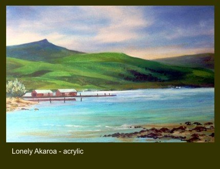
‘Lonely Akaroa’ is an acrylic painting of a quiet harbour on the Bank’s Peninsula in New Zealand.
I’ve never been entirely satisfied with it though it’s going in a show over Easter. Perhaps I’d missed the trick of using a complementary harmony to enliven the painting.
The painting's dominant colour scheme is green so a touch of red - green’s complement - might help. No need to add more elements to clutter the composition – red walls or red roofs on the sheds on the left might work.
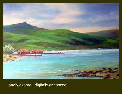
Of course in painting things are never simple. A splash straight out of the Cadmium Red tube will not do. Green’s incline towards either yellow or blue. The complement of a yellow/green needs to be a red inclined to mauve and a blue/green towards orange.
Time to try a digital enhancement on the PC perhaps. Placing the original with the ‘enhanced’ image allows comparison but I’m still not sure which I prefer.
Thursday, March 30, 2006
Brian Sewell is a class act – but there’s surely something more to him.
I’ve been entertained by Brian Sewell’s television series on ‘The Grand Tour’ and enjoying his comment on the Italian locations visited by wealthy English gentry in the 17-1800’s. Sewell loves comfort and admires elegance and refinement. A choppy crossing of the Bay of Naples that induces queasiness and the wild untamed crater of Vesuvius are anathema. He’s at his knowledgeable best when commenting on the fine arts using carefully groomed manner.
The trouble is that the measured delivery and slowly enunciated words make him a bit aloof - you never feel you are getting to know the real man. On camera his act does not allow him to say certain words. Quoting a letter from the Earl of Mar describing the boredom of life at the exiled court of the deposed King James he had to explain an obscure word. It means the same as that word which begins with ‘f’ and ends in ‘king’ he explains. The brash Australian critic Robert Hughes would have had no hesitation in saying the word which Sewell took pains to avoid.
Somewhere between Paestum and Venice travelling the length of the Apennines Sewell’s producer persuaded him to talk about incidents that happened when he made this journey in a group of graduate students. Given a room where four boys were expected to sleep in one bed; driving an old Vauxhall Velox up a street so narrow the car almost jammed between the walls of opposite houses to an impasse where the only way out was down a long flight of steps. Reliving the memory brought a subtle change of body language and the haughty manner and measured diction slipped – just a little.
Behind the act there was a guy who had lived and had fun like the rest of us. I was left with the feeling that off camera and relaxed he would be good company.
I’ve been entertained by Brian Sewell’s television series on ‘The Grand Tour’ and enjoying his comment on the Italian locations visited by wealthy English gentry in the 17-1800’s. Sewell loves comfort and admires elegance and refinement. A choppy crossing of the Bay of Naples that induces queasiness and the wild untamed crater of Vesuvius are anathema. He’s at his knowledgeable best when commenting on the fine arts using carefully groomed manner.
The trouble is that the measured delivery and slowly enunciated words make him a bit aloof - you never feel you are getting to know the real man. On camera his act does not allow him to say certain words. Quoting a letter from the Earl of Mar describing the boredom of life at the exiled court of the deposed King James he had to explain an obscure word. It means the same as that word which begins with ‘f’ and ends in ‘king’ he explains. The brash Australian critic Robert Hughes would have had no hesitation in saying the word which Sewell took pains to avoid.
Somewhere between Paestum and Venice travelling the length of the Apennines Sewell’s producer persuaded him to talk about incidents that happened when he made this journey in a group of graduate students. Given a room where four boys were expected to sleep in one bed; driving an old Vauxhall Velox up a street so narrow the car almost jammed between the walls of opposite houses to an impasse where the only way out was down a long flight of steps. Reliving the memory brought a subtle change of body language and the haughty manner and measured diction slipped – just a little.
Behind the act there was a guy who had lived and had fun like the rest of us. I was left with the feeling that off camera and relaxed he would be good company.
Monday, March 27, 2006
'Il Divino’ at his magnificent best.
A visit to the Sistine Chapel needs an early start – a bus from Piazza di Porta Maggiore takes a ‘scenic’ route directly through the ancient heart of Rome and crosses the Tiber at the Victor Emmanuell II Bridge to a stop a few minutes away from St. Peter’s Square. It was Wednesday and the Pope was due to conduct mass – the faithful pilgrims crowding into the Square were being welcomed in their native language to appreciative cheers. Fewer then in the queues for the Cappella Sistina perhaps!
 Crowd management at the Vatican Museum entrance is slick and well organised involving airport style security. Once through the admission procedure it is important to remain focussed and not get sidetracked by papal artefacts acquired over the centuries. I kept my eyes raised appropriately heavenwards admiring the gloriously painted ceilings in the corridors. None compares with what Michelangelo achieved in the Sistine though.
Despite the distraction of the moving crowds it is a moving experience to look up at the ceiling then take in the scale of the ‘Last Judgment’ on the altar wall. I grabbed the first vacant space on the marble bench which runs the length of the chapel wall and sat for a long time and gazed. There is too much to take in of course all you can do is savour the atmosphere of the place then come home and study a text with good illustrations.
A visit to the Sistine Chapel needs an early start – a bus from Piazza di Porta Maggiore takes a ‘scenic’ route directly through the ancient heart of Rome and crosses the Tiber at the Victor Emmanuell II Bridge to a stop a few minutes away from St. Peter’s Square. It was Wednesday and the Pope was due to conduct mass – the faithful pilgrims crowding into the Square were being welcomed in their native language to appreciative cheers. Fewer then in the queues for the Cappella Sistina perhaps!
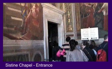 Crowd management at the Vatican Museum entrance is slick and well organised involving airport style security. Once through the admission procedure it is important to remain focussed and not get sidetracked by papal artefacts acquired over the centuries. I kept my eyes raised appropriately heavenwards admiring the gloriously painted ceilings in the corridors. None compares with what Michelangelo achieved in the Sistine though.
Despite the distraction of the moving crowds it is a moving experience to look up at the ceiling then take in the scale of the ‘Last Judgment’ on the altar wall. I grabbed the first vacant space on the marble bench which runs the length of the chapel wall and sat for a long time and gazed. There is too much to take in of course all you can do is savour the atmosphere of the place then come home and study a text with good illustrations.
Tuesday, March 21, 2006
Moses horns seem an odd icon to modern eyes
 Little more than a stone’s throw from the Colosseum is the Church of St. Peter in Chains where there is a treasure that will have to await a future visit. It contains Michelangelo’s statue of Moses carved when he was 30 as part of a monumental tomb for Julius II. Even in a photograph the figure is powerful and striking. The locks of hair that fall from the shoulders are rendered soft and pliable – remarkable given the hard marble material from which they are carved.
The statue bears a mark below the knee apparently caused when Michelangelo threw his chisel at the work and screamed “Why don’t you talk?” The story is plausible given Michelangelo’s fiery temperament and the pitch of emotional intensity at which he worked. Lifelike and powerful though the figure is it is not hard to imagine him being frustrated by some subtle nuance that was eluding him.
Although Michelangelo took painting and sculpture to new heights he was always conscious of tradition. The portrayal of Moses with ‘horns’ was a curious medieval icon which Michelangelo continued to use. They seem strange to a contemporary eye and make Moses appear diabolical.
The origin or meaning of Moses horns is obscure. Exodus records an occasion when after talking with God on Sinai Moses face appeared to shine as he stood before his people. I came across an early painting in the Vatican Museum showing Moses displaying the stone tablets with golden rays emanating from his temples - a primitive painterly ploy to depict Moses shining face perhaps. Maybe Michelangelo was seeking a sculptural alternative to suggest Moses’ shining face.
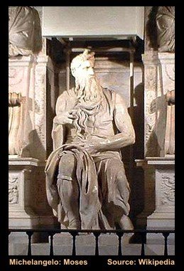 Little more than a stone’s throw from the Colosseum is the Church of St. Peter in Chains where there is a treasure that will have to await a future visit. It contains Michelangelo’s statue of Moses carved when he was 30 as part of a monumental tomb for Julius II. Even in a photograph the figure is powerful and striking. The locks of hair that fall from the shoulders are rendered soft and pliable – remarkable given the hard marble material from which they are carved.
 The statue bears a mark below the knee apparently caused when Michelangelo threw his chisel at the work and screamed “Why don’t you talk?” The story is plausible given Michelangelo’s fiery temperament and the pitch of emotional intensity at which he worked. Lifelike and powerful though the figure is it is not hard to imagine him being frustrated by some subtle nuance that was eluding him.
Although Michelangelo took painting and sculpture to new heights he was always conscious of tradition. The portrayal of Moses with ‘horns’ was a curious medieval icon which Michelangelo continued to use. They seem strange to a contemporary eye and make Moses appear diabolical.
The origin or meaning of Moses horns is obscure. Exodus records an occasion when after talking with God on Sinai Moses face appeared to shine as he stood before his people. I came across an early painting in the Vatican Museum showing Moses displaying the stone tablets with golden rays emanating from his temples - a primitive painterly ploy to depict Moses shining face perhaps. Maybe Michelangelo was seeking a sculptural alternative to suggest Moses’ shining face.
Saturday, March 18, 2006
A Roman Blog
It was Sheila's idea, "I'd love a trip to Rome." she said. So it had to be - I didn't need to be persuaded. A no frills Easy Jet flight from East Midlands Airport got us installed in the Hotel Bled by 12.00 on the day of departure, leaving the rest of the day to explore. In Rome you are immediately made aware of how a civilised society planned and built the city when northern Europe was barbarian. The old aqueducts which once carried water into the city are everywhere and only breached by the main through routes. It was time for an exploration to get our bearings.
 A ten minute walk along a busy road assailed by the deafening sound of city traffic brought the imposing facade of St. John Lateran into view. The figure of Christ holding the Cross of Redemption holds the central position on the parapet. St. John Lateran is Christendom's earliest basilica dedicated by Constantine to Jesus the Saviour. The interior is a delight - Italian churches are well lit compared with the dark cathedrals of Northern Europe and they make good decorative use of local stone and marble. This Church is a bit special - the adjacent Lateran Palace was the home of the Popes until they were forced into exile to Avignon.
It was Sheila's idea, "I'd love a trip to Rome." she said. So it had to be - I didn't need to be persuaded. A no frills Easy Jet flight from East Midlands Airport got us installed in the Hotel Bled by 12.00 on the day of departure, leaving the rest of the day to explore. In Rome you are immediately made aware of how a civilised society planned and built the city when northern Europe was barbarian. The old aqueducts which once carried water into the city are everywhere and only breached by the main through routes. It was time for an exploration to get our bearings.
 A ten minute walk along a busy road assailed by the deafening sound of city traffic brought the imposing facade of St. John Lateran into view. The figure of Christ holding the Cross of Redemption holds the central position on the parapet. St. John Lateran is Christendom's earliest basilica dedicated by Constantine to Jesus the Saviour. The interior is a delight - Italian churches are well lit compared with the dark cathedrals of Northern Europe and they make good decorative use of local stone and marble. This Church is a bit special - the adjacent Lateran Palace was the home of the Popes until they were forced into exile to Avignon.
Wednesday, March 08, 2006
Watercolour to Acrylic: a seamless change
I find myself evolving a working method which moves between traditional gum Arabic based watercolour and fluid acrylic. Why? – well I like the loose way in which watercolour can be used to begin a painting with colours floated on to wet paper and pushed around or sponged out. Then I like the strong vibrant colours and opacity that are some of the characteristics of acrylic.
It is possible to build up strong vibrant colours in watercolour by repeated application of lots of pure washes but it is a time consuming and hazardous process – the underlayers can all too easily be disturbed. Then there is the attraction of playing off transparency against opacity in different parts of the painting – or floating transparent washes over opaque passages – a method similar to the glazing method frequently used by oil painters.
There remains the question of how to describe the results of this way of working in exhibition catalogues. Mixed media is a description most often used where pastel or chalk is combined with watercolour or gouache so doesn’t appeal. Watercolour/Acrylic is clumsy and neither one thing or the other. So the simple description ‘Water Media’ is the one I think I will use for exhibition catalogue entries - with an explanatory note added to the label on the back.
I find myself evolving a working method which moves between traditional gum Arabic based watercolour and fluid acrylic. Why? – well I like the loose way in which watercolour can be used to begin a painting with colours floated on to wet paper and pushed around or sponged out. Then I like the strong vibrant colours and opacity that are some of the characteristics of acrylic.
It is possible to build up strong vibrant colours in watercolour by repeated application of lots of pure washes but it is a time consuming and hazardous process – the underlayers can all too easily be disturbed. Then there is the attraction of playing off transparency against opacity in different parts of the painting – or floating transparent washes over opaque passages – a method similar to the glazing method frequently used by oil painters.
There remains the question of how to describe the results of this way of working in exhibition catalogues. Mixed media is a description most often used where pastel or chalk is combined with watercolour or gouache so doesn’t appeal. Watercolour/Acrylic is clumsy and neither one thing or the other. So the simple description ‘Water Media’ is the one I think I will use for exhibition catalogue entries - with an explanatory note added to the label on the back.
Wednesday, March 01, 2006
tapping my tablet in Painter IX
Getting to grips with Painter IX and what it offers is clearly going to need time and practice. The range of ‘brush’ styles available is daunting for a start so fitting in the occasional short session between more orthodox painterly activities is not going to work.
The on-line tutorials and the printed ones in the handbook are very helpful but I’ve decided that unless I devise a simple basic working method that enables me to achieve good results the potential of this marvellous piece of software will elude me. Exploring the properties of a range of different brushes in an unsystematic way is not much help.
Using a clone of a photograph with the tracing paper function described in the tutorials proved to be too complicated. So I settled for inserting a clone of the photograph on a new layer above the canvas – but I’ve no idea what happened to the tracing paper. Then adding new layers for each stage of the painting process, sketch, underpainting, and so on gave a hint of a simple working method I could manage.
So my standard procedure for now is to create a ‘canvas’ with a light textured ground, copy a sketch onto a new layer above it and develop the painting on successive layers. Sometimes the linear qualities of the sketch enable simple transparent colour enhancements to be added. With others overworking can cover the original drawing as in an oil or pastel painting.
It’s a marvellous way of developing drawings and colour studies for working up in water media or pastel without getting your hands dirty. As Alwyn Crawshaw used to say “I’m happy with that.”
Getting to grips with Painter IX and what it offers is clearly going to need time and practice. The range of ‘brush’ styles available is daunting for a start so fitting in the occasional short session between more orthodox painterly activities is not going to work.
The on-line tutorials and the printed ones in the handbook are very helpful but I’ve decided that unless I devise a simple basic working method that enables me to achieve good results the potential of this marvellous piece of software will elude me. Exploring the properties of a range of different brushes in an unsystematic way is not much help.
Using a clone of a photograph with the tracing paper function described in the tutorials proved to be too complicated. So I settled for inserting a clone of the photograph on a new layer above the canvas – but I’ve no idea what happened to the tracing paper. Then adding new layers for each stage of the painting process, sketch, underpainting, and so on gave a hint of a simple working method I could manage.
So my standard procedure for now is to create a ‘canvas’ with a light textured ground, copy a sketch onto a new layer above it and develop the painting on successive layers. Sometimes the linear qualities of the sketch enable simple transparent colour enhancements to be added. With others overworking can cover the original drawing as in an oil or pastel painting.
It’s a marvellous way of developing drawings and colour studies for working up in water media or pastel without getting your hands dirty. As Alwyn Crawshaw used to say “I’m happy with that.”
dianna ponting: pastel workshops
I received an email yesterday from Dianna Ponting a Canadian Pastel Painter who I introduced to readers of my blog back in January. Dianna is givng a series of Pastel Workshops at some venues in the UK and Ireland. Which I am sure will interest lovers of the medium.
Details can be found on her website at: Dianna Ponting: Pastel Workshops
I received an email yesterday from Dianna Ponting a Canadian Pastel Painter who I introduced to readers of my blog back in January. Dianna is givng a series of Pastel Workshops at some venues in the UK and Ireland. Which I am sure will interest lovers of the medium.
Details can be found on her website at: Dianna Ponting: Pastel Workshops
Thursday, February 23, 2006
Criticism: who needs it?
The March 2006 copy of ‘the Artist’ carried a depressing letter from a man who endured devastating criticism of his painting at a local Art Society meeting. The experience completely destroyed his confidence.
I cannot understand why amateur Art Societies persist in holding criticism evenings; in my experience they achieve very little. What usually happens on these occasions is that several members chip in with often contrary opinions and anyone looking for consistent constructive advice rarely gets it. The situation that exists in a well run class or workshop where the tutor offers advice and comment on a one to one basis is far more helpful.
Interestingly the correspondent described the friendliness and willingness to share ideas that existed in the Dunedin Art Society in New Zealand in the 1960’s. I can verify that the same spirit prevails in the new millennium. I’ve made three visits to New Zealand and met members of Art Societies in Dunedin, Taupo and Thames. Sometimes I ‘gatecrashed’ unannounced but I always had a warm welcome. They were interested to see how a Pom with an English watercolour style handled the strange young evolving landforms of their country.
Once attuned to the excitement aroused by what your eye likes painting comes naturally. A more experienced and sympathetic painter occasionally looking over your shoulder to nudge you in an appropriate direction is all you need. Criticism given in a room full of people which makes you colour with embarrassment – you don’t need it.
The March 2006 copy of ‘the Artist’ carried a depressing letter from a man who endured devastating criticism of his painting at a local Art Society meeting. The experience completely destroyed his confidence.
I cannot understand why amateur Art Societies persist in holding criticism evenings; in my experience they achieve very little. What usually happens on these occasions is that several members chip in with often contrary opinions and anyone looking for consistent constructive advice rarely gets it. The situation that exists in a well run class or workshop where the tutor offers advice and comment on a one to one basis is far more helpful.
Interestingly the correspondent described the friendliness and willingness to share ideas that existed in the Dunedin Art Society in New Zealand in the 1960’s. I can verify that the same spirit prevails in the new millennium. I’ve made three visits to New Zealand and met members of Art Societies in Dunedin, Taupo and Thames. Sometimes I ‘gatecrashed’ unannounced but I always had a warm welcome. They were interested to see how a Pom with an English watercolour style handled the strange young evolving landforms of their country.
Once attuned to the excitement aroused by what your eye likes painting comes naturally. A more experienced and sympathetic painter occasionally looking over your shoulder to nudge you in an appropriate direction is all you need. Criticism given in a room full of people which makes you colour with embarrassment – you don’t need it.
Wednesday, February 22, 2006
I'm pleased for loretta
 A surprise email from an old friend dropped into my Inbox the other day. It was from Loretta Proctor – a name you could hear more of in time.
I met Loretta when we both used to exhibit at the Malvern Gallery but now she spends her creative time writing. Loretta has just published her first novel set in Greece in WWI.
‘With its authentic background, snapshots of Greek life and tradition, splendid mix of characters and fascinating story line, The Long Shadow is both powerful and engrossing.’ Writes one reviewer.
Here’s a link to her entry on the Amazon Website.
Loretta Proctor: ‘The Long Shadow’
 A surprise email from an old friend dropped into my Inbox the other day. It was from Loretta Proctor – a name you could hear more of in time.
I met Loretta when we both used to exhibit at the Malvern Gallery but now she spends her creative time writing. Loretta has just published her first novel set in Greece in WWI.
‘With its authentic background, snapshots of Greek life and tradition, splendid mix of characters and fascinating story line, The Long Shadow is both powerful and engrossing.’ Writes one reviewer.
Here’s a link to her entry on the Amazon Website.
Loretta Proctor: ‘The Long Shadow’
Tuesday, February 21, 2006
summer festival before winter ends
 Each year in June and July my life gets interrupted by the Ludlow Festival. This is because for a number of years my wife has managed wardrobe backstage. Traditionally the main event of the Festival has been an outdoor production of a Shakespeare play in the castle. The Festival runs for two weeks but wardrobe management begins at least one week before the play opens – quite a commitment.
This year having offered to manage the content of the Festival web site it entered my life in January. The web site was developed by the Shropshire Star newspaper and it is huge. Fortunately my remit is only concerned with managing events listing and giving details of accommodation and eating places for visitors. The challenge lies in achieving clear presentation and layout of the text and combining it effectively with images.
Big websites often degenerate into a chaotic jumble of flashing advertising banners which are a distraction. Fortunately visitors to the Ludlow Festival website do not have to cope with them.
Take a look at http://www.ludlowfestival.co.uk/
 Each year in June and July my life gets interrupted by the Ludlow Festival. This is because for a number of years my wife has managed wardrobe backstage. Traditionally the main event of the Festival has been an outdoor production of a Shakespeare play in the castle. The Festival runs for two weeks but wardrobe management begins at least one week before the play opens – quite a commitment.
This year having offered to manage the content of the Festival web site it entered my life in January. The web site was developed by the Shropshire Star newspaper and it is huge. Fortunately my remit is only concerned with managing events listing and giving details of accommodation and eating places for visitors. The challenge lies in achieving clear presentation and layout of the text and combining it effectively with images.
Big websites often degenerate into a chaotic jumble of flashing advertising banners which are a distraction. Fortunately visitors to the Ludlow Festival website do not have to cope with them.
Take a look at http://www.ludlowfestival.co.uk/
Monday, February 20, 2006
a brush with corot
I’ve decided that an artist I must study more closely is Corot. I made this decision after watching Tim Marlow’s recent Channel 5 broadcast from the Bowes Museum. A small landscape by Corot, ‘Landscape with Cattle’ grabbed my attention when Tim Marlow introduced it. Though probably painted as a study ‘en plein air’ the direct manner he adopts was daring for its time.
I admired the way he brushed a heavy application of almost white paint into the negative spaces created by the tree trunks. With a few brush marks he adjusted the tone of the sky and brought the trees forward. It is easy to see why he was admired by the Impressionists. Corot’s classical training manifested itself by the way he rendered the light foliage in the middle distance. Delicate flicks of light green paint moving across the picture – leaves caught by a light breeze perhaps? By comparison the brushwork of the majority of the Impressionists looks quite clumsy.
Corot: 'Landscape with Cattle'
I’ve decided that an artist I must study more closely is Corot. I made this decision after watching Tim Marlow’s recent Channel 5 broadcast from the Bowes Museum. A small landscape by Corot, ‘Landscape with Cattle’ grabbed my attention when Tim Marlow introduced it. Though probably painted as a study ‘en plein air’ the direct manner he adopts was daring for its time.
I admired the way he brushed a heavy application of almost white paint into the negative spaces created by the tree trunks. With a few brush marks he adjusted the tone of the sky and brought the trees forward. It is easy to see why he was admired by the Impressionists. Corot’s classical training manifested itself by the way he rendered the light foliage in the middle distance. Delicate flicks of light green paint moving across the picture – leaves caught by a light breeze perhaps? By comparison the brushwork of the majority of the Impressionists looks quite clumsy.
Corot: 'Landscape with Cattle'
Sunday, February 19, 2006
tim marlow on the bowes museum
I always try to watch Tim Marlow’s broadcasts on Channel 5 because he has the gift of talking about art in plain words – due I like to think by being taught English at Denstone by my brother-in-law. His presentation is natural and unpretentious unlike another Courtauld graduate of an older generation Brian Sewell. Sewell is very clever and extremely knowledgeable but his accent and mannerisms grate with me and I’m never sure if they are natural or cultivated to enhance his public persona. Anyway Tim Marlow is like a breath of fresh air in the art world where pretentious language prevails all too frequently.
I watched Tim Marlow’s broadcast about the Bowes Museum yesterday. The first picture that caught my attention was a lovely portrait by Goya – his small portraits are masterpieces. I first got to love them when I visited a major exhibition of Goya’s work in the Musée des Beaux Arts in Lille. The exhibition had a small gallery of these works sensitively hung with the heads at eye level. All the heads were drawn sight size so the faces gazed out and really engaged with the viewer.
Goya also gives his heads room inside the frame – something which many portrait painters neglect. I was with a group of friends once looking at a portrait of a young woman in one of our local arts society exhibitions. The head was close cropped inside the frame so that the figure was cut off just above the sternum. I commented that the head should have been given more space because she looked as if she was gazing out of a prison cell window. Nobody else could see anything wrong with this so I didn’t labour the point except to say go and look at how Goya paints.
Goya: Juan Antonio Melendez Valdes
I always try to watch Tim Marlow’s broadcasts on Channel 5 because he has the gift of talking about art in plain words – due I like to think by being taught English at Denstone by my brother-in-law. His presentation is natural and unpretentious unlike another Courtauld graduate of an older generation Brian Sewell. Sewell is very clever and extremely knowledgeable but his accent and mannerisms grate with me and I’m never sure if they are natural or cultivated to enhance his public persona. Anyway Tim Marlow is like a breath of fresh air in the art world where pretentious language prevails all too frequently.
I watched Tim Marlow’s broadcast about the Bowes Museum yesterday. The first picture that caught my attention was a lovely portrait by Goya – his small portraits are masterpieces. I first got to love them when I visited a major exhibition of Goya’s work in the Musée des Beaux Arts in Lille. The exhibition had a small gallery of these works sensitively hung with the heads at eye level. All the heads were drawn sight size so the faces gazed out and really engaged with the viewer.
Goya also gives his heads room inside the frame – something which many portrait painters neglect. I was with a group of friends once looking at a portrait of a young woman in one of our local arts society exhibitions. The head was close cropped inside the frame so that the figure was cut off just above the sternum. I commented that the head should have been given more space because she looked as if she was gazing out of a prison cell window. Nobody else could see anything wrong with this so I didn’t labour the point except to say go and look at how Goya paints.
Goya: Juan Antonio Melendez Valdes
One of the participants at my watercolour workshops turned up with a copy of one of Alwyn Crawshaw’s books. He showed me a page with a landscape illustration and said he would love to be able to paint trees like that. Well for a beginner that is not an unworthy ambition and at least he had a clear idea of what he wanted to achieve.
Popular though Alwyn is my only reservation about emulating him is that through his entertaining TV series and ‘how to do it books’ the beginner is left with the idea that watercolours are dashed off in half an hour. This direct approach is fine for the plein air painter if that is the way you like to work.
Dashing off a response to the first compulsive eye catch is exciting but there is a deeper magic to be discovered in the studio
So there are sound reasons for taking a more considered approach in the comfort of the studio Elements of the composition can be rearranged and new colour harmonies explored. I’ve been surprised by the strength and depth of colour that can be built up by superimposing several clean pure washes by using more leisurely studio methods.
The oil painter can work up his plein air sketches in the studio – Monet invariably did. The watercolourist though has to begin again with a totally fresh vision.
Popular though Alwyn is my only reservation about emulating him is that through his entertaining TV series and ‘how to do it books’ the beginner is left with the idea that watercolours are dashed off in half an hour. This direct approach is fine for the plein air painter if that is the way you like to work.
Dashing off a response to the first compulsive eye catch is exciting but there is a deeper magic to be discovered in the studio
So there are sound reasons for taking a more considered approach in the comfort of the studio Elements of the composition can be rearranged and new colour harmonies explored. I’ve been surprised by the strength and depth of colour that can be built up by superimposing several clean pure washes by using more leisurely studio methods.
The oil painter can work up his plein air sketches in the studio – Monet invariably did. The watercolourist though has to begin again with a totally fresh vision.
Friday, February 17, 2006
I ran a series of Watercolour Workshops through autumn 2005 for a group of complete beginners which has sent me back to the basics of watercolour painting – a careful line drawing as a first stage and then laying down a series of controlled transparent washes.
This is a traditional studio method which requires a quite different approach to the direct methods employed in plein air painting. It’s a way of working which I have tended to neglect for some time but returning to it was a marvellous relaxing experience. It needs time it is fatal to apply the next wash until the one beneath is thoroughly dry - the hairdryer gets plenty of use. Better still is to leave the work overnight and greet it like meeting an old friend the next morning!
Another long neglected aspect of using transparent watercolour I discovered was the use of unmixed colours in my washes. A dilute Alizarin Crimson wash applied over the whole picture took the harshness out of a Cerulean Blue sky and brought a subtle harmony to jarring colours in other parts of the composition. I would never have thought of applying this unifying wash had I not left the painting overnight and come to it with a fresh eye the following day.
There is no better way for the beginner to get into watercolour painting than by practising this method.. Another spin off is that on your leisurely way it is easier to accept the challenge of drawing directly with the brush to add variety and enhance the initial outline drawing. It is the most relaxing and rewarding way to paint with watercolour
This is a traditional studio method which requires a quite different approach to the direct methods employed in plein air painting. It’s a way of working which I have tended to neglect for some time but returning to it was a marvellous relaxing experience. It needs time it is fatal to apply the next wash until the one beneath is thoroughly dry - the hairdryer gets plenty of use. Better still is to leave the work overnight and greet it like meeting an old friend the next morning!
Another long neglected aspect of using transparent watercolour I discovered was the use of unmixed colours in my washes. A dilute Alizarin Crimson wash applied over the whole picture took the harshness out of a Cerulean Blue sky and brought a subtle harmony to jarring colours in other parts of the composition. I would never have thought of applying this unifying wash had I not left the painting overnight and come to it with a fresh eye the following day.
There is no better way for the beginner to get into watercolour painting than by practising this method.. Another spin off is that on your leisurely way it is easier to accept the challenge of drawing directly with the brush to add variety and enhance the initial outline drawing. It is the most relaxing and rewarding way to paint with watercolour
Wednesday, January 18, 2006
dianna ponting: canadian pastellist
An email arrived on the Ludlow Art Society’s inbox that aroused my interest. I designed and now manage the Society’s web site and it’s good to find that visitor numbers are increasing.
This particular email came from Dianna Ponting a Canadian artist who lives in British Columbia. Dianna is Vice President of the Confederation of Canadian Artists and is a successful professional painter. She is primarily a pastellist and will be giving a series of pastel workshops in Great Britain and Ireland in 2006.
I was impressed by the variety of work on Dianna’s website and, having bookmarked it, I’ll be back to study it again.
Dianna's web site is worth a visit at http://ponting.com
An email arrived on the Ludlow Art Society’s inbox that aroused my interest. I designed and now manage the Society’s web site and it’s good to find that visitor numbers are increasing.
This particular email came from Dianna Ponting a Canadian artist who lives in British Columbia. Dianna is Vice President of the Confederation of Canadian Artists and is a successful professional painter. She is primarily a pastellist and will be giving a series of pastel workshops in Great Britain and Ireland in 2006.
I was impressed by the variety of work on Dianna’s website and, having bookmarked it, I’ll be back to study it again.
Dianna's web site is worth a visit at http://ponting.com
Friday, January 13, 2006
The digital challenge
I used to be a bit sniffy about digital imaging but the preparation of movies and animations in the lead up to Christmas 2005 has made me change my mind, at least in part. I’d always felt that painterly and drawing processes had as their end result hand crafted artefacts which had value because of their individual character. Any technology which came between the moving hand making marks and the support on which the marks were made was a recipe for disaster.
This was perhaps an extreme attitude but it was formed by the growing use of digital technology to produce Gicleé Prints, a pretentious name for a scanned reproduction of a painting - typically a watercolour. The practice of signing and numbering these is a piece of nonsense aimed at adding value to a reproduction which is really worth very little. There was a good practical reason why etchers and engravers produced signed and numbered editions – over time the plate degraded but with a digitally stored image there is no reason why the print run is theoretically infinite. Furthermore when you buy an etching or engraving you are purchasing a hand crafted artefact which because of the way it was made is likely to be subtly different from others in the edition – it therefore has real value
However digital imaging is here to stay and we artists have to learn how to make creative use of the new technology. I find the current software great fun to use and the results are easy to share over the internet. At the moment I’m exploring ways of using Corel Painter Essentials 2 with a Wacom tablet. It’s great fun simulating pencil and chalk marks, and brush strokes on screen I’m not sure though whether digital drawings can be put in permanent printed form or whether they should remain as strings of bytes on some form of storage medium until sent to a computer screen.
I used to be a bit sniffy about digital imaging but the preparation of movies and animations in the lead up to Christmas 2005 has made me change my mind, at least in part. I’d always felt that painterly and drawing processes had as their end result hand crafted artefacts which had value because of their individual character. Any technology which came between the moving hand making marks and the support on which the marks were made was a recipe for disaster.
This was perhaps an extreme attitude but it was formed by the growing use of digital technology to produce Gicleé Prints, a pretentious name for a scanned reproduction of a painting - typically a watercolour. The practice of signing and numbering these is a piece of nonsense aimed at adding value to a reproduction which is really worth very little. There was a good practical reason why etchers and engravers produced signed and numbered editions – over time the plate degraded but with a digitally stored image there is no reason why the print run is theoretically infinite. Furthermore when you buy an etching or engraving you are purchasing a hand crafted artefact which because of the way it was made is likely to be subtly different from others in the edition – it therefore has real value
However digital imaging is here to stay and we artists have to learn how to make creative use of the new technology. I find the current software great fun to use and the results are easy to share over the internet. At the moment I’m exploring ways of using Corel Painter Essentials 2 with a Wacom tablet. It’s great fun simulating pencil and chalk marks, and brush strokes on screen I’m not sure though whether digital drawings can be put in permanent printed form or whether they should remain as strings of bytes on some form of storage medium until sent to a computer screen.
Sunday, January 01, 2006
Each year as christmas approaches I dabble with computer animations. The object being to send cheery Christmas and New Year email greetings to friends and acquaintances. I don't think this has made me very popular and perhaps the problem was that I was cluttering up people's inboxes with files they couldn't open. You can get these greetings from Yahoo of course but they are mostly naff.
Designing a simple animation for an email greeting is the easy part - sending it in a form that can easily be opened by the recipient is another matter. I haven't found a way of placing either GIF or SWF animations in an email and there is no guarantee if they are sent as attachments the recipient can handle them
So distribution has to be via a link on my blog:
New Year Greetings
or for Christmas 2005 this one:
Happy Christmas
Designing a simple animation for an email greeting is the easy part - sending it in a form that can easily be opened by the recipient is another matter. I haven't found a way of placing either GIF or SWF animations in an email and there is no guarantee if they are sent as attachments the recipient can handle them
So distribution has to be via a link on my blog:
New Year Greetings
or for Christmas 2005 this one:
Happy Christmas
Sunday, December 18, 2005
A recent visit to Tate St. Ives revealed yet another video installation – this time by Tacita Dean. There is a lovely view across the beach from the semi circular atrium all changing light and weather - then they steer you into a darkened room to look at flickering black and white film shot in Berlin accompanied by harsh distorted sound - hardly a thrill. So moved on quickly to look again at the St. Ives modernists. Except for dear old Alfred Wallis whose reputation owes all to the misconceptions of Christopher Wood and Ben Nicholson they grow with renewed acquaintance. For me the best of the non figurative bunch is Bryan Wynter. The paintings are simple linear compositions embellished with gestural and dragged brush marks – very subtle and he’s sensitive to what paint can do. The best of his work of the 1950’s was probably produced while in the trance-like state induced by using mescalin. The drug was used to suppress the conscious and let the subconscious mind take over.
After this disappointment it was good to see a big exhibition in Truro at the Cornwall Museum of work by Kurt Jackson. These days he supplements his watercolours with large works on canvas in water media. He works the paint by splashing and dribbling or pouring onto the canvas laid flat on the ground – and done on site. These are large works with their longest dimension at around 2 metres. Stretched up and displayed in a large gallery they look great there’s a subtle spaciousness to them suggesting glimpses into open sunlit woodland – lovely sensations.
I’ve seen two exhibitions where Kurt shows video of himself at work on these large paintings. Once on a Cornish cliff top with the canvas weighted down with rocks he was dancing around barefoot over the canvas making use of the occasional footprint or toe scratchmark. In the Cornish show he was more sensibly wearing wellington boots. There was no commentary just the natural sounds of the breeze but it was entertaining to see him at work and, unlike the St. Ives installations, the video had a point.
After this disappointment it was good to see a big exhibition in Truro at the Cornwall Museum of work by Kurt Jackson. These days he supplements his watercolours with large works on canvas in water media. He works the paint by splashing and dribbling or pouring onto the canvas laid flat on the ground – and done on site. These are large works with their longest dimension at around 2 metres. Stretched up and displayed in a large gallery they look great there’s a subtle spaciousness to them suggesting glimpses into open sunlit woodland – lovely sensations.
I’ve seen two exhibitions where Kurt shows video of himself at work on these large paintings. Once on a Cornish cliff top with the canvas weighted down with rocks he was dancing around barefoot over the canvas making use of the occasional footprint or toe scratchmark. In the Cornish show he was more sensibly wearing wellington boots. There was no commentary just the natural sounds of the breeze but it was entertaining to see him at work and, unlike the St. Ives installations, the video had a point.
Wednesday, December 07, 2005
Making copies of other artists’ work is one of the best ways of gaining new insights into working methods. Whenever I come across a painting or drawing which grabs my attention I frequently try to make a copy of it. There is a reproduction of a Rossetti ink drawing in Bernard Dunstan’s annotated edition of Ruskin’s‘The Art of Drawing.’ that I once tried. There was some fine hatching that Rossetti had subtly drawn with diluted ink. Now how many of us would have thought of doing that – and yet it is an obvious way of introducing greater tonal subtlety into a line drawing.
Rembrandt made some lovely line and wash drawings of the farms, mills, and canals around Amsterdam which integrate lively line work with delicate washes. He used a quill pen and sepia ink and they prompted me to learn how to cut my own quills. I’ve also experimented with making my own ‘improvements’ – replacing the sepia washes with coloured ones, it adds to the fun!
Rembrandt made some lovely line and wash drawings of the farms, mills, and canals around Amsterdam which integrate lively line work with delicate washes. He used a quill pen and sepia ink and they prompted me to learn how to cut my own quills. I’ve also experimented with making my own ‘improvements’ – replacing the sepia washes with coloured ones, it adds to the fun!
Monday, December 05, 2005

This detail of Thomas Richardson's watercolour was set as a copy exercise to my workshop participants. I decided to make a copy myself. The buff paper ground of the original was simulated with a raw sienna wash laid on a 300gsm Bockingford sheet from a sketchbook. Next the underdrawing was made and the picture was built up with controlled washes and finally the touches of white bodycolour were added with White acrylic ink. I've floated a cropped image below to show the linework more clearly - some adjustment was needed to the roof of the left-hand building. No prizes for working out how it was done!
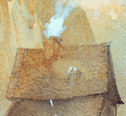
Richardson created this painting by the simplest and most direct means which left me full of admiration. The purplish blue wash laid on the distant hillside was carried down onto the buildings to bring them forward. Essentially the same wash strengthened was used for the shadows. All that was required then were the touches of white and a few added details. None of this would have been discovered by just looking at the painting.
Making copies leads to surprising insights. The aim is not to recreate a mark by mark imitation of the original. There is far more detail in Richardson's linework than in my copy. A careful study of his underdrawing would be worthwhile as a separate exercise. The hand guiding the brush writes its own calligraphy so why not improvise your own style on your copy once the general principles have been grasped.
Friday, December 02, 2005
I've recently completed a series of watercolour workshops for a group of complete beginners - it was something of a challenge. Routine exercises like laying washes, experimenting with wet in wet are not particularly exciting after you've made a few attempts. Sketching outside was a rather daunting prospect for most as it showed up inadequate drawing skills. Students managed a simple still life more convincingly but some had formed clear ideas of what they wanted to achieve. "I want to paint landscapes like Alwym Crawshaw." said one. Others were stimulated by the
'Watercolur Challenge' TV broadcasts.
Then it occurred that copying might be the best way forward - but from what sources? certainly not from photographs. Studying good reproductions of works of art is much better. Making copies has a long tradition as part of a painter's apprenticeship. Dr Monroe invited Joseph Turner and Tom Girtin as two promising RA students into his home to copy the engravings in his collection which he bought for 2s.6d and a bowl of oysters. Girtin often doing the linework and Turner adding watercolour washes - look where this training led!
So good examples were needed - what better artist to begin with than Rembrandt. His pen and wash drawings of the mills and farms in the countryside around Amsterdam display a mastery of line and tone which is an inspiration. Unless a reed or quill pen is used it is hopeless to try and achieve the variey of line which these tools can achieve in the hand of a master like Rembrandt - but for the beginner it is worth transposing the linework by using a modern waterproof ball or fibretip pen. Then the applied washes need not be monochrome - the sketches can be teated imaginatively by applying colour.
I chose two watercolours from the Royal Watercolour Society's Diploma Collection as models. These can be found in Stephen Spender's book 'The Glory of Watercolour.' The first choice was John Varley's delightful small watercolour 'Cader Idris.' It's merit lies in the beautifully controlled washes he has laid down to portray the receding planes of the mountains and lake. He uses a simple colour scheme mainly of blues and greens. The painting is an example of traditional transparent watercolour of the highest quality.
The second example shows a different approach to watercolour. It is 'Saÿn on the Pretsoh Bach, Rhine' by Thomas Miles Richardson. It was painted on a buff ground, the line drawing plays an integral part in the finished picture showing through the overlaid washes to record the details of the buildings. Final touches were added with white bodycolour to render the half timber buildings and a smoke rising from a chimney.
So two different ways of using watercolour which are instructive and worthy of careful study. I asked the students to make their own studies of the examples - I'm keen to see what they made of them.
'Watercolur Challenge' TV broadcasts.
Then it occurred that copying might be the best way forward - but from what sources? certainly not from photographs. Studying good reproductions of works of art is much better. Making copies has a long tradition as part of a painter's apprenticeship. Dr Monroe invited Joseph Turner and Tom Girtin as two promising RA students into his home to copy the engravings in his collection which he bought for 2s.6d and a bowl of oysters. Girtin often doing the linework and Turner adding watercolour washes - look where this training led!
So good examples were needed - what better artist to begin with than Rembrandt. His pen and wash drawings of the mills and farms in the countryside around Amsterdam display a mastery of line and tone which is an inspiration. Unless a reed or quill pen is used it is hopeless to try and achieve the variey of line which these tools can achieve in the hand of a master like Rembrandt - but for the beginner it is worth transposing the linework by using a modern waterproof ball or fibretip pen. Then the applied washes need not be monochrome - the sketches can be teated imaginatively by applying colour.
I chose two watercolours from the Royal Watercolour Society's Diploma Collection as models. These can be found in Stephen Spender's book 'The Glory of Watercolour.' The first choice was John Varley's delightful small watercolour 'Cader Idris.' It's merit lies in the beautifully controlled washes he has laid down to portray the receding planes of the mountains and lake. He uses a simple colour scheme mainly of blues and greens. The painting is an example of traditional transparent watercolour of the highest quality.
The second example shows a different approach to watercolour. It is 'Saÿn on the Pretsoh Bach, Rhine' by Thomas Miles Richardson. It was painted on a buff ground, the line drawing plays an integral part in the finished picture showing through the overlaid washes to record the details of the buildings. Final touches were added with white bodycolour to render the half timber buildings and a smoke rising from a chimney.
So two different ways of using watercolour which are instructive and worthy of careful study. I asked the students to make their own studies of the examples - I'm keen to see what they made of them.
Monday, November 28, 2005
An exhibition associated with Royal Worcester Infimary Installation showed photographs of the building showing the old wards in varying states of dereliction peeling paint and plasterwork nicely composed to show interesting textures and subtle colour effects created by damp and neglect. Then some striking photographs of what I took to be a former patient taken in what was probably the former physiotherapy gym. The model was nude and her legs and arms deformed – she was probably a thalidomide victim. The photographs were not repulsive, there are far more shocking images shown in newsreel but they were startling. The model clearly co-operated willingly and there was a simple dignity about her as she posed; ‘Look at me I’m not ashamed of my body.’ Were then they beautiful? Well no but then I confess to some prejudice against the photographed nude because of the limited artistic range it has. Artistically nude photography hardly rates compared with sculpture which does the incomplete body much better. As examples, The Venus de Milo, Michelangelso’s slaves or the torso’s of Aristide Mailliol and Eric Gill.
Friday, November 25, 2005
The video installations which are the current preoccupation of museum curators are a bore. I encountered one in Worcester recently commissioned, using I suppose Arts Council money, to mark the closure of the old Royal Worcester Infirmary. The RWI was a fine old building which nevertheless fails to meet the standards of present day health practice. The video was filmed in one of the corridors which had doors leading to a staircase at one end. A sequence of apparently unrelated incidents occurred. An old man in a raincoat entered through the doors and stood motionless at the side of the corridor. A young woman entered from a side door and performed rather graceful ballet movements, though the old man did not appear to be aware of her. Finally a young boy suddenly appeared sitting on the floor in the foreground playng a board game. The only bit I enjoyed was when the boy had to reach over to retrieve his dice after a mistimed throw and gave a self-conscious smile to the camera. Good he was living and not a ghost! What was the point of the triple sequence? I hope someone might be able to tell me – in plain words rather than arty jargon.
Tuesday, September 13, 2005
Gallery Talk
Gallery Talk
It is always interesting to listen to comments people make about paintings. At the Ludlow Art Society Summer Exhibition this year I found myself stewarding with a man who was the husband of one of our members and not himself a painter. His low opinion of one of our member’s abstract paintings led to a dialogue which went something like this:
Steward: “What on earth does that represent?”
Me: “Well it has a title – what does it say?”
Steward: “‘Gone in 3 seconds.’ How was I supposed to know that just from those splashes of paint.” Then reading the title of the next one: “‘Caves – Dan yr Ogof’ That doesn’t look like a picture of caves to me.”
Me: “Do you listen to music on Classic FM?”
Steward: “Yes – I enjoy classical music.”
Me: “Well when they play the theme from ‘The Armed Man’ you just sit back and enjoy the sounds you don’t think of a soldier kitted up with military hardware. So why not just enjoy the paintings’ subtle colours, marks, and textures because all those qualities are there when you look at a good figurative painting.”
Steward: “Well I expect pictures to look like something recognisable.”
So I left him unappreciative and unconvinced.
This little dialogue confirms the notion that for most people the pleasure they get from looking at pictures derives from recognition. If they do not immediately recognise the familiar world of experience with the marks on the canvas they are puzzled. This is a problem for artists because we are trained to be selective and to exploit artistic qualities of line, colour, and texture to communicate with the viewer. You have a better chance of engaging the viewer if you start from something observed in the world of everyday experience. Working from the more esoteric domain of pure imagination is likely to leave most people confused.
It is always interesting to listen to comments people make about paintings. At the Ludlow Art Society Summer Exhibition this year I found myself stewarding with a man who was the husband of one of our members and not himself a painter. His low opinion of one of our member’s abstract paintings led to a dialogue which went something like this:
Steward: “What on earth does that represent?”
Me: “Well it has a title – what does it say?”
Steward: “‘Gone in 3 seconds.’ How was I supposed to know that just from those splashes of paint.” Then reading the title of the next one: “‘Caves – Dan yr Ogof’ That doesn’t look like a picture of caves to me.”
Me: “Do you listen to music on Classic FM?”
Steward: “Yes – I enjoy classical music.”
Me: “Well when they play the theme from ‘The Armed Man’ you just sit back and enjoy the sounds you don’t think of a soldier kitted up with military hardware. So why not just enjoy the paintings’ subtle colours, marks, and textures because all those qualities are there when you look at a good figurative painting.”
Steward: “Well I expect pictures to look like something recognisable.”
So I left him unappreciative and unconvinced.
This little dialogue confirms the notion that for most people the pleasure they get from looking at pictures derives from recognition. If they do not immediately recognise the familiar world of experience with the marks on the canvas they are puzzled. This is a problem for artists because we are trained to be selective and to exploit artistic qualities of line, colour, and texture to communicate with the viewer. You have a better chance of engaging the viewer if you start from something observed in the world of everyday experience. Working from the more esoteric domain of pure imagination is likely to leave most people confused.
Sunday, September 11, 2005
Organising Exhibitio
Organising Exhibitions: Tedious Repetition or Challenging Opportunity
The Chairman’s appeal for someone to organise the Summer Exhibition at the Ludlow Art Society’s Society’s AGM was greeted by an ominous silence. Members’ reluctance to grasp such an opportunity is odd because the Exhibitions are the sole reason which motivates most of our members to join. Slowly it dawned that it would have to be me or there might be no exhibition.
The preparation of the entry forms with my name featuring as the recipient aroused a feeling of déja vu – been there done that some fifteen years ago. In those relatively far off days things were much more leisurely. We invited external selectors to judge the entries and advise on hanging. There was no shortage of volunteers and we were all fortified with a glass of wine which made hanging a convivial occasion. This all helped establish the Society’s reputation for mounting exhibitions of high quality that were well presented and tastefully hung. Nowadays constrained by a high rental we are forced to do things in a hurry.
So would a job I once tackled with relatively youthful enthusiasm be a tedious repetition of all the old chores or a creative challenge? Surprisingly it had elements of both. For many years we benefited from the computing expertise of a retired Anglican priest and I owe great deal to him through our association in the production of the Society’s Newsletter. He taught me about correct typographic conventions used in printed documents – when to use an en-dash and when to use a hyphen. The first creative task was to set up the software procedures to produce exhibition stationery to the standard which Ernest had established. This took about four weeks and was tested with the data we had stored from the Spring Exhibition.
I was also helped by the exhibition organisers who succeeded me – I was delighted to find amongst a bag of papers passed to me a file of very detailed records which had been compiled by one of my succcessors. There are the routine chores of course, telephone calls have to be made, preview mailings, press releases, and posters distributed. All too often these tasks fall to the hard-pressed few and yet they could be undertaken by anyone willing to attend two or three exhibition planning meetings where a check-list of jobs is drawn up and allocated.
The August 2005 issue of ‘The Artist’ carried a very sad editorial called ‘Please Don’t Say No!’ It was written by Jan Milsom about her Art Society that finally had to disband after 23 years. The Society had been kept going by a dwindling band of ageing volunteers but inevitably it collapsed when the Chairman had to undergo major surgery and a successor could not be found. It’s the same the whole world over. I correspond with a friend who is a member of the Thames Art Society in New Zealand. They had to call an extraordinary general meeting to appoint volunteers to enable the Society to carry on. The Ludlow Society has been close to that situation.
What then of the future? I have to be hopefully optimistic for two reasons. First, the Society has rightly earned a widely respected reputation for almost 60 years – yes that is an anniversary we must plan to celebrate in style next year. Like many others I drifted into a Summer Exhibition when I was planning to move to Ludlow and was given an encouraging and friendly welcome by the Secretary who handed me a membership form. I’ve never forgotten that welcome or being told that there was no waiting list or that I didn’t have to present a portfolio of work and be voted in by members. The subsequent years of active involvement confirmed that I had been fortunate to join a very friendly society. If that experience is common to other newer members there must be sufficient motivation to continue the Society’s good work if it could be harnessed.
Jan Milsum’s plea in her editorial ‘…if you are asked to help out in some small capacity at your art society, please, please, please, think very carefully before you say no!’ was very apt. Better still, don’t wait to be asked just volunteer!
The Chairman’s appeal for someone to organise the Summer Exhibition at the Ludlow Art Society’s Society’s AGM was greeted by an ominous silence. Members’ reluctance to grasp such an opportunity is odd because the Exhibitions are the sole reason which motivates most of our members to join. Slowly it dawned that it would have to be me or there might be no exhibition.
The preparation of the entry forms with my name featuring as the recipient aroused a feeling of déja vu – been there done that some fifteen years ago. In those relatively far off days things were much more leisurely. We invited external selectors to judge the entries and advise on hanging. There was no shortage of volunteers and we were all fortified with a glass of wine which made hanging a convivial occasion. This all helped establish the Society’s reputation for mounting exhibitions of high quality that were well presented and tastefully hung. Nowadays constrained by a high rental we are forced to do things in a hurry.
So would a job I once tackled with relatively youthful enthusiasm be a tedious repetition of all the old chores or a creative challenge? Surprisingly it had elements of both. For many years we benefited from the computing expertise of a retired Anglican priest and I owe great deal to him through our association in the production of the Society’s Newsletter. He taught me about correct typographic conventions used in printed documents – when to use an en-dash and when to use a hyphen. The first creative task was to set up the software procedures to produce exhibition stationery to the standard which Ernest had established. This took about four weeks and was tested with the data we had stored from the Spring Exhibition.
I was also helped by the exhibition organisers who succeeded me – I was delighted to find amongst a bag of papers passed to me a file of very detailed records which had been compiled by one of my succcessors. There are the routine chores of course, telephone calls have to be made, preview mailings, press releases, and posters distributed. All too often these tasks fall to the hard-pressed few and yet they could be undertaken by anyone willing to attend two or three exhibition planning meetings where a check-list of jobs is drawn up and allocated.
The August 2005 issue of ‘The Artist’ carried a very sad editorial called ‘Please Don’t Say No!’ It was written by Jan Milsom about her Art Society that finally had to disband after 23 years. The Society had been kept going by a dwindling band of ageing volunteers but inevitably it collapsed when the Chairman had to undergo major surgery and a successor could not be found. It’s the same the whole world over. I correspond with a friend who is a member of the Thames Art Society in New Zealand. They had to call an extraordinary general meeting to appoint volunteers to enable the Society to carry on. The Ludlow Society has been close to that situation.
What then of the future? I have to be hopefully optimistic for two reasons. First, the Society has rightly earned a widely respected reputation for almost 60 years – yes that is an anniversary we must plan to celebrate in style next year. Like many others I drifted into a Summer Exhibition when I was planning to move to Ludlow and was given an encouraging and friendly welcome by the Secretary who handed me a membership form. I’ve never forgotten that welcome or being told that there was no waiting list or that I didn’t have to present a portfolio of work and be voted in by members. The subsequent years of active involvement confirmed that I had been fortunate to join a very friendly society. If that experience is common to other newer members there must be sufficient motivation to continue the Society’s good work if it could be harnessed.
Jan Milsum’s plea in her editorial ‘…if you are asked to help out in some small capacity at your art society, please, please, please, think very carefully before you say no!’ was very apt. Better still, don’t wait to be asked just volunteer!
Thursday, April 28, 2005
The loose handling of watercolour has a surprisingly long history. The most notable exponent was Turner whose Venetian sketchbooks are full of drawings which have colour notes added in watercolour. Some of his sketches are made directly in watercolour and there are some interesting examples using body colour on blue paper. They were done as working studies to note down effects of light and to develop his visual memory of a place.
Another exponent of the genre was Sargent who frequently made watercolours on his extensive travels in Europe. Most of his watercolours date from c1900-1917 when he became disillusioned with portrait painting. He embarked on journeys through Europe with friends and students recording places in direct bold watercolours many of which he casually gave away. He probably painted them for simple enjoyment but his fame as a fashionable portrait painter ensured interest by dealers and collectors in everything he produced. In 1909 80 watercolours exhibited at Knoedler’s in New York were bought by the Brooklyn Museum and gradually his watercolours were bought by other American museums.
The loose fluid manner of execution which Sargent developed was very similar to that used by Edward Wesson. In particular there is a striking resemblance between a small watercolour of Venice by Sargent,‘All’ Ave Maria’ painted c1907 and one by Wesson titled ‘Venetian Waters’. The location and composition are very similar. Both paintings could have been made as a quick impression in front of the motif with the aim of further development in the studio. That seems to be the way Wesson evolved his characteristic style – he was able to refine a method that was quick and immediately recognised by his distinctive direct brushwork. It brought him steady sales and a host of imitators.
Another exponent of the genre was Sargent who frequently made watercolours on his extensive travels in Europe. Most of his watercolours date from c1900-1917 when he became disillusioned with portrait painting. He embarked on journeys through Europe with friends and students recording places in direct bold watercolours many of which he casually gave away. He probably painted them for simple enjoyment but his fame as a fashionable portrait painter ensured interest by dealers and collectors in everything he produced. In 1909 80 watercolours exhibited at Knoedler’s in New York were bought by the Brooklyn Museum and gradually his watercolours were bought by other American museums.
The loose fluid manner of execution which Sargent developed was very similar to that used by Edward Wesson. In particular there is a striking resemblance between a small watercolour of Venice by Sargent,‘All’ Ave Maria’ painted c1907 and one by Wesson titled ‘Venetian Waters’. The location and composition are very similar. Both paintings could have been made as a quick impression in front of the motif with the aim of further development in the studio. That seems to be the way Wesson evolved his characteristic style – he was able to refine a method that was quick and immediately recognised by his distinctive direct brushwork. It brought him steady sales and a host of imitators.
Sunday, April 10, 2005
I am a keen admirer of Edward Wesson’s watercolours but he is a bad exemplar for amateur painters. Wesson developed a very personal loose way of working which is very popular and his style has spawned look-alikes of varying degrees of competence. Demonstrations by professional artists who paint in a loose Wesson manner are sure to captivate audiences at meetings of amateur painters.
The April meeting of Ludlow Art Society members enjoyed two watercolour demonstrations typical of the loosely handled genre. The first demonstration followed a predictable course. First a quick sky painted with fluid washes laid on with a Japanese hake – Wesson’s favourite tool for this job was a French Polisher’s mop. The hake was used again with stronger blues to create foreground shapes. At this point the demonstrator announced it would be a snow scene. The use of a hairdryer to dry off part of the sky area enabled the demonstrator to drybrush the outline of an oak tree with the side of a sign writer’s liner. The point of the liner was used with a dark pthalo blue/umber mix to flick in suggestions of branches. Finally purple blue/grey washes were used to suggest distant hills and create the outline of a farmhouse roof. After further use of the hairdryer a suggestion of the detail was added and the job was done – a finished watercolour in 35 minutes. Members were treated to a second slick performance after an interval. Two large water colours ready for framing in 90 minutes.
Over the years I have observed several demonstrations of this kind and they teach you very little. For the beginner they encourage the idea that loose direct handling is the key to success in water colour and little else. After each of these demonstrations I always return to Barry Miles book on Edward Wesson* to compare his work with that of his look-alikes. This kind of study is important if you want to appreciate him. A superficial awareness of Wesson’s work overlooks the fact that the loose brushwork of his small plein air landscapes are based on keen observation developed through drawing.
Wesson like his contemporaries Jack Merriot, Leonard Squirrel, and Claude Muncaster was a fine draughtsman. For me Wesson is seen at his best in his pen and wash watercolours. There is a fine example, St. Mary Redcliffe, Bristol on the dustjacket of Barry Miles book. The clean loosely handled transparent washes are there to be enjoyed but they are supported by accurate, though understated, ink line drawing.
Wesson has so many disciples - John Yardley and Ron Ranson being the most widely known - that it is worth reflecting that Watercolour has a long tradition. It is important to visit public collections to discover how other artists have used the medium. Dear old Edward's watercolours are very seductive but it is best to avoid becoming enslaved by them.
* Edward Wesson 1910-1983: Barry Miles, Hallsgrove (1999)
The April meeting of Ludlow Art Society members enjoyed two watercolour demonstrations typical of the loosely handled genre. The first demonstration followed a predictable course. First a quick sky painted with fluid washes laid on with a Japanese hake – Wesson’s favourite tool for this job was a French Polisher’s mop. The hake was used again with stronger blues to create foreground shapes. At this point the demonstrator announced it would be a snow scene. The use of a hairdryer to dry off part of the sky area enabled the demonstrator to drybrush the outline of an oak tree with the side of a sign writer’s liner. The point of the liner was used with a dark pthalo blue/umber mix to flick in suggestions of branches. Finally purple blue/grey washes were used to suggest distant hills and create the outline of a farmhouse roof. After further use of the hairdryer a suggestion of the detail was added and the job was done – a finished watercolour in 35 minutes. Members were treated to a second slick performance after an interval. Two large water colours ready for framing in 90 minutes.
Over the years I have observed several demonstrations of this kind and they teach you very little. For the beginner they encourage the idea that loose direct handling is the key to success in water colour and little else. After each of these demonstrations I always return to Barry Miles book on Edward Wesson* to compare his work with that of his look-alikes. This kind of study is important if you want to appreciate him. A superficial awareness of Wesson’s work overlooks the fact that the loose brushwork of his small plein air landscapes are based on keen observation developed through drawing.
Wesson like his contemporaries Jack Merriot, Leonard Squirrel, and Claude Muncaster was a fine draughtsman. For me Wesson is seen at his best in his pen and wash watercolours. There is a fine example, St. Mary Redcliffe, Bristol on the dustjacket of Barry Miles book. The clean loosely handled transparent washes are there to be enjoyed but they are supported by accurate, though understated, ink line drawing.
Wesson has so many disciples - John Yardley and Ron Ranson being the most widely known - that it is worth reflecting that Watercolour has a long tradition. It is important to visit public collections to discover how other artists have used the medium. Dear old Edward's watercolours are very seductive but it is best to avoid becoming enslaved by them.
* Edward Wesson 1910-1983: Barry Miles, Hallsgrove (1999)
Friday, April 08, 2005
The other day I was talking to a friend about drawing in pen and ink. The medium is essentially a linear one and tonal contrast is generally achieved by cross hatching. Ruskin in ‘The Elements of Drawing’ sets a very tedious exercise asking the student to cover a small square with lines to achieve gradations of tone. I’ve tried this several times and however hard you try – varying the line spacing, varying the density of cross hatching – smooth gradation of tone is very difficult and time consuming requiring waiting for each stage to dry.
Studying the Whistler etching in Walsall's Garman-Ryan collection the thought occurred that some of the qualities of the print could be reproduced in a pen drawing. An etched plate is often dipped in the acid bath several times. The length of time in the bath determined the depth of ‘bite.’ A deeply bitten line holds more ink than a shallow one and results in a darker line. A similar effect can be achieved by using dilute ink for the most delicate lines in the drawing. Turner used dilute ink in his small watercolour in the Garman-Ryan collection for distant detail. It’s a simple idea which is rarely used and when applied sensitively broadens the scope of pen drawing.
Studying the Whistler etching in Walsall's Garman-Ryan collection the thought occurred that some of the qualities of the print could be reproduced in a pen drawing. An etched plate is often dipped in the acid bath several times. The length of time in the bath determined the depth of ‘bite.’ A deeply bitten line holds more ink than a shallow one and results in a darker line. A similar effect can be achieved by using dilute ink for the most delicate lines in the drawing. Turner used dilute ink in his small watercolour in the Garman-Ryan collection for distant detail. It’s a simple idea which is rarely used and when applied sensitively broadens the scope of pen drawing.
Tuesday, April 05, 2005
Artists, I am certain, love their own paintings – it is something that is inherent in the creative process. I daresay there are artists, driven by the necessity to sell, who turn out three or four paintings a day with little real affection for what they are producing. This has a hint of production line mentality and there can be little real satisfaction in that way of working.
David Cox, enfeebled and on his death bed, is reported to have said, “Goodbye paintings, I will never see you again.” It was as if he was saying farewell to some dear friends. I experience a similar sensation whenever I sell a painting – part of me is sorry to see it go. I sent'The Flower Girl' which is shown on a Blog posted in February to the LAS Spring Exhibition. I’d enjoyed having her around for a few weeks before the handing-in day and David Cox’ attributed remark came to mind when I learned the painting had been sold. “Goodbye Flower Girl, I may never see you again.” I only hope you give your new owner lasting pleasure. But then the purchaser may be a dealer who will add a 50% mark up and flog you off to someone else. I do hope not.
David Cox, enfeebled and on his death bed, is reported to have said, “Goodbye paintings, I will never see you again.” It was as if he was saying farewell to some dear friends. I experience a similar sensation whenever I sell a painting – part of me is sorry to see it go. I sent'The Flower Girl' which is shown on a Blog posted in February to the LAS Spring Exhibition. I’d enjoyed having her around for a few weeks before the handing-in day and David Cox’ attributed remark came to mind when I learned the painting had been sold. “Goodbye Flower Girl, I may never see you again.” I only hope you give your new owner lasting pleasure. But then the purchaser may be a dealer who will add a 50% mark up and flog you off to someone else. I do hope not.
Monday, April 04, 2005
I paid a visit to the Walsall Art Gallery which houses the Garman-Ryan Collection. Sally Garman was Jacob Epstein’s lifelong mistress who he married late in life. Garman was born in nearby Wednesbury – a fact which influenced her decision to choose Walsall as a home for the collection of Epstein’s bronzes and the art works that she and her friend Sally Ryan had collected.
The Epstein bronzes in the collection are powerful works modelled directly and retaining a satisfying feeling for the plastic nature of clay. Epstein made friends with the Parisian avant-garde in the 1930’s particularly Modigliani. His interest in modernism made him a controversial figure yet he was denied the acclaim which he deserved. In the post war years he became sidelined largely due to the promotion of Henry Moore by the then Director of the National Gallery, Kenneth Clarke.
The rest of the collection consists chiefly of drawings and works on paper – minor works perhaps but many are worth close study. A nicely handled drawing by Sickert of St. Marks Square freely drawn in pencil overlaid with watercolour washes. Then a small watercolour of Westminster Bridge with detail subtly added with diluted ink.
Another favourite is a small etching of riverside buildings at Chelsea. Whistler is mostly known by his loosely handled Nocturnes – sand also the controversial ‘Cremorne Gardens, the Falling Rocket.’ This little etching shows him to be a sound draughtsman. An artist who has learned his craft so well is entitled to display a little cockney impudence and fling a pot of paint in the public’s face occasionally. Ruskin, who was invariably right in his comments on art, was wrong in his assessment of Whistler.
The Epstein bronzes in the collection are powerful works modelled directly and retaining a satisfying feeling for the plastic nature of clay. Epstein made friends with the Parisian avant-garde in the 1930’s particularly Modigliani. His interest in modernism made him a controversial figure yet he was denied the acclaim which he deserved. In the post war years he became sidelined largely due to the promotion of Henry Moore by the then Director of the National Gallery, Kenneth Clarke.
The rest of the collection consists chiefly of drawings and works on paper – minor works perhaps but many are worth close study. A nicely handled drawing by Sickert of St. Marks Square freely drawn in pencil overlaid with watercolour washes. Then a small watercolour of Westminster Bridge with detail subtly added with diluted ink.
Another favourite is a small etching of riverside buildings at Chelsea. Whistler is mostly known by his loosely handled Nocturnes – sand also the controversial ‘Cremorne Gardens, the Falling Rocket.’ This little etching shows him to be a sound draughtsman. An artist who has learned his craft so well is entitled to display a little cockney impudence and fling a pot of paint in the public’s face occasionally. Ruskin, who was invariably right in his comments on art, was wrong in his assessment of Whistler.
Subscribe to:
Posts (Atom)