A way of seeing
‘The Impressionists’ – BBC2’s drama documentary made informative viewing. There was a telling moment in the first episode where Julian Glover, as Monet, brandished a bunch of flowers before his guest’s eyes and asked, “What do you see?” It took the startled man three tries to give the answer Monet wanted – “Patches of purple, yellow, green…...” His natural reaction at first was to give names to the objects rather than respond to the emotive sensation of colour.
This little incident summed up nicely what the Impressionist painters were setting out to do – essentially to see the world as small patches of pure colour. Monet’s late water lily paintings are not concerned with portraying particular named varieties – instead he offers a purely personal assemblage of colour harmonies. Look more closely and even more subtleties of colour are revealed by the brush marks
It doesn’t do to be stuck in an Impressionist time capsule, painting moves on, but colour sensation and the mark – whether made with brush or chalk – are two basic elements in painting that allow us to communicate our personal view. The colour patch and the mark themselves are pure abstractions but Monet and his friends showed how they could be used to reveal a new way of seeing.

Saturday, May 13, 2006
Guernsey didn’t disappoint

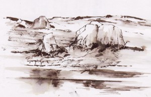
Taking a walk along the cliff paths opened up views of sea and rock which for me have always been exciting subjects. In spring these cliff tops are a riot of colour sea campion, thrift, bluebells, sloe and gorse all in flower. Then there are the colours and textures of the lichen covered rocks themselves that excite. I’m looking for a change of direction more concerned with the small and intimate rather than the grand vista so I wasn’t disappointed.
My sketches on this visit were mostly of rock formations recorded with a brush pen and sepia wash. The brush is ideal for creating the expressive linear forms found in weathered granite. More information relating to colour and texture can be recorded with a digital camera.
Now begins the task of recreating the painterly visual equivalent of tbese experiences in the studio.
Friday, April 28, 2006
Guernsey revisited
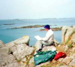
Tomorrow my wife and I are off on a visit to Guernsey. It is ten years since our last visit and I’m quite excited at the prospect. On previous visits I was a madly compulsive sketcher – here I’m sketching the tiny island of Jethou from a rocky headland on Herm. These little islands are lovely unspoilt places and painterly subjects abound.
I’ve been looking at the sketches I made on these early visits. Some are simple pencil line drawings in others I’ve used charcoal for a broader tonal treatment. Then I came across a series of line and wash drawings done with a quill and acrylic ink. I used to carry around some of those plastic cases that came with Fuji 35mm films – ideal for holding small samples of ink in different dilutions. For this visit my sketching kit will be pared down to a few Carb-Othello Pencils and a Pentel colour brush with a water reservoir. Oh and a digital camera of course.
Sadly these sketches of 10 years ago do not generate the excitement they did at the time. Partly my artistic objectives have changed and I tend to delve deeper into my memory than I once did indicating that perhaps I’m becoming more of a dreamer. I quite hope that this next visit will regenerate the visual excitement I once experienced on Guernsey – we shall see.
Thursday, April 27, 2006
Was his stilted eloquence the same before his hair turned grey?
Last week I watched the last programme of ‘Brian Sewell’s Grand Tour’ on Channel 5 and afterwards searched the web for his website – he has three. The tasteless content on two of them was a surprise and I wondered if it was included with his approval or if he was just being sent up. One Shockwave Flash clip shows a young dark-haired Sewell giving a commentary from the ornamental garden of a country house. Was it him or was it a look-alike - the poor quality of the video made it impossible to be sure.
Another page shows the central panel from the Sistine ceiling with him superimposed on the figure of God. The digital make over is a mirror image of the original so the ‘omnipotent Sewell’ becomes left handed in the web version. The left hand is infusing life into a Brian Sewell t-shirt design that serendipitously makes use of the BSI kite logo.
This association of one of the great images of Renaissance art with such tasteless treatment seems out of character. He is after all a writer who has been fiercely critical of similar tackiness produced in the name of art.
The broadcast ended with the old sage sitting in the Danielli enjoying a cup of hot chocolate - this was something he’d first done in his impecunious student years. He was visibly moved by the memory and by the thought that he may not enjoy many more visits to Venice. I’ll stay away from the dreadful web sites that display his name and carry a memory of him enjoying his hot chocolate in the civilised surroundings of the Danieli – that’s where he belongs.
Saturday, April 15, 2006
A Genius who was creative to the end.
Robert Hughes (remember ‘the Shock of the New’?) is the best art critic around and he’s recently written a perceptive review of an exhibition of Goya’s late works. The exhibition is devoted to work done when he was nearly 82 and living in exile in Bordeaux. There is a moving oil, ‘Self Portrait with Dr Arrieta.’ How did he paint that? He is shown ill and ailing and the doctor is encouraging him to drink a potion. A painting carefully composed from memory perhaps.
The most instructive though are the little miniatures he did in watercolour on ivory. Mostly of subjects he observed on the streets of Bordeaux of people odd and tormented. These are not the tight detailed miniatures we’ve grown accustomed to from The Hilliard Society but expressive ones made from blots, dabs and accidental runs of black dilute watercolour. As Hughes observes ‘… they contain some of the most beautiful feats of controlled chance that would be seen in art until the 20th Century.’
‘Man looking for fleas in his shirt.’ is a study of a short-sighted old man trying to remove tne tiny pests. Goya would have been sympathetic to the man’s predicament because he was complaining to friends about his own failing eyesight. The miniature shows that powerful and moving images are made by acute observation and empathy with the subject rather than refined and perfected technique.
You can read Robert Hughes’ review at: Goya's Last Works
There is also a link to the exhibition where you can see the pictures.
Friday, April 07, 2006
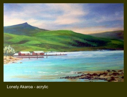
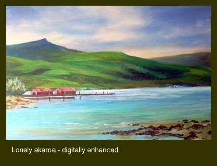
Perhaps ’Lonely Akaroa’ needs an emphatic complement

‘Lonely Akaroa’ is an acrylic painting of a quiet harbour on the Bank’s Peninsula in New Zealand.
I’ve never been entirely satisfied with it though it’s going in a show over Easter. Perhaps I’d missed the trick of using a complementary harmony to enliven the painting.
The painting's dominant colour scheme is green so a touch of red - green’s complement - might help. No need to add more elements to clutter the composition – red walls or red roofs on the sheds on the left might work.

Of course in painting things are never simple. A splash straight out of the Cadmium Red tube will not do. Green’s incline towards either yellow or blue. The complement of a yellow/green needs to be a red inclined to mauve and a blue/green towards orange.
Time to try a digital enhancement on the PC perhaps. Placing the original with the ‘enhanced’ image allows comparison but I’m still not sure which I prefer.
‘Lonely Akaroa’ is an acrylic painting of a quiet harbour on the Bank’s Peninsula in New Zealand.
I’ve never been entirely satisfied with it though it’s going in a show over Easter. Perhaps I’d missed the trick of using a complementary harmony to enliven the painting.
The painting's dominant colour scheme is green so a touch of red - green’s complement - might help. No need to add more elements to clutter the composition – red walls or red roofs on the sheds on the left might work.
Of course in painting things are never simple. A splash straight out of the Cadmium Red tube will not do. Green’s incline towards either yellow or blue. The complement of a yellow/green needs to be a red inclined to mauve and a blue/green towards orange.
Time to try a digital enhancement on the PC perhaps. Placing the original with the ‘enhanced’ image allows comparison but I’m still not sure which I prefer.
Thursday, March 30, 2006
Brian Sewell is a class act – but there’s surely something more to him.
I’ve been entertained by Brian Sewell’s television series on ‘The Grand Tour’ and enjoying his comment on the Italian locations visited by wealthy English gentry in the 17-1800’s. Sewell loves comfort and admires elegance and refinement. A choppy crossing of the Bay of Naples that induces queasiness and the wild untamed crater of Vesuvius are anathema. He’s at his knowledgeable best when commenting on the fine arts using carefully groomed manner.
The trouble is that the measured delivery and slowly enunciated words make him a bit aloof - you never feel you are getting to know the real man. On camera his act does not allow him to say certain words. Quoting a letter from the Earl of Mar describing the boredom of life at the exiled court of the deposed King James he had to explain an obscure word. It means the same as that word which begins with ‘f’ and ends in ‘king’ he explains. The brash Australian critic Robert Hughes would have had no hesitation in saying the word which Sewell took pains to avoid.
Somewhere between Paestum and Venice travelling the length of the Apennines Sewell’s producer persuaded him to talk about incidents that happened when he made this journey in a group of graduate students. Given a room where four boys were expected to sleep in one bed; driving an old Vauxhall Velox up a street so narrow the car almost jammed between the walls of opposite houses to an impasse where the only way out was down a long flight of steps. Reliving the memory brought a subtle change of body language and the haughty manner and measured diction slipped – just a little.
Behind the act there was a guy who had lived and had fun like the rest of us. I was left with the feeling that off camera and relaxed he would be good company.
Monday, March 27, 2006
'Il Divino’ at his magnificent best.
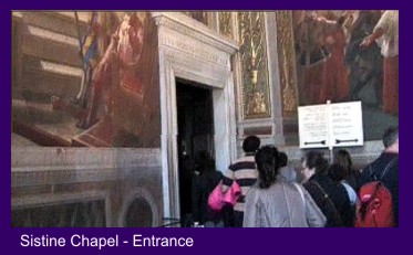
A visit to the Sistine Chapel needs an early start – a bus from Piazza di Porta Maggiore takes a ‘scenic’ route directly through the ancient heart of Rome and crosses the Tiber at the Victor Emmanuell II Bridge to a stop a few minutes away from St. Peter’s Square. It was Wednesday and the Pope was due to conduct mass – the faithful pilgrims crowding into the Square were being welcomed in their native language to appreciative cheers. Fewer then in the queues for the Cappella Sistina perhaps!
 Crowd management at the Vatican Museum entrance is slick and well organised involving airport style security. Once through the admission procedure it is important to remain focussed and not get sidetracked by papal artefacts acquired over the centuries. I kept my eyes raised appropriately heavenwards admiring the gloriously painted ceilings in the corridors. None compares with what Michelangelo achieved in the Sistine though.
Despite the distraction of the moving crowds it is a moving experience to look up at the ceiling then take in the scale of the ‘Last Judgment’ on the altar wall. I grabbed the first vacant space on the marble bench which runs the length of the chapel wall and sat for a long time and gazed. There is too much to take in of course all you can do is savour the atmosphere of the place then come home and study a text with good illustrations.
Tuesday, March 21, 2006
Moses horns seem an odd icon to modern eyes
 Little more than a stone’s throw from the Colosseum is the Church of St. Peter in Chains where there is a treasure that will have to await a future visit. It contains Michelangelo’s statue of Moses carved when he was 30 as part of a monumental tomb for Julius II. Even in a photograph the figure is powerful and striking. The locks of hair that fall from the shoulders are rendered soft and pliable – remarkable given the hard marble material from which they are carved.
The statue bears a mark below the knee apparently caused when Michelangelo threw his chisel at the work and screamed “Why don’t you talk?” The story is plausible given Michelangelo’s fiery temperament and the pitch of emotional intensity at which he worked. Lifelike and powerful though the figure is it is not hard to imagine him being frustrated by some subtle nuance that was eluding him.
Although Michelangelo took painting and sculpture to new heights he was always conscious of tradition. The portrayal of Moses with ‘horns’ was a curious medieval icon which Michelangelo continued to use. They seem strange to a contemporary eye and make Moses appear diabolical.
The origin or meaning of Moses horns is obscure. Exodus records an occasion when after talking with God on Sinai Moses face appeared to shine as he stood before his people. I came across an early painting in the Vatican Museum showing Moses displaying the stone tablets with golden rays emanating from his temples - a primitive painterly ploy to depict Moses shining face perhaps. Maybe Michelangelo was seeking a sculptural alternative to suggest Moses’ shining face.
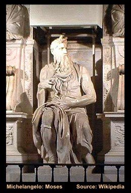 Little more than a stone’s throw from the Colosseum is the Church of St. Peter in Chains where there is a treasure that will have to await a future visit. It contains Michelangelo’s statue of Moses carved when he was 30 as part of a monumental tomb for Julius II. Even in a photograph the figure is powerful and striking. The locks of hair that fall from the shoulders are rendered soft and pliable – remarkable given the hard marble material from which they are carved.
 The statue bears a mark below the knee apparently caused when Michelangelo threw his chisel at the work and screamed “Why don’t you talk?” The story is plausible given Michelangelo’s fiery temperament and the pitch of emotional intensity at which he worked. Lifelike and powerful though the figure is it is not hard to imagine him being frustrated by some subtle nuance that was eluding him.
Although Michelangelo took painting and sculpture to new heights he was always conscious of tradition. The portrayal of Moses with ‘horns’ was a curious medieval icon which Michelangelo continued to use. They seem strange to a contemporary eye and make Moses appear diabolical.
The origin or meaning of Moses horns is obscure. Exodus records an occasion when after talking with God on Sinai Moses face appeared to shine as he stood before his people. I came across an early painting in the Vatican Museum showing Moses displaying the stone tablets with golden rays emanating from his temples - a primitive painterly ploy to depict Moses shining face perhaps. Maybe Michelangelo was seeking a sculptural alternative to suggest Moses’ shining face.
Saturday, March 18, 2006
A Roman Blog
It was Sheila's idea, "I'd love a trip to Rome." she said. So it had to be - I didn't need to be persuaded. A no frills Easy Jet flight from East Midlands Airport got us installed in the Hotel Bled by 12.00 on the day of departure, leaving the rest of the day to explore. In Rome you are immediately made aware of how a civilised society planned and built the city when northern Europe was barbarian. The old aqueducts which once carried water into the city are everywhere and only breached by the main through routes. It was time for an exploration to get our bearings.
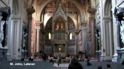
 A ten minute walk along a busy road assailed by the deafening sound of city traffic brought the imposing facade of St. John Lateran into view. The figure of Christ holding the Cross of Redemption holds the central position on the parapet. St. John Lateran is Christendom's earliest basilica dedicated by Constantine to Jesus the Saviour. The interior is a delight - Italian churches are well lit compared with the dark cathedrals of Northern Europe and they make good decorative use of local stone and marble. This Church is a bit special - the adjacent Lateran Palace was the home of the Popes until they were forced into exile to Avignon.
It was Sheila's idea, "I'd love a trip to Rome." she said. So it had to be - I didn't need to be persuaded. A no frills Easy Jet flight from East Midlands Airport got us installed in the Hotel Bled by 12.00 on the day of departure, leaving the rest of the day to explore. In Rome you are immediately made aware of how a civilised society planned and built the city when northern Europe was barbarian. The old aqueducts which once carried water into the city are everywhere and only breached by the main through routes. It was time for an exploration to get our bearings.
 A ten minute walk along a busy road assailed by the deafening sound of city traffic brought the imposing facade of St. John Lateran into view. The figure of Christ holding the Cross of Redemption holds the central position on the parapet. St. John Lateran is Christendom's earliest basilica dedicated by Constantine to Jesus the Saviour. The interior is a delight - Italian churches are well lit compared with the dark cathedrals of Northern Europe and they make good decorative use of local stone and marble. This Church is a bit special - the adjacent Lateran Palace was the home of the Popes until they were forced into exile to Avignon.
Wednesday, March 08, 2006
Watercolour to Acrylic: a seamless change
I find myself evolving a working method which moves between traditional gum Arabic based watercolour and fluid acrylic. Why? – well I like the loose way in which watercolour can be used to begin a painting with colours floated on to wet paper and pushed around or sponged out. Then I like the strong vibrant colours and opacity that are some of the characteristics of acrylic.
It is possible to build up strong vibrant colours in watercolour by repeated application of lots of pure washes but it is a time consuming and hazardous process – the underlayers can all too easily be disturbed. Then there is the attraction of playing off transparency against opacity in different parts of the painting – or floating transparent washes over opaque passages – a method similar to the glazing method frequently used by oil painters.
There remains the question of how to describe the results of this way of working in exhibition catalogues. Mixed media is a description most often used where pastel or chalk is combined with watercolour or gouache so doesn’t appeal. Watercolour/Acrylic is clumsy and neither one thing or the other. So the simple description ‘Water Media’ is the one I think I will use for exhibition catalogue entries - with an explanatory note added to the label on the back.
Wednesday, March 01, 2006
tapping my tablet in Painter IX
Getting to grips with Painter IX and what it offers is clearly going to need time and practice. The range of ‘brush’ styles available is daunting for a start so fitting in the occasional short session between more orthodox painterly activities is not going to work.
The on-line tutorials and the printed ones in the handbook are very helpful but I’ve decided that unless I devise a simple basic working method that enables me to achieve good results the potential of this marvellous piece of software will elude me. Exploring the properties of a range of different brushes in an unsystematic way is not much help.
Using a clone of a photograph with the tracing paper function described in the tutorials proved to be too complicated. So I settled for inserting a clone of the photograph on a new layer above the canvas – but I’ve no idea what happened to the tracing paper. Then adding new layers for each stage of the painting process, sketch, underpainting, and so on gave a hint of a simple working method I could manage.
So my standard procedure for now is to create a ‘canvas’ with a light textured ground, copy a sketch onto a new layer above it and develop the painting on successive layers. Sometimes the linear qualities of the sketch enable simple transparent colour enhancements to be added. With others overworking can cover the original drawing as in an oil or pastel painting.
It’s a marvellous way of developing drawings and colour studies for working up in water media or pastel without getting your hands dirty. As Alwyn Crawshaw used to say “I’m happy with that.”
dianna ponting: pastel workshops
I received an email yesterday from Dianna Ponting a Canadian Pastel Painter who I introduced to readers of my blog back in January. Dianna is givng a series of Pastel Workshops at some venues in the UK and Ireland. Which I am sure will interest lovers of the medium.
Details can be found on her website at: Dianna Ponting: Pastel Workshops
Thursday, February 23, 2006
Criticism: who needs it?
The March 2006 copy of ‘the Artist’ carried a depressing letter from a man who endured devastating criticism of his painting at a local Art Society meeting. The experience completely destroyed his confidence.
I cannot understand why amateur Art Societies persist in holding criticism evenings; in my experience they achieve very little. What usually happens on these occasions is that several members chip in with often contrary opinions and anyone looking for consistent constructive advice rarely gets it. The situation that exists in a well run class or workshop where the tutor offers advice and comment on a one to one basis is far more helpful.
Interestingly the correspondent described the friendliness and willingness to share ideas that existed in the Dunedin Art Society in New Zealand in the 1960’s. I can verify that the same spirit prevails in the new millennium. I’ve made three visits to New Zealand and met members of Art Societies in Dunedin, Taupo and Thames. Sometimes I ‘gatecrashed’ unannounced but I always had a warm welcome. They were interested to see how a Pom with an English watercolour style handled the strange young evolving landforms of their country.
Once attuned to the excitement aroused by what your eye likes painting comes naturally. A more experienced and sympathetic painter occasionally looking over your shoulder to nudge you in an appropriate direction is all you need. Criticism given in a room full of people which makes you colour with embarrassment – you don’t need it.
Wednesday, February 22, 2006
I'm pleased for loretta
 A surprise email from an old friend dropped into my Inbox the other day. It was from Loretta Proctor – a name you could hear more of in time.
I met Loretta when we both used to exhibit at the Malvern Gallery but now she spends her creative time writing. Loretta has just published her first novel set in Greece in WWI.
‘With its authentic background, snapshots of Greek life and tradition, splendid mix of characters and fascinating story line, The Long Shadow is both powerful and engrossing.’ Writes one reviewer.
Here’s a link to her entry on the Amazon Website.
Loretta Proctor: ‘The Long Shadow’
Tuesday, February 21, 2006
summer festival before winter ends
 Each year in June and July my life gets interrupted by the Ludlow Festival. This is because for a number of years my wife has managed wardrobe backstage. Traditionally the main event of the Festival has been an outdoor production of a Shakespeare play in the castle. The Festival runs for two weeks but wardrobe management begins at least one week before the play opens – quite a commitment.
This year having offered to manage the content of the Festival web site it entered my life in January. The web site was developed by the Shropshire Star newspaper and it is huge. Fortunately my remit is only concerned with managing events listing and giving details of accommodation and eating places for visitors. The challenge lies in achieving clear presentation and layout of the text and combining it effectively with images.
Big websites often degenerate into a chaotic jumble of flashing advertising banners which are a distraction. Fortunately visitors to the Ludlow Festival website do not have to cope with them.
Take a look at http://www.ludlowfestival.co.uk/
Monday, February 20, 2006
a brush with corot
I’ve decided that an artist I must study more closely is Corot. I made this decision after watching Tim Marlow’s recent Channel 5 broadcast from the Bowes Museum. A small landscape by Corot, ‘Landscape with Cattle’ grabbed my attention when Tim Marlow introduced it. Though probably painted as a study ‘en plein air’ the direct manner he adopts was daring for its time.
I admired the way he brushed a heavy application of almost white paint into the negative spaces created by the tree trunks. With a few brush marks he adjusted the tone of the sky and brought the trees forward. It is easy to see why he was admired by the Impressionists. Corot’s classical training manifested itself by the way he rendered the light foliage in the middle distance. Delicate flicks of light green paint moving across the picture – leaves caught by a light breeze perhaps? By comparison the brushwork of the majority of the Impressionists looks quite clumsy.
Corot: 'Landscape with Cattle'
Sunday, February 19, 2006
tim marlow on the bowes museum
I always try to watch Tim Marlow’s broadcasts on Channel 5 because he has the gift of talking about art in plain words – due I like to think by being taught English at Denstone by my brother-in-law. His presentation is natural and unpretentious unlike another Courtauld graduate of an older generation Brian Sewell. Sewell is very clever and extremely knowledgeable but his accent and mannerisms grate with me and I’m never sure if they are natural or cultivated to enhance his public persona. Anyway Tim Marlow is like a breath of fresh air in the art world where pretentious language prevails all too frequently.
I watched Tim Marlow’s broadcast about the Bowes Museum yesterday. The first picture that caught my attention was a lovely portrait by Goya – his small portraits are masterpieces. I first got to love them when I visited a major exhibition of Goya’s work in the Musée des Beaux Arts in Lille. The exhibition had a small gallery of these works sensitively hung with the heads at eye level. All the heads were drawn sight size so the faces gazed out and really engaged with the viewer.
Goya also gives his heads room inside the frame – something which many portrait painters neglect. I was with a group of friends once looking at a portrait of a young woman in one of our local arts society exhibitions. The head was close cropped inside the frame so that the figure was cut off just above the sternum. I commented that the head should have been given more space because she looked as if she was gazing out of a prison cell window. Nobody else could see anything wrong with this so I didn’t labour the point except to say go and look at how Goya paints.
Goya: Juan Antonio Melendez Valdes
One of the participants at my watercolour workshops turned up with a copy of one of Alwyn Crawshaw’s books. He showed me a page with a landscape illustration and said he would love to be able to paint trees like that. Well for a beginner that is not an unworthy ambition and at least he had a clear idea of what he wanted to achieve.
Popular though Alwyn is my only reservation about emulating him is that through his entertaining TV series and ‘how to do it books’ the beginner is left with the idea that watercolours are dashed off in half an hour. This direct approach is fine for the plein air painter if that is the way you like to work.
Dashing off a response to the first compulsive eye catch is exciting but there is a deeper magic to be discovered in the studio
So there are sound reasons for taking a more considered approach in the comfort of the studio Elements of the composition can be rearranged and new colour harmonies explored. I’ve been surprised by the strength and depth of colour that can be built up by superimposing several clean pure washes by using more leisurely studio methods.
The oil painter can work up his plein air sketches in the studio – Monet invariably did. The watercolourist though has to begin again with a totally fresh vision.
Friday, February 17, 2006
I ran a series of Watercolour Workshops through autumn 2005 for a group of complete beginners which has sent me back to the basics of watercolour painting – a careful line drawing as a first stage and then laying down a series of controlled transparent washes.
This is a traditional studio method which requires a quite different approach to the direct methods employed in plein air painting. It’s a way of working which I have tended to neglect for some time but returning to it was a marvellous relaxing experience. It needs time it is fatal to apply the next wash until the one beneath is thoroughly dry - the hairdryer gets plenty of use. Better still is to leave the work overnight and greet it like meeting an old friend the next morning!
Another long neglected aspect of using transparent watercolour I discovered was the use of unmixed colours in my washes. A dilute Alizarin Crimson wash applied over the whole picture took the harshness out of a Cerulean Blue sky and brought a subtle harmony to jarring colours in other parts of the composition. I would never have thought of applying this unifying wash had I not left the painting overnight and come to it with a fresh eye the following day.
There is no better way for the beginner to get into watercolour painting than by practising this method.. Another spin off is that on your leisurely way it is easier to accept the challenge of drawing directly with the brush to add variety and enhance the initial outline drawing. It is the most relaxing and rewarding way to paint with watercolour
Subscribe to:
Posts (Atom)