
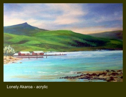
‘Lonely Akaroa’ is an acrylic painting of a quiet harbour on the Bank’s Peninsula in New Zealand.
I’ve never been entirely satisfied with it though it’s going in a show over Easter. Perhaps I’d missed the trick of using a complementary harmony to enliven the painting.
The painting's dominant colour scheme is green so a touch of red - green’s complement - might help. No need to add more elements to clutter the composition – red walls or red roofs on the sheds on the left might work.
Of course in painting things are never simple. A splash straight out of the Cadmium Red tube will not do. Green’s incline towards either yellow or blue. The complement of a yellow/green needs to be a red inclined to mauve and a blue/green towards orange.
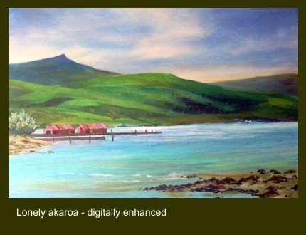
Time to try a digital enhancement on the PC perhaps. Placing the original with the ‘enhanced’ image allows comparison but I’m still not sure which I prefer.
2 comments:
Hmmm! I think using a computer to try out your colour combinations is cheating yourself out of what could be a happy accident.
I'd be inclined to give the sky a light burnt sienna glaze. Leave the shed roofs as they are but make the walls burnt sienna and then give the foreground water a light raw sienna glaze.
Good to have your comments John, thanks. I have to say I try to avoid accidents because with me they are rarely 'happy.' Can't do anything to the original as it's going to an exhibition on Thursday. Your suggestions are worth a try though with a new digital enhancement when I get time. Maybe I'll blog it in a week or so.
Post a Comment