WATERCOLOURS AT TATE BRITAIN
This is a fascinating exhibition which reveals what a versatile medium watercolour is. It's a mistake to judge the exhibition on who is in and who has been left out - better to develop an awareness of how artists have exploited the medium and why they chose it.
It was the medium of choice of artists engaged in scientific exploration exploring the flora and fauna of distant countries. At Ludlow Museum I did a course with Angela Gladwell who was trained as a technical illustrator at the RCA. She used to enthuse over very precise watercolour studies which naturalists used to record the structure and anatomy of rare plants and animals. So my initial interest was the ‘Natural World’ gallery
To my shame I could never work up much enthusiasm for this way of working as experienced from the book illustrations which Angela showed us. Seeing the originals in this exhibition though is a totally different experience. The drawing is so accurate and the colour laid so skilfully it takes your breath away.
My personal favourite in the natural history genre is a really striking watercolour of an osprey, with a fish in its talons, by William Macgillivray. He was a Scottish naturalist who became a very accomplished artist. I think it must have been drawn from a dead bird but drawing on his experience in the field he's placed it against a background of Scottish hills. Again he displays superb draughtsmanship supported by lovely clean washes on the feathers which gradate from a dark VanDyck Brown on the head to Burnt Umber on the scapular and tail feathers. The picture is on the Natural History website in the Macgillivray Art Collection at.
http://www.nhm.ac.uk/jdsml/nature-online/macgillivray/
The most popular section is sure to be the Travel and Topography gallery where you see watercolours developing into romantic evocations of landscape. Many 18th Century watercolourists like Myles Birkett Foster were self taught. But it’s clear that the watercolours were built on close observation and careful drawing. Gradually although the tradition develops into more expressive styles that we’re more used to the graphite drawing is still visible as a kind of support.
There was a lovely watercolour by one of my favourite watercolourists David Cox where although the initial graphite drawing is sketchy he’s firmed up the main shapes with his washes.
http://www.tate.org.uk/servlet/ViewWork?wo...4&tabview=image
Tour d’Horloge, Rouen 1829
On passing I caught a glimpse of a nice mixed media (w’col/gouache/ink) by John Piper. Watercolourists of his generation like Paul Nash, and Eric Ravilious are worth a closer look. I say on passing because after half an hour or so there was fire alert and the building was cleared. So I was spared the horrors of Emin and her contemporaries but I do regret not having more time with my two favourite ‘Blues’.
Arthur Melville ‘The Blue Night, Venice’
http://www.tate.org.uk/servlet/ViewWork?wo...6&tabview=image
and JMW Turner ‘The Blue Rigi, Sunrise’
http://www.tate.org.uk/servlet/ViewWork?wo...9&tabview=image
Don’t be disappointed if your favourites are not shown just immerse yourself in the sheer variety of the medium. The message I got is that if you want to ‘up your game’ brush up your drawing.

Tuesday, April 19, 2011

NORTH ISLAND ROBINS
This is a set of studies of New Zealand robins. I photographed them in a nature reserve on an island in Lake Rotorua. They are heavier than our native robins but they share the same characteristics, alert, fearless and inquisitive if you disturb the ground they immediately fly down to search for insects at your feet. They don't have the red breast of the UK species - you'd take them to be simply black and white until you look closely. In nature blacks are never black neither are whites true white.
For these studies I used acrylic on a prepared canvas board. I drew directly with the brush it's easy to correct outlines and proportions with acrylic making it an ideal medium for sketches and studies. Each study is at a different stage of completion.
Monday, February 21, 2011
Sheila Hancock Brushes Up: The Art of Watercolours
It was good to see Sheila Hancock on BBC1 tonight describing her enthusiasm for watercolour in plain words. Her commentary was a refreshing change from the pretentious obscurity of the language often used by art critics.
I never knew Alexander Cozens ended up in an asylum following what we would now describe as a nervous breakdown. A doctor at the asylum bought his watercolours but the commentery didn't make clear if this was Dr Monro who took Girtin and Turner under his wing when they were young. Dr Monro encouraged them to make copies of his watercolours - probably some by Cozens - to learn their craft.
There were some stunning watercolour sketches done by a soldier who had served Afghanistan and another by the much neglected Paul Nash. He was a war artist too but it was refreshing change to see a watercolour by Nash of a stand of trees on the Wiltshire downs. Refreshing because it was so different from the work of most contemporary watercolourists.
I must download the programme with BBC iPlayer to watch it again.…
It was good to see Sheila Hancock on BBC1 tonight describing her enthusiasm for watercolour in plain words. Her commentary was a refreshing change from the pretentious obscurity of the language often used by art critics.
I never knew Alexander Cozens ended up in an asylum following what we would now describe as a nervous breakdown. A doctor at the asylum bought his watercolours but the commentery didn't make clear if this was Dr Monro who took Girtin and Turner under his wing when they were young. Dr Monro encouraged them to make copies of his watercolours - probably some by Cozens - to learn their craft.
There were some stunning watercolour sketches done by a soldier who had served Afghanistan and another by the much neglected Paul Nash. He was a war artist too but it was refreshing change to see a watercolour by Nash of a stand of trees on the Wiltshire downs. Refreshing because it was so different from the work of most contemporary watercolourists.
I must download the programme with BBC iPlayer to watch it again.…
Monday, January 24, 2011


I've also warmed up the background by working pure colours into a wet ground of Chinese White and letting them run. To tone in with this I've also made the bird's plumage warmer and worked up details. The pose proved to be more difficult than I expected so I'm pleased it is now finished.
Thursday, December 30, 2010
OUR MIGRANT BIRDS HAVE FLOWN
The snow brought a succession of flocks of Redwings and Fieldfares, to feed on our crab apples and holly berries. By Christmas Day the holly had been stripped of berries but some Crab Apples survived on the ground for the ground feeders the blackbirds and Chaffinches. The snow covered ground brought one or two pheasant and the ubiquitous pigeons to clear up the seed dropped from the feeders.
Now the snow has gone things are strangely quiet just the daily visits mostly from Blue and Great Tits. I've got material for paintings that will keep me occupied for some time - so I'm happy!
The snow brought a succession of flocks of Redwings and Fieldfares, to feed on our crab apples and holly berries. By Christmas Day the holly had been stripped of berries but some Crab Apples survived on the ground for the ground feeders the blackbirds and Chaffinches. The snow covered ground brought one or two pheasant and the ubiquitous pigeons to clear up the seed dropped from the feeders.
Saturday, December 18, 2010
SHEILA FELL
Browsing the art shelves in my local library I was surprised and delighted to find a monograph on the Cumbrian painter Sheila Fell. She was a protégé of L S Lowry who supported her and bought her work. Her career as a painter was remarkable for a working class girl - her father was a miner. Determined to break away from life in Aspatria on the Solway where she was born she won a scholarship to Carlisle College of Art and then went to London to study painting at St. Martins.
This must have taken tremendous determination as she was virtually penniless. She met Lowry after one of her London exhibitions when he bought two of her paintings. He became a lifelong friend and thought her the best landscape painter of the 20th Century. It was Lowry who encouraged her to send in to the RA. "You must join the RA Miss Fell they are a nice bunch of fellows and they make a wonderful cup of tea." Lowry urged. She was one of the youngest painters to be elected ARA and duly became a full RA and served on the selection committee.
Her inspiration was always the Cumbrian landscape where she grew up. ""I want to live till I'm 104. I've promised myself I will. It's what keeps me going when I worry if I'll ever have enough time to do all the paintings in my head." she told an interviewer. Ironically the remark was broadcast the day after she died after falling downstairs at her flat.
The link opens up a feature about her on the BBC Visual Arts Archive which carries a recorded item for download to 'Real Player'
http://www.bbc.co.uk/radio4/womanshour/2005_14_sat_01.shtml
Another link of interest posted by a member on Art and Artistry is:
Sheila Fell: a-passion-for-paint
Browsing the art shelves in my local library I was surprised and delighted to find a monograph on the Cumbrian painter Sheila Fell. She was a protégé of L S Lowry who supported her and bought her work. Her career as a painter was remarkable for a working class girl - her father was a miner. Determined to break away from life in Aspatria on the Solway where she was born she won a scholarship to Carlisle College of Art and then went to London to study painting at St. Martins.
This must have taken tremendous determination as she was virtually penniless. She met Lowry after one of her London exhibitions when he bought two of her paintings. He became a lifelong friend and thought her the best landscape painter of the 20th Century. It was Lowry who encouraged her to send in to the RA. "You must join the RA Miss Fell they are a nice bunch of fellows and they make a wonderful cup of tea." Lowry urged. She was one of the youngest painters to be elected ARA and duly became a full RA and served on the selection committee.
Her inspiration was always the Cumbrian landscape where she grew up. ""I want to live till I'm 104. I've promised myself I will. It's what keeps me going when I worry if I'll ever have enough time to do all the paintings in my head." she told an interviewer. Ironically the remark was broadcast the day after she died after falling downstairs at her flat.
The link opens up a feature about her on the BBC Visual Arts Archive which carries a recorded item for download to 'Real Player'
http://www.bbc.co.uk/radio4/womanshour/2005_14_sat_01.shtml
Another link of interest posted by a member on Art and Artistry is:
Sheila Fell: a-passion-for-paint
Monday, November 22, 2010
PAINTING BIRDS
It was familiarity with Charles Tunnicliffe's watercolour paintings which aroused my interest in drawing and painting birds. I got to know his work from his published illustrations but the first time I saw the originals was in an exhibition in the Oriel Gallery at Llangefni on Anglesey. His draughtsmanship and control of the watercolour medium was breathtaking. Robert Gillmor's collection of CT's drawings 'A Sketchbook of Birds' gives an insight into his working methods but I really wanted to read a book 'Bird Portraiture' which he published in 1945. I was delighted to buy a second hand copy quite cheaply from an Amazon bookseller and I wasn't disappointed.
CT recognised that birds even if you take them out of their natural environment are still have an intrinsic beauty just like flowers but he thought it important for the artist to interpret his bird subjects in terms of basic graphic elements.
It was familiarity with Charles Tunnicliffe's watercolour paintings which aroused my interest in drawing and painting birds. I got to know his work from his published illustrations but the first time I saw the originals was in an exhibition in the Oriel Gallery at Llangefni on Anglesey. His draughtsmanship and control of the watercolour medium was breathtaking. Robert Gillmor's collection of CT's drawings 'A Sketchbook of Birds' gives an insight into his working methods but I really wanted to read a book 'Bird Portraiture' which he published in 1945. I was delighted to buy a second hand copy quite cheaply from an Amazon bookseller and I wasn't disappointed.
CT recognised that birds even if you take them out of their natural environment are still have an intrinsic beauty just like flowers but he thought it important for the artist to interpret his bird subjects in terms of basic graphic elements.
'It is with the creation of a very different kind of beauty that this book will try to deal, - that of line and form and colour on paper or canvas; a work of art in fact which, we hope will have its own particular claim to be beautiful, not because it has slavishly imitated the form and colour of the bird, but because it has used the bird and controlled it to create a new beauty.'
When you study CT's they owe little to 'realism' but a great deal to careful composition and colour harmony.
Thursday, November 11, 2010

BUZZARD STUDIES
I've been fortunate this summer to be able to observe a young buzzard who took to perching on the goalposts on the village playing field. He arrived regularly about 8.00am and flew of when the field started to be used. While he was using the goalposts as a lookout he was still enough to be sketched through a telescope When he took off to browse for ants with the jackdaws I had to take photographs.
Saturday, November 06, 2010
NESTING KITTIWAKES

This is a working study of nesting Kittiwakes. I photographed them through a telephoto lense from the boat going across to the Farne Islands. There seemed to be dozens of birds on the cliffs and I've composed the sketch by using four from two different photographs.
I've used a 160gsm Ingres grey pastel paper and I began the sketch using Carb Othello pastel pencils. I decided that using watercolour for the birds would speed things up. Using watercolour on toned paper is an occasion when body colour comes into its own. If you decide to try this you will be in good company Turner used the technique on a blue sugar papar.
The white plumage of the birds is basically pure Titanium White and the grey feathers are painted with a Cobalt/Titanium mix. Ivory Black was used for the tail feathers and eyes. I would never use a pure Kolinsky Sable for this technique. I always use Rosemary & Co brushes these days and I've used a Series 401 Sable Blend for the birds and the transparent washes on the cliff face. It's sometimes useful to have a more springy brush and I found Rosemary's Shiraz Round was ideal for the nesting material.
For this way of sketching I owe something to Keith Brockie the Scottish wildlife artist. I managed to pick up 'One Man's Island' a book he wrote as a young man when he had an artists residency on the Isle of May in the Firth of Forth. It's a book of pencil studies of wildlife he observed in the field and worked up later in the studio. Charles Tunnicliffe worked in a similar way.

This is a working study of nesting Kittiwakes. I photographed them through a telephoto lense from the boat going across to the Farne Islands. There seemed to be dozens of birds on the cliffs and I've composed the sketch by using four from two different photographs.
I've used a 160gsm Ingres grey pastel paper and I began the sketch using Carb Othello pastel pencils. I decided that using watercolour for the birds would speed things up. Using watercolour on toned paper is an occasion when body colour comes into its own. If you decide to try this you will be in good company Turner used the technique on a blue sugar papar.
The white plumage of the birds is basically pure Titanium White and the grey feathers are painted with a Cobalt/Titanium mix. Ivory Black was used for the tail feathers and eyes. I would never use a pure Kolinsky Sable for this technique. I always use Rosemary & Co brushes these days and I've used a Series 401 Sable Blend for the birds and the transparent washes on the cliff face. It's sometimes useful to have a more springy brush and I found Rosemary's Shiraz Round was ideal for the nesting material.
For this way of sketching I owe something to Keith Brockie the Scottish wildlife artist. I managed to pick up 'One Man's Island' a book he wrote as a young man when he had an artists residency on the Isle of May in the Firth of Forth. It's a book of pencil studies of wildlife he observed in the field and worked up later in the studio. Charles Tunnicliffe worked in a similar way.
Sunday, October 31, 2010
GREY WAGTAILS Watercolour and bodycolour 31 x 41cm on 300gsm Arches.Not.


This is a sheet of Grey Wagtail studies made from two skins. The annotated sketch is the foreground bird in the watercolour and the far one is based on the top right sketch. I'd never actually seen a wagtail turn its head like the centre right bird which was drawn from a second skin - so I've not made use of it yet.
Bird painters seem to fall into two categories - first there are those who make detailed anatomical studies for identification and recording. Angela Gladwell - who runs courses at Ludlow Museum - was trained at the RCA as a technical illustrator used to be very keen on this kind of painting. I did two courses with her from which I learned a lot and I acknowledge the help I received from her tuition. The second class of bird painters try to capture their subjects in their natural surroundings. So Peter Scott, Charles Tunnicliffe from a previous generation, and contemporaries like Lars Jonsson, Keith Brockie and Darren Woodhead point me in the direction I want to go.

Having done the research and assembled all of the elements the most satisfying stage, for me, is bringing them all together in the studio.
Friday, October 29, 2010
RAILWAY ART - A NOSTALGIC GLIMPSE INTO A LOST AGE.
One aspect of the steam train era I get nostalgic about is the poster and carriage art. Before nationalisation the railway companies commissioned artists to produce posters to promote attractive destinations served by rail. There was once a fashion for showing prints of watercolour paintings in carriage compartments. Jack Merriott received several commissions both for posters and carriage prints.
Ceredigion Museum has a nice example of a poster designed by Merriott and the draft sketch design he submitted for it.


Here's a nice example of his watercolour of Mousehole, Cornwall used for a carriage print.

One aspect of the steam train era I get nostalgic about is the poster and carriage art. Before nationalisation the railway companies commissioned artists to produce posters to promote attractive destinations served by rail. There was once a fashion for showing prints of watercolour paintings in carriage compartments. Jack Merriott received several commissions both for posters and carriage prints.
Ceredigion Museum has a nice example of a poster designed by Merriott and the draft sketch design he submitted for it.


Here's a nice example of his watercolour of Mousehole, Cornwall used for a carriage print.

Thursday, October 28, 2010
A WATERCOLOUR PAINTER IN THE ENGLISH TRADITION
I've been fortunate over several years to have been given advice from more senior members of the Ludlow Art Society. One I remember with particular affection was Kath Edfryn-Jones - she was Welsh, she taught art at Hafren College in Newtown and her watercolour presentations were always very informative. I once asked her to tell me of a good book on watercolour methods. Without hesitation she recommended 'Discovering Watercolour' by Jack Merriot. "You needn't bother looking at any other." she said. At that time I'd never heard of him and the book was long out of print. Edward Wesson was everybodys favourite and Ron Ranson wielding his Japanese Hake was beginning to make his mark.
I was lucky though and found a second hand copy of Jack Merriot's book in a Tewkesbury bookshop. The book grew from a correspondence course which Jack Merriot devised with his friend Ernest Savage. So it was carefully structured placing initial emphasis on good observational drawing. Successive chapters then dealt with three basic methods first Line and Wash. Secondly The Direct Method which involves a direct attack on the main centre of interest on dry paper. This is a method for responding to the excitement of the first compulsive eye-catch with strong colour. Finally he describes The Controlled Wash method where the painting is built up with superimposed washes on slightly dampened paper. It's the method most frequently advocated by contemporary watercolourists - notably David Curtis.
When I'm in watercolour mode I often look at Trevor Chamberlain's plein air watercolours. They are usually very small 7" x 10" or 10" x 14" and display an attractive controlled looseness - where does he get it from?
There's an element of Merriot's Direct Method about them. I was pleased to discover Trevor acknowledged the influence of Jack Merriott in his early years in his book 'Light and Atmosphere in Watercolour.' One of Merriot's wartime watercolours showing St Paul's after the Blitz is printed on page16.
This image of Merriot's painting appears on the Wapping Group of Artists website.

I've been fortunate over several years to have been given advice from more senior members of the Ludlow Art Society. One I remember with particular affection was Kath Edfryn-Jones - she was Welsh, she taught art at Hafren College in Newtown and her watercolour presentations were always very informative. I once asked her to tell me of a good book on watercolour methods. Without hesitation she recommended 'Discovering Watercolour' by Jack Merriot. "You needn't bother looking at any other." she said. At that time I'd never heard of him and the book was long out of print. Edward Wesson was everybodys favourite and Ron Ranson wielding his Japanese Hake was beginning to make his mark.
I was lucky though and found a second hand copy of Jack Merriot's book in a Tewkesbury bookshop. The book grew from a correspondence course which Jack Merriot devised with his friend Ernest Savage. So it was carefully structured placing initial emphasis on good observational drawing. Successive chapters then dealt with three basic methods first Line and Wash. Secondly The Direct Method which involves a direct attack on the main centre of interest on dry paper. This is a method for responding to the excitement of the first compulsive eye-catch with strong colour. Finally he describes The Controlled Wash method where the painting is built up with superimposed washes on slightly dampened paper. It's the method most frequently advocated by contemporary watercolourists - notably David Curtis.
When I'm in watercolour mode I often look at Trevor Chamberlain's plein air watercolours. They are usually very small 7" x 10" or 10" x 14" and display an attractive controlled looseness - where does he get it from?
There's an element of Merriot's Direct Method about them. I was pleased to discover Trevor acknowledged the influence of Jack Merriott in his early years in his book 'Light and Atmosphere in Watercolour.' One of Merriot's wartime watercolours showing St Paul's after the Blitz is printed on page16.
This image of Merriot's painting appears on the Wapping Group of Artists website.

Sunday, October 24, 2010

VALLEY IN THE DOLOMITES 2
Here's the finished half-sheet watercolour. I've made use of Titanium White as a bodycolour because it is more opaque than the traditional Chinese(Zinc) White. I'm not someone who holds strictly to the 'pure transparent' doctrine. The use of white 'bodycolour' has always been part of the watercolour tradition and it's use enhances the possibilities of the medium. You can play off opaque passages against transparent ones as Ken Howard does and it can be used to create crumbly textures on rocks and old walls. Only when it is thickly laid on like whitewash does it look out of place.
 VALLEY IN THE DOLOMITES
This is a view near Siror done on holiday in the Dolomites some years ago. I've got a stretched sheet of Waterford on which I'm going to make the preliminary drawing for a watercolour.
The composition perhaps needs a little attention. I'm going to push the donkeys further back to simplify the foreground - I may include just one. Then I think the building needs more space so that will have to go further back too. Maybe a hint of peaks at the head of the valley would be nice.
Saturday, October 23, 2010
 TREVI FOUNTAIN
Digital cameras are a great aid for the painter. I'm showing a way of using a digital camera to help paint a watercolour of a complex subject. The subject is the Trevi Fountain in Rome which gets so crowded I would find it impossible to paint on the spot. I had to resort to taking lots of photographs.
The first stage is to crop the photograph to find a good composition. I did this in Corel Photopaint an alternative to Photoshop. These programs also let you superimpose a grid. This is useful when you have a complicated subject. Here's a screen grab of the active Photopaint window
 I set the grid size to one quarter of the width of the paper I was using. It's easy then to feintly draw the grid on the paper and make a careful outline drawing. Using a grid to transfer an image to paper or canvas is a well established method.
I painted the watercolour with the image displayed on a laptop. It's obviously not a straight copy. I've left out much of the background detail so that the focus of interest is the falling water. This was painted by first using masking fluid and later using 'drybrush' (ie with little paint on the brush and dragging it sideways rather than using the point.) This way you can exploit the grain of the paper to achieve a nice broken texture.I used a heavy Waterford rough.

These gulls were scavenging on the sea front at Ostend. It was December last uear, bitterly cold and I was with friends. Not the occasion for sitting sketching so I took lots of photographs. This sheet of studies was made in preparation for a composition. Trouble is I can't decide what species of gull they are. My best guess - based on the shape of the bill and the colour of the legs - is that they're immature Blackbacks.
 GARDEN VISITOR
This grey squirrell was under the apple tree in my garden - an easy target for a 300mm lens I took 6 photographs and based this drawing on one of them.
I've used Wollf Carbon Pencils - Artifolk sell them in sets of B, 2B, 4B, 6B and they make rich black marks. They don't go shiny like graphite when applied thickly. I was taught a very traditional technique in the Life Room - tones built up gently and gradually with hachures. It's a lovely way of drawing
Friday, September 24, 2010

DIGITAL STUDY AFTER DEGAS
This study is taken from one of Degas’ late pastels. He did a series of them at the end of his life when he was too ill to go to the ballet and his eyesight was failing. They are some of the best things he ever did.
I love these late pastels of Degas and I’ve made two or three studies of different ones using conventional pastels on Tiziano paper. Although this digital study doesn’t really capture the true feel of pastel it is a good way of studying the technique of a great artist – you’re not using up paper and chalk.
I suppose applying the computer in this way is a bit like using a flight simulator when learning to fly a plane.
 For comparison I’ve posted another study this time in pastel. The source image is in 'Degas Pastels' by Alfred Werner and I've taked the foreground figure from the composition.
This time Degas used a more painterly approach which is reflected in the study. I can’t be sure what Degas underpainting was like but for the purpose of this exercise I used an acrylic ground on a heavy cartridge paper.
Thursday, September 23, 2010


Tuesday, October 06, 2009
SNOWY OWL AGAIN

It was good to get back to this project. I’ve completed a quick composition sketch from the drawings. Charles Tunnicliffe did a lovely large watercolour of a snowy owl – it’s in ‘Tunnicliffe’s Bird Life.’ His model was a dead bird shot on Anglesea and he’s used the location where it was shot as a background. The background here is loosely taken from a charcoal drawing made in the Lake District – I’m not sure what the skyline is it might be Crinkle Crags or possibly Coniston Old Man.
I’ve used watercolour and kept the background deliberately loose – the bird will eventually get more detailed treatment. The bird in the Rare Breeds collection was large standing approx 24in. It really needs a full watercolour sheet like Tunnicliffe used. I’m unhappy working on such a large scale in watercolour so i think I’ll go for Heavy Body Acrylic on board.
I forgot to add that although its predominantly pure watercolour there are touches of White Acrylic Ink left foreground and on the distant snow patches. In fact there are also some touches on the bird - got carreiad away rather!

It was good to get back to this project. I’ve completed a quick composition sketch from the drawings. Charles Tunnicliffe did a lovely large watercolour of a snowy owl – it’s in ‘Tunnicliffe’s Bird Life.’ His model was a dead bird shot on Anglesea and he’s used the location where it was shot as a background. The background here is loosely taken from a charcoal drawing made in the Lake District – I’m not sure what the skyline is it might be Crinkle Crags or possibly Coniston Old Man.
I’ve used watercolour and kept the background deliberately loose – the bird will eventually get more detailed treatment. The bird in the Rare Breeds collection was large standing approx 24in. It really needs a full watercolour sheet like Tunnicliffe used. I’m unhappy working on such a large scale in watercolour so i think I’ll go for Heavy Body Acrylic on board.
I forgot to add that although its predominantly pure watercolour there are touches of White Acrylic Ink left foreground and on the distant snow patches. In fact there are also some touches on the bird - got carreiad away rather!
Monday, September 28, 2009
SNOWY OWL

These sketches were made at the Rare Breeds Centre at Kington, Herefordshire. This seemed a very shy, nervous bird who didn’t like being sketched! As soon as I made a few cursory outlines it would flit to the back of it’s enclosure and seek cover behind a thick tree trunk. So the details were completed from several digital photographs.
Last week I acquired a good second hand copy of ‘Tunnicliffe’s Birdlife’ which had a watercolour of a Snowy Owl. He was presented with a bird that had been shot just inland from Carmel Head on Anglesea. He painted the bird against a background of the Anglesea coast with an offshore lighthouse.
This set me wondering about a background I might use for a portrait of the bird in this sketch. The Snowy Owl is an Arctic bird so a winter Welsh or Lake District scene may be appropriate.

These sketches were made at the Rare Breeds Centre at Kington, Herefordshire. This seemed a very shy, nervous bird who didn’t like being sketched! As soon as I made a few cursory outlines it would flit to the back of it’s enclosure and seek cover behind a thick tree trunk. So the details were completed from several digital photographs.
Last week I acquired a good second hand copy of ‘Tunnicliffe’s Birdlife’ which had a watercolour of a Snowy Owl. He was presented with a bird that had been shot just inland from Carmel Head on Anglesea. He painted the bird against a background of the Anglesea coast with an offshore lighthouse.
This set me wondering about a background I might use for a portrait of the bird in this sketch. The Snowy Owl is an Arctic bird so a winter Welsh or Lake District scene may be appropriate.
Sunday, September 27, 2009
KEEPING AN EYE ON THE BIRDS
 This is a sketchbook page of moorhen studies drawn from digital photographs taken on a recent walk along the Worcs. Birmingham canal. They are based on images from several photographs and the beauty of digital images as reference for wildlife is that you can zoom in to individual birds and observe visually useful details.
Charles Tunnicliffe did hundreds of notes like this in sketchbooks some of which were published a few years ago and were very popular - he compiled his from life returning each evening to make more refined compositional studies from notes made in the field. I think it's a practice worth following even if the starting point is a digital photograph. To catch the life of any living creature it's prudent to make some preliminary sketches rather than to go straight in and try to produce a finished painting.
Incidentally the drawings were made with a 2b Carbon Pencil and for the colourwork I used Caran D'Ache Neoart watersoluble wax crayons. I'm trying these out and I've created washes by taking the colour off the crayon with a wet brush just as you would from a cake of watercolour. As a bonus you can also draw with them - see the seed heads of the rushes.
 This is a sketchbook page of moorhen studies drawn from digital photographs taken on a recent walk along the Worcs. Birmingham canal. They are based on images from several photographs and the beauty of digital images as reference for wildlife is that you can zoom in to individual birds and observe visually useful details.
Charles Tunnicliffe did hundreds of notes like this in sketchbooks some of which were published a few years ago and were very popular - he compiled his from life returning each evening to make more refined compositional studies from notes made in the field. I think it's a practice worth following even if the starting point is a digital photograph. To catch the life of any living creature it's prudent to make some preliminary sketches rather than to go straight in and try to produce a finished painting.
Incidentally the drawings were made with a 2b Carbon Pencil and for the colourwork I used Caran D'Ache Neoart watersoluble wax crayons. I'm trying these out and I've created washes by taking the colour off the crayon with a wet brush just as you would from a cake of watercolour. As a bonus you can also draw with them - see the seed heads of the rushes.
Monday, November 19, 2007
Today's Wake-up Call

When preparing for a day in the studio it's nice to do a practice 'warm up' study from a sketchbook. Today I came across this little sketch done at a favorite location. It caught my eye though it was done some time ago - I've already used it for a watercolour called 'The ending of the day – Aberdovey'

Seeing the sketch again I realise how far the colours in the finished watercolour had drifted away from the original. In taking the original sketch further I've tried to recapture the original mood. I did think of framing this but I don't think it's good enough. I'm unhappy that the original pencil drawing is distracting. So it will have to be a fresh start – no bad thing a new beginning might lead to further discoveries. The wake-up practice has helped me get my eye in.

When preparing for a day in the studio it's nice to do a practice 'warm up' study from a sketchbook. Today I came across this little sketch done at a favorite location. It caught my eye though it was done some time ago - I've already used it for a watercolour called 'The ending of the day – Aberdovey'

Seeing the sketch again I realise how far the colours in the finished watercolour had drifted away from the original. In taking the original sketch further I've tried to recapture the original mood. I did think of framing this but I don't think it's good enough. I'm unhappy that the original pencil drawing is distracting. So it will have to be a fresh start – no bad thing a new beginning might lead to further discoveries. The wake-up practice has helped me get my eye in.
Wednesday, November 14, 2007
Why I always stretch paper
 This is a plein air sketch I did a few weeks ago at our week-end workshop at Clunton. I was using 300gsm Fabriano Artistico Not. It's a nice pure cotton paper but with a rather bland grain. I was working with the sheet held on a piece of mdf by two bulldog clips. Since the workshop it has been stored flat between the pages of a sketchbook.
After a day in the field you face the dilemma of which of the sketches to taken further. Usually I hold the best as reference for the future. A few like this I decide to take further. It's obvious from the photograph that the sheet has cockled. It's tempting to try a quick fix by taping the sides down with masking tape but that could cause the centre to lift and there will still be some cockling when the masking tape is removed.
Others may have a different solution but the only sure way to achieve the nice flat surface I like to work on is to stretch. With partly completed work I only spray water on the back before taping the sides with good old gumstrip.
Incidentally there's an unightly 'bloom' just above the ladder on the left. This was once regarded as a serious fault but I notice Shirley Trevena frequently makes use of the effect in her paintings. How taste changes! I might be tempted to exploit the 'fault' in this work and call it a 'happy accident.' They sometimes happen don't they?
 This is a plein air sketch I did a few weeks ago at our week-end workshop at Clunton. I was using 300gsm Fabriano Artistico Not. It's a nice pure cotton paper but with a rather bland grain. I was working with the sheet held on a piece of mdf by two bulldog clips. Since the workshop it has been stored flat between the pages of a sketchbook.
After a day in the field you face the dilemma of which of the sketches to taken further. Usually I hold the best as reference for the future. A few like this I decide to take further. It's obvious from the photograph that the sheet has cockled. It's tempting to try a quick fix by taping the sides down with masking tape but that could cause the centre to lift and there will still be some cockling when the masking tape is removed.
Others may have a different solution but the only sure way to achieve the nice flat surface I like to work on is to stretch. With partly completed work I only spray water on the back before taping the sides with good old gumstrip.
Incidentally there's an unightly 'bloom' just above the ladder on the left. This was once regarded as a serious fault but I notice Shirley Trevena frequently makes use of the effect in her paintings. How taste changes! I might be tempted to exploit the 'fault' in this work and call it a 'happy accident.' They sometimes happen don't they?
Tuesday, September 18, 2007
Peter De Wint
I’ve just been reading about Peter De Wint in the October issue of the A&I mag. It was a surprise that the article described him as ‘almost unknown today’ because his work is represented in many public collections and careful study of his work is a ‘must’ for anybody who is serious about painting in watercolour.
The main lesson to be learned from him is the fundamental importance of sound drawing. He was a superb draughtsman and much of his work is constructed on a sound underdrawing. There’s a marvellous example, ‘West Front of Lincoln Cathedral,’ featured in the A&I article. In this painting - apart from the fine draughtsmanship - there’s a little wisp of smoke on the left deftly applied with bodycolour which is a masterly touch.
Here are links to a few more examples:
Constable Tower Dover Castle – Fitzwilliam Museum, Cambridge.
Fine drawing in the architecture combined with looser handling in the foreground.
Sunset – Fitzwilliam Museum, Cambridge.
A lovely painting evoking a quiet mood at the endng of the day.
Sheltering from the sun – Birmingham Museum & art Galleries.
Unfinished perhaps. It has the feel of a plein air study with lovely fluent directly painted brushwork.
I’ve just been reading about Peter De Wint in the October issue of the A&I mag. It was a surprise that the article described him as ‘almost unknown today’ because his work is represented in many public collections and careful study of his work is a ‘must’ for anybody who is serious about painting in watercolour.
The main lesson to be learned from him is the fundamental importance of sound drawing. He was a superb draughtsman and much of his work is constructed on a sound underdrawing. There’s a marvellous example, ‘West Front of Lincoln Cathedral,’ featured in the A&I article. In this painting - apart from the fine draughtsmanship - there’s a little wisp of smoke on the left deftly applied with bodycolour which is a masterly touch.
Here are links to a few more examples:
Constable Tower Dover Castle – Fitzwilliam Museum, Cambridge.

Fine drawing in the architecture combined with looser handling in the foreground.
Sunset – Fitzwilliam Museum, Cambridge.

A lovely painting evoking a quiet mood at the endng of the day.
Sheltering from the sun – Birmingham Museum & art Galleries.
Unfinished perhaps. It has the feel of a plein air study with lovely fluent directly painted brushwork.
Thursday, August 16, 2007
The End of an Era
Two events this summer have made me aware of the passing of a generation of artists who were an inspiration. The first was the NEAC exhibition in Hereford which commemorated the life and work of John Ward. He had many admirers in the circle I befriended when I began to paint seriously. I went to see the exhibition again this week partly to admire John Ward’s pen and wash drawings of Rome and also to enjoy the diversity of the work by a group of painters who are working in the figurative tradition.
The next event was prompted by a flier which dropped out of the September issue of ‘The Artist’ magazine. It announced the publication of a book celebrating the life and work of James Fletcher-Watson. His loose rather understated watercolours in the Wesson – Seago manner had many followers among the older Ludlow Art Soc members when I began exhibiting. J F-W was an architect and for me he was at his best when painting buildings. Although he still has many admirers and a lifetime of achievement that will make copies of the Hallsgrove monograph greatly prized he belongs to an era that is passing.
It was an article by Frank Whitford one of the judges of the Singer and Friedlander Watercolour competition in the same issue of ‘The Artist’ that confirmed this opinion. He was writing about his favourite entries amongst the shortlisted prizewinners. Contemporary watercolour now admits the use of any waterbased medium whether opaque or transparent. Though this development would have upset Wesson who would never countenance the use of Chinese White I don’t have a problem with incorporating gouache or acrylic in a watercolour painting.
I have to say though Frank Whitford’s favourites are not to my taste but then taste is a subjective matter anyway. I’ve always enjoyed the work of David Curtis and David Prentice – both past prizewinners – as among the best exponents of contemporary watercolour. I’m pleased that David Curtis is now on the S&F panel of judges and that David Prentice is a 2007 prizewinner.
Two events this summer have made me aware of the passing of a generation of artists who were an inspiration. The first was the NEAC exhibition in Hereford which commemorated the life and work of John Ward. He had many admirers in the circle I befriended when I began to paint seriously. I went to see the exhibition again this week partly to admire John Ward’s pen and wash drawings of Rome and also to enjoy the diversity of the work by a group of painters who are working in the figurative tradition.
The next event was prompted by a flier which dropped out of the September issue of ‘The Artist’ magazine. It announced the publication of a book celebrating the life and work of James Fletcher-Watson. His loose rather understated watercolours in the Wesson – Seago manner had many followers among the older Ludlow Art Soc members when I began exhibiting. J F-W was an architect and for me he was at his best when painting buildings. Although he still has many admirers and a lifetime of achievement that will make copies of the Hallsgrove monograph greatly prized he belongs to an era that is passing.
It was an article by Frank Whitford one of the judges of the Singer and Friedlander Watercolour competition in the same issue of ‘The Artist’ that confirmed this opinion. He was writing about his favourite entries amongst the shortlisted prizewinners. Contemporary watercolour now admits the use of any waterbased medium whether opaque or transparent. Though this development would have upset Wesson who would never countenance the use of Chinese White I don’t have a problem with incorporating gouache or acrylic in a watercolour painting.
I have to say though Frank Whitford’s favourites are not to my taste but then taste is a subjective matter anyway. I’ve always enjoyed the work of David Curtis and David Prentice – both past prizewinners – as among the best exponents of contemporary watercolour. I’m pleased that David Curtis is now on the S&F panel of judges and that David Prentice is a 2007 prizewinner.
Friday, August 03, 2007
At the New English
Happened to be in Hereford last week and was delighted to discover an exhibition by members of the New English Art club in the Museum and Art Gallery. It seemed to have been staged in memory of John Ward CBE, RA, NEAC who died earlier this year. He was born and educated in Hereford before going on to the RCA after service in the Royal Engineers in WW2. He left a set of drawings which he made on active service to the Hereford museum which were on display.
The NEAC was founded in1886 - one of founder members was Sickert he and others imported impressionist and realist ideas from France. Augustus John’s work aroused a concern for sensitive draughtsmanship and his influence is still traced in the work of current members.
The NEAC claims to represent the very best of contemporary British figurative painting. There are some fine medium sized oil paintings that look well in a large gallery space and are well worth studying. There’s also encouragement to be gained by seeing the smaller works painted with a directness of touch maybe as studies. There were two little oils of Padstow by Tom Coates – they left me with the feeling that with a little effort and practice I could pull off something almost as good! A touch of conceit? – perhaps but at least Tom's paintings inspired me to push myself a lttle further.
The exhibition runs till 29th August - do get to see it if you can.
Happened to be in Hereford last week and was delighted to discover an exhibition by members of the New English Art club in the Museum and Art Gallery. It seemed to have been staged in memory of John Ward CBE, RA, NEAC who died earlier this year. He was born and educated in Hereford before going on to the RCA after service in the Royal Engineers in WW2. He left a set of drawings which he made on active service to the Hereford museum which were on display.
The NEAC was founded in1886 - one of founder members was Sickert he and others imported impressionist and realist ideas from France. Augustus John’s work aroused a concern for sensitive draughtsmanship and his influence is still traced in the work of current members.
The NEAC claims to represent the very best of contemporary British figurative painting. There are some fine medium sized oil paintings that look well in a large gallery space and are well worth studying. There’s also encouragement to be gained by seeing the smaller works painted with a directness of touch maybe as studies. There were two little oils of Padstow by Tom Coates – they left me with the feeling that with a little effort and practice I could pull off something almost as good! A touch of conceit? – perhaps but at least Tom's paintings inspired me to push myself a lttle further.
The exhibition runs till 29th August - do get to see it if you can.
Sunday, June 17, 2007
stagestruck at midsummer
Around midsummer my wife and I become stagestruck. It starts in early June with visits to the Royal Shakespeare Theatre and this year was special because we got into the final performance in the old theatre before it closed – it was Coriolanus. There’s a nice busy atmosphere in Stratford upon Avon around Midsummer – it’s nice to hear the different accents Japanese, American/Canadian and a few French.
It’s a surprise to find that each year significant numbers of Japanese visitors come to enjoy Shakespeare. Glen Walford who is directing ‘The Comedy of Errors’ at the Ludlow Festival this year has just returned from Japan where she regularly directs Shakespeare plays in Japanese theatres.
The Ludlow Festival takes us over for a period of four weeks or so. I’ve been preoccupied updating the Festival website – posting pictures of the cast and making last minute changes. Today we’ve been in the Castle arranging things backstage ready for the arrival of the costumes. Next week the company will be holding rehearsals so I can leave them to it and get back to painting.
Wardrobe management is one of the less glamorous jobs in the theatre and I don’t know why my wife enjoys it. It has its compensations because she has worked with some charming actors who remember her. Last week we were at Malvern to see David Suchet in ‘The Last Confession.’ Another member of the cast was Clifford Rose who she had ‘dressed’ at Ludlow on couple of occasions. She just had to leave him a card and a box of chocolate fudge at the stage door. She was delighted when he rang her up the following day to thank her – that was a nice gesture from an actor who has is well-known for the work he has done in the theatre and on television.

Here’s the set for this year’s Ludlow Festival play under construction – let’s hope the rain goes away!
Around midsummer my wife and I become stagestruck. It starts in early June with visits to the Royal Shakespeare Theatre and this year was special because we got into the final performance in the old theatre before it closed – it was Coriolanus. There’s a nice busy atmosphere in Stratford upon Avon around Midsummer – it’s nice to hear the different accents Japanese, American/Canadian and a few French.
It’s a surprise to find that each year significant numbers of Japanese visitors come to enjoy Shakespeare. Glen Walford who is directing ‘The Comedy of Errors’ at the Ludlow Festival this year has just returned from Japan where she regularly directs Shakespeare plays in Japanese theatres.
The Ludlow Festival takes us over for a period of four weeks or so. I’ve been preoccupied updating the Festival website – posting pictures of the cast and making last minute changes. Today we’ve been in the Castle arranging things backstage ready for the arrival of the costumes. Next week the company will be holding rehearsals so I can leave them to it and get back to painting.
Wardrobe management is one of the less glamorous jobs in the theatre and I don’t know why my wife enjoys it. It has its compensations because she has worked with some charming actors who remember her. Last week we were at Malvern to see David Suchet in ‘The Last Confession.’ Another member of the cast was Clifford Rose who she had ‘dressed’ at Ludlow on couple of occasions. She just had to leave him a card and a box of chocolate fudge at the stage door. She was delighted when he rang her up the following day to thank her – that was a nice gesture from an actor who has is well-known for the work he has done in the theatre and on television.

Here’s the set for this year’s Ludlow Festival play under construction – let’s hope the rain goes away!
Saturday, May 26, 2007
Mill on a Bruges Canal
 Pen Study – This windmill stands on the banks of a quiet canal between Bruges and Dammer. I discovered it while taking a boat excursion and there was barely time to get down a scribbled impression so I had to work it up with the aid of a photograph.
Mills, waterways, and canals occur in many of Rembrandt’s drawings in pen and bistre. Occasionally he worked them up as etchings but mostly he seems to have done them for relaxation – a form of escape from his studio enterprise perhaps.
 Pen Study – This windmill stands on the banks of a quiet canal between Bruges and Dammer. I discovered it while taking a boat excursion and there was barely time to get down a scribbled impression so I had to work it up with the aid of a photograph.
Mills, waterways, and canals occur in many of Rembrandt’s drawings in pen and bistre. Occasionally he worked them up as etchings but mostly he seems to have done them for relaxation – a form of escape from his studio enterprise perhaps.
Friday, May 25, 2007
Canals, Beer and Chocolates
I'm just back from a trip by Eurostar to Bruges. It is city frequently compared with Venice because of its canals. That's about the only thing thing the two places have in common though - apart from the tourists. Like Venice the place fills up with tour parties during the day. Evenings though are magical when the place becomes quiet. That's the time to enjoy the restaurants and the beer. Then there is the other Belgian speciality - Chocolate. The plan was to fill a sketchbook but the crowds and responsible beer tasting made this almost impossible so I had to rely on my digital camera.
Bruges has altar pieces by Van Eyck and the Flemish primitives which are not to my taste. But Antwerp is less than hour away and it was marvellous to see Rubens on his own ground. There are two large altar pieces by him in the Cathedral and his house - now a museum - has some masterly portraits. There are some who think he is overshadowed by Rembrandt but for me his outstanding achievement was to bring a touch of Italy north of the alps that at least makes him Rembrandt's equal
I'm just back from a trip by Eurostar to Bruges. It is city frequently compared with Venice because of its canals. That's about the only thing thing the two places have in common though - apart from the tourists. Like Venice the place fills up with tour parties during the day. Evenings though are magical when the place becomes quiet. That's the time to enjoy the restaurants and the beer. Then there is the other Belgian speciality - Chocolate. The plan was to fill a sketchbook but the crowds and responsible beer tasting made this almost impossible so I had to rely on my digital camera.
Bruges has altar pieces by Van Eyck and the Flemish primitives which are not to my taste. But Antwerp is less than hour away and it was marvellous to see Rubens on his own ground. There are two large altar pieces by him in the Cathedral and his house - now a museum - has some masterly portraits. There are some who think he is overshadowed by Rembrandt but for me his outstanding achievement was to bring a touch of Italy north of the alps that at least makes him Rembrandt's equal
Monday, April 09, 2007
A Ferry Tale
 I fished this painting out of a draw today because my wife remembered it and thought it would be nice to send as a birthday card to a friend who has helped with her genealogy researches. They go back a long way, so to speak, he is a distant cousin several generations removed. It turns out he is also related in a similar way to the guy who was once the ferryman which I suppose my wife is too.
The ferry has long been replaced by an ugly footbridge and in the old days you could ferry a horse and cart and farm animals across the Severn - now you can't. This was one of my early watercolours - must be 20 years old - and I''ve never thought of selling it because in our courting days my wife and I would walk upstream along the west bank of the Severn from Bewdley cross on the ferry and walk back downstream on the east bank. We never realised as a couple of dewy-eyed lovers that she might be distantly related to the ferryman.
 I fished this painting out of a draw today because my wife remembered it and thought it would be nice to send as a birthday card to a friend who has helped with her genealogy researches. They go back a long way, so to speak, he is a distant cousin several generations removed. It turns out he is also related in a similar way to the guy who was once the ferryman which I suppose my wife is too.
The ferry has long been replaced by an ugly footbridge and in the old days you could ferry a horse and cart and farm animals across the Severn - now you can't. This was one of my early watercolours - must be 20 years old - and I''ve never thought of selling it because in our courting days my wife and I would walk upstream along the west bank of the Severn from Bewdley cross on the ferry and walk back downstream on the east bank. We never realised as a couple of dewy-eyed lovers that she might be distantly related to the ferryman.
The Place of Stones
 I began this painting by simply taking pleasure in making vigorous marks with a few pastel sticks and blending them by rubbing. I continued the process until the patches of colour began to ‘read’ as a landscape.
I had no particular plan or location in mind until I remembered a couple of quick studies made a few years ago in an A4 sketchbook. They were drawn on location while walking one of the routes up Cader Idris in the Snowdonia National Park.
One of the sketches showed a group of stones that were once a farm dwelling. Built high up at the limit of cultivation life was always going to be hard for whoever lived there. Now I’m thinking ‘Highland Clearances’ and wondering if the former tenants were forced to embark from Liverpool for the New World.
So a painting that began in a dreamy sort of way by toying with the abstract elements of painting took on a point and a meaning. I rather like that way of working – when it comes off!
 I began this painting by simply taking pleasure in making vigorous marks with a few pastel sticks and blending them by rubbing. I continued the process until the patches of colour began to ‘read’ as a landscape.
I had no particular plan or location in mind until I remembered a couple of quick studies made a few years ago in an A4 sketchbook. They were drawn on location while walking one of the routes up Cader Idris in the Snowdonia National Park.
One of the sketches showed a group of stones that were once a farm dwelling. Built high up at the limit of cultivation life was always going to be hard for whoever lived there. Now I’m thinking ‘Highland Clearances’ and wondering if the former tenants were forced to embark from Liverpool for the New World.
So a painting that began in a dreamy sort of way by toying with the abstract elements of painting took on a point and a meaning. I rather like that way of working – when it comes off!
Tuesday, April 03, 2007
Autumn Evening, Great Langdale.
 The Royal Watercolour Society’s Diploma Collection has a wonderful painting of the ‘Dents des Bouquetons, Arolla’ that will cause anyone who loves mountain subjects to catch their breath. It’s by Cecil Arthur Hunt (1873-1965) and he’s created a marvellous rendering of swirling wisps of cloud forming in the valley below two alpine peaks.
To render the clouds he’s used Chinese (Zinc) White body colour – the direct handling is a tour de force. I’ve attempted to follow his example in this watercolour of Great Langdale by using White Acrylic Ink rather than the traditional Chinese White.
Hunt’s painting is reproduced in ‘The glory of Watercolour’ by Stephen Spender (p186) and ‘Watercolour Masters – then and Now’ foreword by HRH The Prince of Wales (p36). Both books are a ‘must have’ for serious study of the art of watercolour. If you haven’t got either of them search the online catalogue of your local library and reserve a copy.
 The Royal Watercolour Society’s Diploma Collection has a wonderful painting of the ‘Dents des Bouquetons, Arolla’ that will cause anyone who loves mountain subjects to catch their breath. It’s by Cecil Arthur Hunt (1873-1965) and he’s created a marvellous rendering of swirling wisps of cloud forming in the valley below two alpine peaks.
To render the clouds he’s used Chinese (Zinc) White body colour – the direct handling is a tour de force. I’ve attempted to follow his example in this watercolour of Great Langdale by using White Acrylic Ink rather than the traditional Chinese White.
Hunt’s painting is reproduced in ‘The glory of Watercolour’ by Stephen Spender (p186) and ‘Watercolour Masters – then and Now’ foreword by HRH The Prince of Wales (p36). Both books are a ‘must have’ for serious study of the art of watercolour. If you haven’t got either of them search the online catalogue of your local library and reserve a copy.
Monday, February 05, 2007
Watercolours Fast and Loose – but are they any good?
I regularly post to artists’ forums and become a bit dismayed by the almost universal preoccupation with ‘looseness’ of handling in watercolour. Look around though and you discover watercolour is a medium which can be handled in many different ways.
The argument about loose and free as against tight or controlled handling of the medium has raged for at least a hundred years. Ruskin taught students to avoid the easy freedom achieved with the uncontrolled sweep of the brush or pencil. He wrote: “masterliness is in never letting the hand be free, but keeping it under control at every part of the line.” The qualities he admired are found in the beautiful drawings and watercolours of artists like Rossetti.
With watercolours of any quality looseness is an illusion. In the apparently freely handled watercolours of Edward Wesson or John Yardley what we’re really observing are carefully considered confident brushstrokes precisely placed to create maximum effect. The kind of mastery they each achieved arises from close observation and through the discipline of drawing. There’s no quick half-hour fix as offered by some of the popular watercolour manuals.
I regularly post to artists’ forums and become a bit dismayed by the almost universal preoccupation with ‘looseness’ of handling in watercolour. Look around though and you discover watercolour is a medium which can be handled in many different ways.
The argument about loose and free as against tight or controlled handling of the medium has raged for at least a hundred years. Ruskin taught students to avoid the easy freedom achieved with the uncontrolled sweep of the brush or pencil. He wrote: “masterliness is in never letting the hand be free, but keeping it under control at every part of the line.” The qualities he admired are found in the beautiful drawings and watercolours of artists like Rossetti.
With watercolours of any quality looseness is an illusion. In the apparently freely handled watercolours of Edward Wesson or John Yardley what we’re really observing are carefully considered confident brushstrokes precisely placed to create maximum effect. The kind of mastery they each achieved arises from close observation and through the discipline of drawing. There’s no quick half-hour fix as offered by some of the popular watercolour manuals.
Thursday, January 11, 2007
Painter IX again
At last things are coming together. I’ve found a simple way of working with Painter IX that I can get on with. This involves working with layers and devising a plan for what each will contain. The first layer is always the canvas and for the moment for me that is always ‘sandy pastel paper.’
The next layer contains the drawing. Until today this has been a scanned drawing from my sketchbook. The drawback with this is that the sketch has to be cropped and resized in Photopaint first to fit the canvas. Today though I made the drawing by working directly with the stylus on an Intuos 3 tablet. This is how I would normally work on a real canvas, corrections can be made just as easily but the big advantage is that the sketch layer is preserved in the saved file and can always be referred to. In a real painting it is lost.
A new layer is opened for the lay-in where the main features are blocked in. This is followed by a defining layer where the drawing is firmed up and tonal adjustments are made. Finally come a detail layer for the final touches.
For the moment I’m following this simple strategy with a range of Pastels Brush tools. These tools respond to stylus pressure which comes easily with the way I draw. There is some stunning digital art produced by artists with Painter IX who manipulate photographs and graphic art work using cloning techniques. The range and scope of digital art is amazing.
At last things are coming together. I’ve found a simple way of working with Painter IX that I can get on with. This involves working with layers and devising a plan for what each will contain. The first layer is always the canvas and for the moment for me that is always ‘sandy pastel paper.’
The next layer contains the drawing. Until today this has been a scanned drawing from my sketchbook. The drawback with this is that the sketch has to be cropped and resized in Photopaint first to fit the canvas. Today though I made the drawing by working directly with the stylus on an Intuos 3 tablet. This is how I would normally work on a real canvas, corrections can be made just as easily but the big advantage is that the sketch layer is preserved in the saved file and can always be referred to. In a real painting it is lost.
A new layer is opened for the lay-in where the main features are blocked in. This is followed by a defining layer where the drawing is firmed up and tonal adjustments are made. Finally come a detail layer for the final touches.
For the moment I’m following this simple strategy with a range of Pastels Brush tools. These tools respond to stylus pressure which comes easily with the way I draw. There is some stunning digital art produced by artists with Painter IX who manipulate photographs and graphic art work using cloning techniques. The range and scope of digital art is amazing.
Tuesday, January 09, 2007
Going Digital
 I'm resolved to gain some competence with Painter IX this year. I’ve tinkered about with it and found it a difficult piece of software because of its complexity. I suppose the danger is that you read abouits different features and try out everything at once.
So it’s back to basics. The pastel, conte and grainy pencil brushes seem to suit my style best and they’re the tools I’m most at ease with. So I’ve decided to confine myself to using those.
Then there’s the problem of getting started. I’ve not been too successful with using cloned photographs so at the moment I’m using scans of sketches as a starting point. ‘Keep things simple’ is my motto as far as digital painting goes. Here’s a sample:-
 I'm resolved to gain some competence with Painter IX this year. I’ve tinkered about with it and found it a difficult piece of software because of its complexity. I suppose the danger is that you read abouits different features and try out everything at once.
So it’s back to basics. The pastel, conte and grainy pencil brushes seem to suit my style best and they’re the tools I’m most at ease with. So I’ve decided to confine myself to using those.
Then there’s the problem of getting started. I’ve not been too successful with using cloned photographs so at the moment I’m using scans of sketches as a starting point. ‘Keep things simple’ is my motto as far as digital painting goes. Here’s a sample:-
Saturday, January 06, 2007
Thank You Prof. Gombrich
‘There really is no such thing as Art. There are only artists.’ These are a surprising couple of opening sentences for a book about the ‘The Story of Art.’ Back in December I read reviews of Ernst Gombrich’s best seller which Phaidon have reprinted as a pocket edition. The reviews prompted me to take a fresh look at my own copy – a weighty paperback which is a reprint of the 16th edition of 1995. Like many other students my first acquaintance with the book was via a college library copy and I immediately took to the direct plain language of his writing.
I’ve always discovered new insights from Gombrich. Even after having ‘The Story of Art’ on my bookshelf for around ten years I was taken by his comments on Raphael’s sketch books in the introduction. The sketchbook drawings were Raphael’s studies for his ‘Virgin in the Meadows’ of 1505 now in Vienna. It’s regarded as the most charming of Raphael’s ‘Madonna’ paintings and the pages of pen and ink sketches reveal the trouble he took to get the group of three figures into a harmonious relationship.
Few of us take similar pains or are inclined to give much thought to composition today. Painting manuals gloss over the problems in demonstrations – giving descriptions of each stage but little about the thought processes needed to compose the painting in the first place. When sketching ‘en plein air’ all too frequently I take the subject as presented and often have to make major changes in the studio. The Professor's words and Raphael's sketches prompt me change my ways!
‘There really is no such thing as Art. There are only artists.’ These are a surprising couple of opening sentences for a book about the ‘The Story of Art.’ Back in December I read reviews of Ernst Gombrich’s best seller which Phaidon have reprinted as a pocket edition. The reviews prompted me to take a fresh look at my own copy – a weighty paperback which is a reprint of the 16th edition of 1995. Like many other students my first acquaintance with the book was via a college library copy and I immediately took to the direct plain language of his writing.
I’ve always discovered new insights from Gombrich. Even after having ‘The Story of Art’ on my bookshelf for around ten years I was taken by his comments on Raphael’s sketch books in the introduction. The sketchbook drawings were Raphael’s studies for his ‘Virgin in the Meadows’ of 1505 now in Vienna. It’s regarded as the most charming of Raphael’s ‘Madonna’ paintings and the pages of pen and ink sketches reveal the trouble he took to get the group of three figures into a harmonious relationship.
Few of us take similar pains or are inclined to give much thought to composition today. Painting manuals gloss over the problems in demonstrations – giving descriptions of each stage but little about the thought processes needed to compose the painting in the first place. When sketching ‘en plein air’ all too frequently I take the subject as presented and often have to make major changes in the studio. The Professor's words and Raphael's sketches prompt me change my ways!
Thursday, November 30, 2006
The Way I Was: doing a Wesson
When starting out in watercolour it’s a good idea to focus on a painter whose work appeals. Once, for me and others in my painting circle, it was Edward Wesson. His loose understated style in the tradition of Sargent, Whistler, and Edward Seago evolved as a means of quick direct observation done en plein air. It seemed the right way to paint watercolour.
I’ve never regretted the time when I hauled an easel, a rucksack full of painting gear, and a drawing board out of the car boot and set up in the corner of some field – but it is a bind. Often when walking our local footpaths a compelling subject would present itself – no time to set up all the paraphernalia even if I’d had it with me. I soon decided that travelling light with just a sketchbook was better.
Most of the interest in painting landscape comes from recording effects of light and these are often fleeting. Mood and the sense of place can be captured quickly and directly in a bold medium like charcoal or graphite pencil. Colour is not critical, it is an element that can be worked on imaginatively in the studio, but tonal values are much more difficult to recreate convincingly from memory.
Looking through some old sketchbooks at my charcoal drawings they seemed to lead naturally to the ‘Wesson treatment.’ He’s a hard act to follow and so many have trodden the road where he led. There’s a fascination and charm about his way of working though – so maybe I’ll do one more ‘Wesson’ for old time’s sake.
When starting out in watercolour it’s a good idea to focus on a painter whose work appeals. Once, for me and others in my painting circle, it was Edward Wesson. His loose understated style in the tradition of Sargent, Whistler, and Edward Seago evolved as a means of quick direct observation done en plein air. It seemed the right way to paint watercolour.
I’ve never regretted the time when I hauled an easel, a rucksack full of painting gear, and a drawing board out of the car boot and set up in the corner of some field – but it is a bind. Often when walking our local footpaths a compelling subject would present itself – no time to set up all the paraphernalia even if I’d had it with me. I soon decided that travelling light with just a sketchbook was better.
Most of the interest in painting landscape comes from recording effects of light and these are often fleeting. Mood and the sense of place can be captured quickly and directly in a bold medium like charcoal or graphite pencil. Colour is not critical, it is an element that can be worked on imaginatively in the studio, but tonal values are much more difficult to recreate convincingly from memory.
Looking through some old sketchbooks at my charcoal drawings they seemed to lead naturally to the ‘Wesson treatment.’ He’s a hard act to follow and so many have trodden the road where he led. There’s a fascination and charm about his way of working though – so maybe I’ll do one more ‘Wesson’ for old time’s sake.
Thursday, November 23, 2006
A Ruskin Masterclass on colour
I’ve just picked up my copy of Ruskin’s ‘Elements of Drawing’ again, it’s a timeless work because the advice he gives is equally relevant and applicable today. He reduces drawing to its basic elements of making marks and developing an eye for shape and form before going on to deal with more complex concepts like colour and composition.
Re-reading the ‘Elements’ has set me thinking about ways of colour mixing in watercolour and the merits of each. Ruskin omits the obvious method of premixing in the palette which often produces a sullied colour less pure than the constituents. He first discusses mixing wet in wet on the paper, a familiar technique which is good fun but is always unpredictable. Next comes laying one pure colour over an earlier wash when dry – it’s interesting to note what Ruskin has to say about this:-
‘If you lay a solid touch of vermilion and after it is quite dry, strike a little very wet carmine quickly over it, you will obtain a much more brilliant red than by mixing the carmine and vermilion. Similarly if you lay a dark colour first and strike a little blue or white body-colour over it you will get a more beautiful grey than by mixing the colour with blue or white.’
His reference to the use of white might surprise those who regard watercolour as a pure transparent medium. For Ruskin this attitude is too restrictive and he recommends mixing Chinese white with colours as a preferable way to tint them rather than dilute them with water.
‘The mixing of white with the pigments, so as to render them opaque, constitutes body-colour drawing, and you will, perhaps, have it often said to you that this body-colour is ‘illegitimate.’ It is just as legitimate as oil-painting, being so far as handling is concerned, the same process, only without its uncleanliness,……for oil will not dry quickly, nor carry safely, nor give the same effects of atmosphere without tenfold labour.’
The last method he describes is ‘Breaking one colour in small points through or over another.’ This is not a method that seems to be endorsed very much but Ruskin rates it highly.
‘This is the most important of all processes In good modern oil and watercolour painting,…….. To do it well is very laborious, and requires such skill and delicacy of hand as can be only acquired by unceasing practice.’
The method involves the interlacing of one pure colour over or alongside another, or applying small touches separately sometimes leaving space between them allowing the untouched paper to show. What he seems to be advocating is a technique that relies on an optical mix of pure colours that anticipates Impressionism.
Note that Ruskin is inclusive in his comment of both oil and watercolour. The basic problem of rendering colour has to be faced in all media.
After Turner, Ruskin rated Rossetti and Holman Hunt the best of the 19th Century watercolourists. It’s worth studying the work of each of them particularly in respect of the way they employed ‘broken’ colour.
I’ve just picked up my copy of Ruskin’s ‘Elements of Drawing’ again, it’s a timeless work because the advice he gives is equally relevant and applicable today. He reduces drawing to its basic elements of making marks and developing an eye for shape and form before going on to deal with more complex concepts like colour and composition.
Re-reading the ‘Elements’ has set me thinking about ways of colour mixing in watercolour and the merits of each. Ruskin omits the obvious method of premixing in the palette which often produces a sullied colour less pure than the constituents. He first discusses mixing wet in wet on the paper, a familiar technique which is good fun but is always unpredictable. Next comes laying one pure colour over an earlier wash when dry – it’s interesting to note what Ruskin has to say about this:-
‘If you lay a solid touch of vermilion and after it is quite dry, strike a little very wet carmine quickly over it, you will obtain a much more brilliant red than by mixing the carmine and vermilion. Similarly if you lay a dark colour first and strike a little blue or white body-colour over it you will get a more beautiful grey than by mixing the colour with blue or white.’
His reference to the use of white might surprise those who regard watercolour as a pure transparent medium. For Ruskin this attitude is too restrictive and he recommends mixing Chinese white with colours as a preferable way to tint them rather than dilute them with water.
‘The mixing of white with the pigments, so as to render them opaque, constitutes body-colour drawing, and you will, perhaps, have it often said to you that this body-colour is ‘illegitimate.’ It is just as legitimate as oil-painting, being so far as handling is concerned, the same process, only without its uncleanliness,……for oil will not dry quickly, nor carry safely, nor give the same effects of atmosphere without tenfold labour.’
The last method he describes is ‘Breaking one colour in small points through or over another.’ This is not a method that seems to be endorsed very much but Ruskin rates it highly.
‘This is the most important of all processes In good modern oil and watercolour painting,…….. To do it well is very laborious, and requires such skill and delicacy of hand as can be only acquired by unceasing practice.’
The method involves the interlacing of one pure colour over or alongside another, or applying small touches separately sometimes leaving space between them allowing the untouched paper to show. What he seems to be advocating is a technique that relies on an optical mix of pure colours that anticipates Impressionism.
Note that Ruskin is inclusive in his comment of both oil and watercolour. The basic problem of rendering colour has to be faced in all media.
After Turner, Ruskin rated Rossetti and Holman Hunt the best of the 19th Century watercolourists. It’s worth studying the work of each of them particularly in respect of the way they employed ‘broken’ colour.
Tuesday, October 24, 2006
Fanciful Gothic Beasts
This pastel was composed around 1992 from sketches of the misericords in the choir stalls of St. Laurence, Ludlow. They are quaint carvings of biblical stories as interpreted by the medieval woodcarvers. Sketching them involved sitting on the floor to get a better view which meant I was out of sight to anyone standing at the chancel screen. While totally engrossed I was interrupted by the verger leaning over the bookrest to see what was going on. Apparently thefts of choir stall seats were not unknown.
Dark fantasy is never far away in the art of Northern Europe – you find it in the paintings of Breughel and Heironymous Bosch. But I found these fishes and beasts rather quaint, all that was lacking was bright cheerful colour. Use the thumbnail to see a larger image.
Fanciful Gothic Beasts
This pastel was composed around 1992 from sketches of the misericords in the choir stalls of St. Laurence, Ludlow. They are quaint carvings of biblical stories as interpreted by the medieval woodcarvers. Sketching them involved sitting on the floor to get a better view which meant I was out of sight to anyone standing at the chancel screen. While totally engrossed I was interrupted by the verger leaning over the bookrest to see what was going on. Apparently thefts of choir stall seats were not unknown.
Dark fantasy is never far away in the art of Northern Europe – you find it in the paintings of Breughel and Heironymous Bosch. But I found these fishes and beasts rather quaint, all that was lacking was bright cheerful colour. Use the thumbnail to see a larger image.
Fanciful Gothic Beasts

Saturday, October 21, 2006
‘A brief encounter after more than 15 years.’
Yesterday I went into our local print gallery just to browse. They have boxes of cheap mounted prints that are on offer for a few pounds. On the walls they display paintings of varying age and quality and I was stunned to find that they had a framed pastel of mine. I told the assistant that I was the artist and asked how they had acquired it – she had no idea.
I remember that it was a painting of a hill farm – Alltforgan – at the head of Lake Vyrnwy. It was painted at least 15 years ago and I must have sold it at one of the Ludlow Art Society exhibitions. In those days I was not very businesslike and did not keep careful records or take photographs of my work so I have no idea who the original purchaser was.
By co-incidence another painting by a former Vice-President turned up recently in the same shop. It was bought by his son who showed it to me. Fortunately I was able to tell him who had bought it and the gallery must have acquired it at a sale of the purchaser’s effects when she died. I guess the gallery acquired mine in a similar way. It was good to see it again and I was tempted to buy it back because they’d valued it at far less than the price I ask now. I resisted but I’ll probably go back again to see if they’ve sold it – I hope it finds a good home

Yesterday I went into our local print gallery just to browse. They have boxes of cheap mounted prints that are on offer for a few pounds. On the walls they display paintings of varying age and quality and I was stunned to find that they had a framed pastel of mine. I told the assistant that I was the artist and asked how they had acquired it – she had no idea.
I remember that it was a painting of a hill farm – Alltforgan – at the head of Lake Vyrnwy. It was painted at least 15 years ago and I must have sold it at one of the Ludlow Art Society exhibitions. In those days I was not very businesslike and did not keep careful records or take photographs of my work so I have no idea who the original purchaser was.
By co-incidence another painting by a former Vice-President turned up recently in the same shop. It was bought by his son who showed it to me. Fortunately I was able to tell him who had bought it and the gallery must have acquired it at a sale of the purchaser’s effects when she died. I guess the gallery acquired mine in a similar way. It was good to see it again and I was tempted to buy it back because they’d valued it at far less than the price I ask now. I resisted but I’ll probably go back again to see if they’ve sold it – I hope it finds a good home
Friday, October 13, 2006
“It’s Like Meeting Old Friends.”
I’m married to a woman who is passionate about tidiness so when faced with the threat of having my normally chaotic studio tidied up I knew I had to act immediately! The trouble with being ‘tidy’ is that you can never find things; but never mind the enforced reorganisation of my studio storage did me a good turn – I had to sort through my old painting and drawings.
This was a task that took me two days because renewing acquaintance with the paintings was like meeting old friends, you can’t just give them a cursory glance and pass on. Memories come back and the realisation dawns that things don’t look as they once did so many of the subjects I would now treat differently. There are several paintings though that could be improved by the application of a stronger wash or by cropping to a smaller format. That’s a task that will have to be fitted in between developing new work during the coming months.
I’m married to a woman who is passionate about tidiness so when faced with the threat of having my normally chaotic studio tidied up I knew I had to act immediately! The trouble with being ‘tidy’ is that you can never find things; but never mind the enforced reorganisation of my studio storage did me a good turn – I had to sort through my old painting and drawings.
This was a task that took me two days because renewing acquaintance with the paintings was like meeting old friends, you can’t just give them a cursory glance and pass on. Memories come back and the realisation dawns that things don’t look as they once did so many of the subjects I would now treat differently. There are several paintings though that could be improved by the application of a stronger wash or by cropping to a smaller format. That’s a task that will have to be fitted in between developing new work during the coming months.
Sunday, October 01, 2006
Scilly tips for Sketchers
Sketching outdoors in front of the subject beats having to work solely from photographs. When working out of doors these days I do tonal studies and leave colour work for the studio. It is difficult to assess tone values when you are also considering colour. The advantage of making tonal studies is that the means of doing them is so simple. The 'Tonal Studies' link navigates to a web page that discusses the topic further - do have a look!
Tonal Studies
Sketching outdoors in front of the subject beats having to work solely from photographs. When working out of doors these days I do tonal studies and leave colour work for the studio. It is difficult to assess tone values when you are also considering colour. The advantage of making tonal studies is that the means of doing them is so simple. The 'Tonal Studies' link navigates to a web page that discusses the topic further - do have a look!
Tonal Studies
Saturday, September 23, 2006
More Candidates for reworking

Although these two pastels started as ‘plein air’ sketches one ended up as a finished pastel. It was a mistake though to work over the original sketch – the first fresh vision has gone. At the time I was rushing to find work for an exhibition – as it turned out I need not have got in a froth because I’m still enjoying 'Pennine Summer at home!
At the end of day crit. Moira didn’t seem very taken with ‘Pennine Summer’ and preferred ‘Jack Beck 2’. I think perhaps she thought it caught the brooding mood of the Pennine moors better and the drawing was more direct.
With Moira’s comments in mind I decided to use ‘Jack Beck 2’ as the foundation for a new painting in water media – leaving the options open for a pure watercolour treatment, or acrylic, or a combination of the two. There were features in ‘Pennine Summer’ that I was reluctant to lose. I decided to retain the barn and some of the trees in any future reworking.

Although these two pastels started as ‘plein air’ sketches one ended up as a finished pastel. It was a mistake though to work over the original sketch – the first fresh vision has gone. At the time I was rushing to find work for an exhibition – as it turned out I need not have got in a froth because I’m still enjoying 'Pennine Summer at home!
At the end of day crit. Moira didn’t seem very taken with ‘Pennine Summer’ and preferred ‘Jack Beck 2’. I think perhaps she thought it caught the brooding mood of the Pennine moors better and the drawing was more direct.
With Moira’s comments in mind I decided to use ‘Jack Beck 2’ as the foundation for a new painting in water media – leaving the options open for a pure watercolour treatment, or acrylic, or a combination of the two. There were features in ‘Pennine Summer’ that I was reluctant to lose. I decided to retain the barn and some of the trees in any future reworking.
Monday, September 18, 2006
Second Thoughts - reworking in a different medium.
I’m currently taking a look at some paintings I did a few years ago with the idea of reworking them. It’s not that that I’m dissatisfied with my past work or that they are particularly bad paintings. I want to explore the idea that something new could be said by reworking a subject in a different medium. A few years ago I did relatively few watercolours and worked mostly in pastel so the choice was virtually a faite accompli – what could be discovered about a place by transforming a pastel study into a watercolour.
The first work I chose for reworking was a little pastel of a hill farm above the Mawddach estuary in Wales. It’s a small work done in 2002 measuring 15cm x 21cm. on a buff Ingres paper. I found pastel a difficult medium to use on such a small scale – though Diana Armfield has produced some little gems which are no bigger! She has the talent to focus on the most significant forms and colours leaving areas of the paper untouched. On a small intimate scale this approach works better than the full painterly treatment that I used.

I’m currently taking a look at some paintings I did a few years ago with the idea of reworking them. It’s not that that I’m dissatisfied with my past work or that they are particularly bad paintings. I want to explore the idea that something new could be said by reworking a subject in a different medium. A few years ago I did relatively few watercolours and worked mostly in pastel so the choice was virtually a faite accompli – what could be discovered about a place by transforming a pastel study into a watercolour.
The first work I chose for reworking was a little pastel of a hill farm above the Mawddach estuary in Wales. It’s a small work done in 2002 measuring 15cm x 21cm. on a buff Ingres paper. I found pastel a difficult medium to use on such a small scale – though Diana Armfield has produced some little gems which are no bigger! She has the talent to focus on the most significant forms and colours leaving areas of the paper untouched. On a small intimate scale this approach works better than the full painterly treatment that I used.
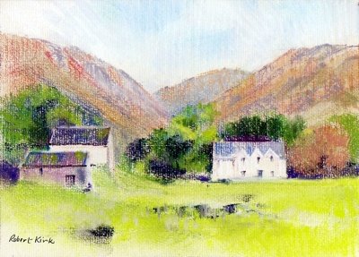
Saturday, September 09, 2006
“This guy can draw anything.”
In Ludlow we were entertained by John Palmer who gave a presentation to Art Society members at our September social meeting. John sprouts up almost like a hardy annual in Ludlow, it was his third visit and judging by the large attendance he came by popular request.
John is based in Bristol and has worked all his life as a graphic designer producing advertising art work and magazine illustrations. He always brings a huge portfolio of his graphic work in watercolour, gouache and acrylic and is happy to have this passed around. The range of style and subject matter is staggering. “This guy can draw anything.” said one of our young members as she looked at the next piece of art work that came to hand.
For his demonstrations John brings three or four large watercolours at various stages of finish and works on each in turn – sometimes adding more drawing as well as new washes. It’s an interesting way to work; it emphasises that sound draughtsmanship lies at the heart of good watercolour and forms an integral part of the finished work.
I first got to know John’s work from a book he wrote back in 1993. The title was ‘Drawing and Sketching’ and was published as a title in the Ron Ranson’s Painting School series. The series has long since been out of print and I picked up my copy at a bargain price in a publishers remaindered bookshop. I always intend to get him to autograph my copy perhaps on a future visit I will remember
to ask him.
Incidentally I was surprised to find copies of the book are still available via Amazon.
In Ludlow we were entertained by John Palmer who gave a presentation to Art Society members at our September social meeting. John sprouts up almost like a hardy annual in Ludlow, it was his third visit and judging by the large attendance he came by popular request.
John is based in Bristol and has worked all his life as a graphic designer producing advertising art work and magazine illustrations. He always brings a huge portfolio of his graphic work in watercolour, gouache and acrylic and is happy to have this passed around. The range of style and subject matter is staggering. “This guy can draw anything.” said one of our young members as she looked at the next piece of art work that came to hand.
For his demonstrations John brings three or four large watercolours at various stages of finish and works on each in turn – sometimes adding more drawing as well as new washes. It’s an interesting way to work; it emphasises that sound draughtsmanship lies at the heart of good watercolour and forms an integral part of the finished work.
I first got to know John’s work from a book he wrote back in 1993. The title was ‘Drawing and Sketching’ and was published as a title in the Ron Ranson’s Painting School series. The series has long since been out of print and I picked up my copy at a bargain price in a publishers remaindered bookshop. I always intend to get him to autograph my copy perhaps on a future visit I will remember
to ask him.
Incidentally I was surprised to find copies of the book are still available via Amazon.
Saturday, September 02, 2006
Drenched but Ecstatic
Last week I paid a visit to ‘The Stiperstones’ – these are striking outcrops of rocks on a hilltop in Shropshire. The outcrops consist of Precambrian quartzite – old, metamorphosed and hard they have been eroded into fantastic shapes which have given rise to legend hence the largest and most northerly outcrop has been named ‘The Devil’s Chair.’
I wasn’t fearful of the devil on this occasion I was more apprehensive about the shower clouds blowing in from the west. I had my sketching gear in the rucksack and wondered if I would get a chance to make use of it. Apart from the threat of rain it was a wonderful day of changing light which threw shadows across the rocks, the heather was in bloom reflecting bright purple when in sunlight. All these transient effects had to be captured on camera in the uncertain weather conditions.
The first shower arrived as I approached the summit outcrop which provided some shelter but not sufficient to make a drawing. At the next bright interval I moved out to look around for a sketching viewpoint and was made ecstatic by the effect of sunlight on wet rocks – just got to grab that – another job for the digital camera.
There was just time to settle on a viewpoint and get the sketchbook out when the next shower arrived. Caught on an open hillside and drenched in the first minute of driving rain the only option was to retreat back to the car. Not a wasted day though my trusty Canon digital camera had captured several images that could be used as reference material for paintings. Here’s my favourite:-

Last week I paid a visit to ‘The Stiperstones’ – these are striking outcrops of rocks on a hilltop in Shropshire. The outcrops consist of Precambrian quartzite – old, metamorphosed and hard they have been eroded into fantastic shapes which have given rise to legend hence the largest and most northerly outcrop has been named ‘The Devil’s Chair.’
I wasn’t fearful of the devil on this occasion I was more apprehensive about the shower clouds blowing in from the west. I had my sketching gear in the rucksack and wondered if I would get a chance to make use of it. Apart from the threat of rain it was a wonderful day of changing light which threw shadows across the rocks, the heather was in bloom reflecting bright purple when in sunlight. All these transient effects had to be captured on camera in the uncertain weather conditions.
The first shower arrived as I approached the summit outcrop which provided some shelter but not sufficient to make a drawing. At the next bright interval I moved out to look around for a sketching viewpoint and was made ecstatic by the effect of sunlight on wet rocks – just got to grab that – another job for the digital camera.
There was just time to settle on a viewpoint and get the sketchbook out when the next shower arrived. Caught on an open hillside and drenched in the first minute of driving rain the only option was to retreat back to the car. Not a wasted day though my trusty Canon digital camera had captured several images that could be used as reference material for paintings. Here’s my favourite:-
Thursday, August 24, 2006
I’ve Been Out Sketching Today
I happened to be in Worcester with an hour to spare, it was a warm sunny afternoon so I found a quiet spot in the cathedral close and had an absorbing 45 minutes drawing a bit of medieval ruin near the west doorway. Drawing en plein air is an activity I’ve neglected of late. Nowadays I work mostly from old sketchbooks or I rework paintings by transforming them into a different medium – so a pastel subject is revived and taken in a different direction through the medium of watercolour.
That’s a convenient way of working and when looking through old work there are always discoveries to be made. I could have happily kept working in this way reworking things in Pastel, Acrylic or watercolour except events have a way of taking over. The Ince exhibition nudged me towards taking pure watercolour seriously again and his sketchbooks displayed a degree of finish which I’d never attempted.
Then I bought ‘Light and Mood in Watercolour’ - David Curtis most recent book which prompted me to take another hard look at his work. His early training as a draughtsman shows in all his watercolours – very noticeably so in his larger ones. This was reason enough to go back to basics and work on my own draughtsmanship.
I happened to be in Worcester with an hour to spare, it was a warm sunny afternoon so I found a quiet spot in the cathedral close and had an absorbing 45 minutes drawing a bit of medieval ruin near the west doorway. Drawing en plein air is an activity I’ve neglected of late. Nowadays I work mostly from old sketchbooks or I rework paintings by transforming them into a different medium – so a pastel subject is revived and taken in a different direction through the medium of watercolour.
That’s a convenient way of working and when looking through old work there are always discoveries to be made. I could have happily kept working in this way reworking things in Pastel, Acrylic or watercolour except events have a way of taking over. The Ince exhibition nudged me towards taking pure watercolour seriously again and his sketchbooks displayed a degree of finish which I’d never attempted.
Then I bought ‘Light and Mood in Watercolour’ - David Curtis most recent book which prompted me to take another hard look at his work. His early training as a draughtsman shows in all his watercolours – very noticeably so in his larger ones. This was reason enough to go back to basics and work on my own draughtsmanship.
Wednesday, August 23, 2006
In Watercolour Small is Beautiful
J. M. Ince’s watercolours in Hereford have set me off on a series of small watercolours. Ince’s paintings in the bicentenary exhibition were around 10in x 14in or 7in x 10in. To me watercolour accommodates these small dimensions far better than oil – the medium is ideal when working on a small intimate scale. I can understand why artists frequently submit large half imperial watercolours to open exhibitions anything smaller gets lost in a massive show.
So I’m following the Cox/Ince route and adopting the small scale watercolour mode – not to imitate their technique or method but at least to try and capture the charm of their small works.
J. M. Ince’s watercolours in Hereford have set me off on a series of small watercolours. Ince’s paintings in the bicentenary exhibition were around 10in x 14in or 7in x 10in. To me watercolour accommodates these small dimensions far better than oil – the medium is ideal when working on a small intimate scale. I can understand why artists frequently submit large half imperial watercolours to open exhibitions anything smaller gets lost in a massive show.
So I’m following the Cox/Ince route and adopting the small scale watercolour mode – not to imitate their technique or method but at least to try and capture the charm of their small works.
Tuesday, August 15, 2006
Celebrating 60 Years
Celebrating 60 Years Of Achievement
Ludlow Art Society’s Summer Exhibition which opens on the 19th August marks the Society’s 60th Anniversary. As a small celebration of the occasion we are showing work by former members - sadly most of them have died. When details of the former members paintings were received, pleasant memories were revived of people who were active in the Society when I first joined 20 years ago now.
Although I only managed to assemble a small and rather arbitrary selection of former members work it confirms the impression – held by those of us who’ve been associated with the Society for many years – that the standard has remained consistently high. The Society’s exhibitions have always been an interesting, varied mixture of amateur and professional work. Long may it continue – for another 60 years and more.
There is more information on the Society’s website : www.ludlowartsociety.org.uk
Ludlow Art Society’s Summer Exhibition which opens on the 19th August marks the Society’s 60th Anniversary. As a small celebration of the occasion we are showing work by former members - sadly most of them have died. When details of the former members paintings were received, pleasant memories were revived of people who were active in the Society when I first joined 20 years ago now.
Although I only managed to assemble a small and rather arbitrary selection of former members work it confirms the impression – held by those of us who’ve been associated with the Society for many years – that the standard has remained consistently high. The Society’s exhibitions have always been an interesting, varied mixture of amateur and professional work. Long may it continue – for another 60 years and more.
There is more information on the Society’s website : www.ludlowartsociety.org.uk
Sunday, August 06, 2006
The Painter of Presteigne
The Hereford Art Gallery and Museum is curently showing an exhibition of Watercolours by Joseph Murray Ince 1806-1851 to celebrate his bicentenary. Although born in London he was brought up in Presteign. He was a fine watercolourist who studied for three years with David Cox in Hereford before finally establishing himself as a painter in London. The link goes to the Powys On-line History Project that gives more information about him and contains an illustration of his work.
Follow the link - Joseph Murray Ince
Seeing an exhibition of largely topographical watercolours by a single 19th Century artist is a striking reminder of how the best work of that period was underpinned by really sound draughtsmanship. This is a quality that often missing in modern watercolour due to the prevalent fashion for 'loooseness.' The quality of Ince's mastery of drawing can be seen in his sketchbook studies in the exhibition. These are fine examples of firmly controlled linework done mostly in pencil – simple means but wonderful artistry.
In Ince's day painters had to be content with a few simple colours – the modern synthetic colours and those made from coal tar derivatives like Alizarin and French Ultramarine did not arrive until some time later. Ince's palette was made up of Cobalt blue, a few earth colours and white. Greens were made from black, yellow ochre, with a touch of cobalt. Cobalt and yellow ochre were used for skies and occasionally light red.
With these simple colours they often fell back on well-tried strategies. Blues were kept for distances and foregrounds were laid in over a warm background wash of yellow ochre or light red. Foreground incidentals frequently contained a touch of vermilion used for a farm labourer's waistcoat or a skirt.
As a student with David Cox Ince probably learned by copying his tutor's sketches and paintings. It was the standard method of teaching and has much to commend it.
The Hereford Art Gallery and Museum is curently showing an exhibition of Watercolours by Joseph Murray Ince 1806-1851 to celebrate his bicentenary. Although born in London he was brought up in Presteign. He was a fine watercolourist who studied for three years with David Cox in Hereford before finally establishing himself as a painter in London. The link goes to the Powys On-line History Project that gives more information about him and contains an illustration of his work.
Follow the link - Joseph Murray Ince
Seeing an exhibition of largely topographical watercolours by a single 19th Century artist is a striking reminder of how the best work of that period was underpinned by really sound draughtsmanship. This is a quality that often missing in modern watercolour due to the prevalent fashion for 'loooseness.' The quality of Ince's mastery of drawing can be seen in his sketchbook studies in the exhibition. These are fine examples of firmly controlled linework done mostly in pencil – simple means but wonderful artistry.
In Ince's day painters had to be content with a few simple colours – the modern synthetic colours and those made from coal tar derivatives like Alizarin and French Ultramarine did not arrive until some time later. Ince's palette was made up of Cobalt blue, a few earth colours and white. Greens were made from black, yellow ochre, with a touch of cobalt. Cobalt and yellow ochre were used for skies and occasionally light red.
With these simple colours they often fell back on well-tried strategies. Blues were kept for distances and foregrounds were laid in over a warm background wash of yellow ochre or light red. Foreground incidentals frequently contained a touch of vermilion used for a farm labourer's waistcoat or a skirt.
As a student with David Cox Ince probably learned by copying his tutor's sketches and paintings. It was the standard method of teaching and has much to commend it.
Thursday, August 03, 2006

A struggle with ‘The Friars’
The gothic west front of I Frari in Venice dominates a little campo so that you have to tilt the head backwards to view its full height. Constantly moving the head when drawing creates all sorts of problems – the task is far easier when both the subject and the drawing are held within the field of vision. Nevertheless with the colourful pair of gondolas as a foreground motif I thought it would be a good subject. Working from a rather inadequate pen drawing dashed off in a hurry and photographs the painting became a struggle.
Buildings with dominant verticals always seem to present a problem so in the under drawing I used a t-square to lay in the lines of the shallow buttresses on the façade. Gradually these got lost as the painting progressed and had to be restated using the t-square – but the mechanically drawn lines laid on a loosely handled paint surface didn’t work.
After much agonising I looked afresh at the sketch and the photographs and realised there wasn’t a vertical line anywhere! Furthermore although In the sketch the buttresses were drawn with strong pen lines, in the photograph they only appeared as subtle tonal differences. The way forward then was to to think like a painter rather than an architectural draughtsman – concentrate on the colour and texture in the brickwork of the façade and offer merely a suggestion of the buttresses. This might convey the atmosphere of the place without needing precise accuracy.
This little campo is a favoured location for artists but usually they have the sense to turn their backs to I Frari and choose a subject looking down the canal from the far side. There is a shot of John Yardley in an APV Films video at his easel doing just that. Trevor Chamberlain also shows a nice little watercolour in one of his books of the view looking along the canal from the bridge in my picture. He made his picture from a few simple elements, a bridge and two or three boats moored on the canal. The buildings were cropped below first floor level – no head tilting needed for that approach. It was enough to capture the spirit of the place.
With hindsight I realised that the west doorway of I Frari held sufficient visual interest in itself to make an attractive picture. I could have saved myself a lot of trouble by keeping to simple things!
Tuesday, August 01, 2006
A Preview and a First Night
Last week I was at the Aberystwyth Arts Centre for the first night of Michael Bogdanov’s production of ‘Fiddler on the Roof’. My wife always gets a hug from Bogdanov - she got to know him when he directed the Shakespeare play at the Ludlow Festival for three years. This year – following a true Ukranian custom I got one too.
The Arts Centre also puts on some interesting exhibitions and while waiting of the performance I wandered towards the sound of people chatting and unexpectedly gate crashed a preview. The Exhibition was called ’40 Part Motet’ by Janet Cardiff. It was an installation of 40 hi fi loudspeakers mounted at shoulder level and arranged in a circle. Each speaker presumably playing one of the 40 parts. The curious thing was that nobody seemed to be listening to a single note.
In the theatre at least the audience were listening and enjoying the music.
Last week I was at the Aberystwyth Arts Centre for the first night of Michael Bogdanov’s production of ‘Fiddler on the Roof’. My wife always gets a hug from Bogdanov - she got to know him when he directed the Shakespeare play at the Ludlow Festival for three years. This year – following a true Ukranian custom I got one too.
The Arts Centre also puts on some interesting exhibitions and while waiting of the performance I wandered towards the sound of people chatting and unexpectedly gate crashed a preview. The Exhibition was called ’40 Part Motet’ by Janet Cardiff. It was an installation of 40 hi fi loudspeakers mounted at shoulder level and arranged in a circle. Each speaker presumably playing one of the 40 parts. The curious thing was that nobody seemed to be listening to a single note.
In the theatre at least the audience were listening and enjoying the music.
Sunday, July 30, 2006
En Plein Air
Artists’ online forums are interesting places. For a start they are an ideal way for artists to share interests and concerns even though they are located miles apart and are unlikely ever to meet face to face. Just recently I came across a thread about painting ‘en plein air.’ Some contributors had never painted outdoors and were seeking advice about how to begin, others were enthusiasts. Video tutorials inevitably have a sequence of the painter with his easel set up at an outdoor location demonstrating an oil or watercolour suggesting to beginners that this is the way to work.
Certainly when I started to paint seriously in watercolour the loose style of Seago and Wesson was the flavour of the month. Tales circulated of how Ted Wesson would dash off his characteristic freely handled watercolours done sur le motif as demonstrations for students on his courses. This was the accepted way of working and it had to be done en plein air.
I was once infected by the same enthusiasm and used to set out with easel, portfolio containing drawing board and paper, haversack with watercolour materials – a massive weight of gear. Then I saw a TV broadcast about David Gentleman – he just set out with a camping stool and haversack over his shoulder. At his chosen location he just sat on the stool and worked in a sketchbook on his knee with water pot placed on the ground with easy reach. That’s how I work outdoors now.
Unless your sole aim is to be a Wesson disciple it’s rarely worth attempting to make a finished watercolour in front of the subject – I’ve wasted many sheets of watercolour paper by trying.
A myth has taken root about painting en plein air which arises from misconceptions about impressionism. It was generally thought that the Impressionists completed their canvases outdoors in front of the motif. John House in ‘Landscape into Art’ describes Monet’s methods in some detail. Although Monet took his canvases almost to completion en plein air he rarely produced a final work in front to the subject. Particularly from about 1880 on most of his outdoor studies were refined later after a period of reflection in the studio.. His salon submissions often have the characteristics of studio work which suggests that he regarded his outdoor paintings chiefly as studies.
Another misconception is that the Impressionists cared nothing about composition and simply accepted the random arrangements of the natural world. Monet in fact spent time exploring a new location for good viewpoints and made quick linear sketches of motifs in a sketchbook. So when he set off with his easel and canvasses he probably carried in his mind an idea for a composition..
Artists’ online forums are interesting places. For a start they are an ideal way for artists to share interests and concerns even though they are located miles apart and are unlikely ever to meet face to face. Just recently I came across a thread about painting ‘en plein air.’ Some contributors had never painted outdoors and were seeking advice about how to begin, others were enthusiasts. Video tutorials inevitably have a sequence of the painter with his easel set up at an outdoor location demonstrating an oil or watercolour suggesting to beginners that this is the way to work.
Certainly when I started to paint seriously in watercolour the loose style of Seago and Wesson was the flavour of the month. Tales circulated of how Ted Wesson would dash off his characteristic freely handled watercolours done sur le motif as demonstrations for students on his courses. This was the accepted way of working and it had to be done en plein air.
I was once infected by the same enthusiasm and used to set out with easel, portfolio containing drawing board and paper, haversack with watercolour materials – a massive weight of gear. Then I saw a TV broadcast about David Gentleman – he just set out with a camping stool and haversack over his shoulder. At his chosen location he just sat on the stool and worked in a sketchbook on his knee with water pot placed on the ground with easy reach. That’s how I work outdoors now.
Unless your sole aim is to be a Wesson disciple it’s rarely worth attempting to make a finished watercolour in front of the subject – I’ve wasted many sheets of watercolour paper by trying.
A myth has taken root about painting en plein air which arises from misconceptions about impressionism. It was generally thought that the Impressionists completed their canvases outdoors in front of the motif. John House in ‘Landscape into Art’ describes Monet’s methods in some detail. Although Monet took his canvases almost to completion en plein air he rarely produced a final work in front to the subject. Particularly from about 1880 on most of his outdoor studies were refined later after a period of reflection in the studio.. His salon submissions often have the characteristics of studio work which suggests that he regarded his outdoor paintings chiefly as studies.
Another misconception is that the Impressionists cared nothing about composition and simply accepted the random arrangements of the natural world. Monet in fact spent time exploring a new location for good viewpoints and made quick linear sketches of motifs in a sketchbook. So when he set off with his easel and canvasses he probably carried in his mind an idea for a composition..
Subscribe to:
Posts (Atom)